The network for creativity
Join 1.25M professional creatives like you
Connect with clients, get discovered, and run your business 100% commission-free
Creatives on Contra have earned over $150M and we are just getting started
Back to feedPost

Most conference booths are forgotten before you reach the exit.
For IAPP Summit, we skipped the booth entirely. Branded a coffee house a few minutes away, and gave attendees a reason to walk toward us: coffee, productive roundtables, a 6am Run Club, happy hour.
Same budget. Completely different presence.
The visual system "Classified Systems" borrowed from the world privacy professionals actually live in: restricted access, redaction, deliberate reduction. On a show floor full of noise, the quietest materials stood out.
36 warm leads. 3× site visits. Full case in my portfolio.

The network for creativity
Join 1.25M professional creatives like you
Connect with clients, get discovered, and run your business 100% commission-free
Creatives on Contra have earned over $150M and we are just getting started







Related posts

Some places deserve a website as quiet as their halls 🏛️
Landing page for Timeless Treasures, a small museum in Florence: three halls, twenty-six centuries and one very old house ✨
Instead of another ticket-shop layout, we let the collection speak. Big photography, a strict Swiss grid and one calm typeface, so it feels like walking through the museum itself.
Scroll through the halls, from paintings to the princes' ballroom to a room full of marble faces 🖼️ Then check what's on this season, the museum in numbers, and everything you need to plan a visit, all in one place.
Got a story that deserves more than a template? Let's make it together 🙌


Great work!!

🙌 Interactive Coffee Shop Game built ENTiRELY in Rive🚀
A playful cafe experience combining animated characters, interactive gameplay, and a complex in-game economy.
Everything from the UI and animations to the game logic and economic calculations runs directly inside Rive, with Data Tables making the entire system easy to configure and balance.
More than just animation — a fully interactive gaming experience powered by Rive.


Title / Headline:
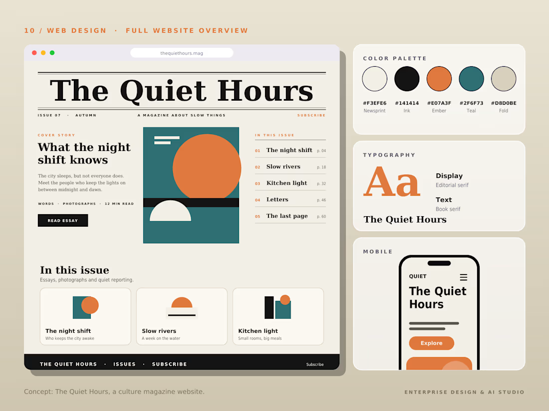
The Quiet Hours — Cultural Magazine Web Design & Brand Identity
Description
Overview:
The Quiet Hours is an editorial-driven digital magazine concept focused on slow living, culture, and thoughtful essays, designed with a sophisticated print-inspired digital aesthetic.
Design Highlights:
Print-Inspired Editorial Layout: Engineered a structured grid system blending classic editorial serif display typography with clean body text for an immersive reading experience.
Calm & Earthy Color Palette: Curated a muted, harmonious color scheme (Pampad, Ink, Ember, Teal, and Pod) to evoke a sense of quiet and reflection.
Content Architecture: Structured clear content hierarchies, including issue highlights, article previews, and category navigation.
Mobile Responsive Layout: Designed a seamless mobile reading interface tailored for on-the-go content consumption.
Tools & Stack:
Figma, Adobe Illustrator, Editorial Typography, Web Design, UI/UX Layouts.



This is very beautiful 😍