The network for creativity
Join 1.25M professional creatives like you
Connect with clients, get discovered, and run your business 100% commission-free
Creatives on Contra have earned over $150M and we are just getting started
Back to feedPost
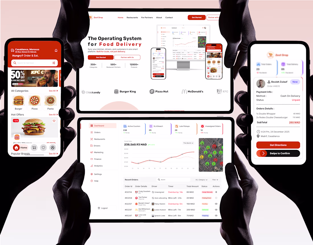
🔴 The Dashboard... Is it just colorful tables?
🟠 The Customer App... Is it for the hungry user ordering food in a minute, or the one waiting ten minutes for the interface to load? Or an app unusable under the sun? Or a complex interface needing an iPhone 17 to run?
🔵 The Driver App... Was it designed for the hero delivering the order in 15 minutes, or to get lost because they can't see the screen? Ugly design? Touch errors? Color contrast impossible to distinguish while driving at 60 km/h under the scorching sun?
💡 This is the difference between "Eye Candy 🍬" case studies and a "Real Product" ready for the market. And this is exactly what we achieved in Zest Drop:
It is a balance between "Appeal" and "Efficiency".
🔗 Check the full Case Study on Contra via the link in the first comment. 👇
🚀 Full High-Res Case Study: [https://contra.com/p/mMgYl3Eb-food-delivery-app-dashboardandwebsite-or-uiux-case-study?r=migiwara_lyzupja7]
The network for creativity
Join 1.25M professional creatives like you
Connect with clients, get discovered, and run your business 100% commission-free
Creatives on Contra have earned over $150M and we are just getting started
Related posts
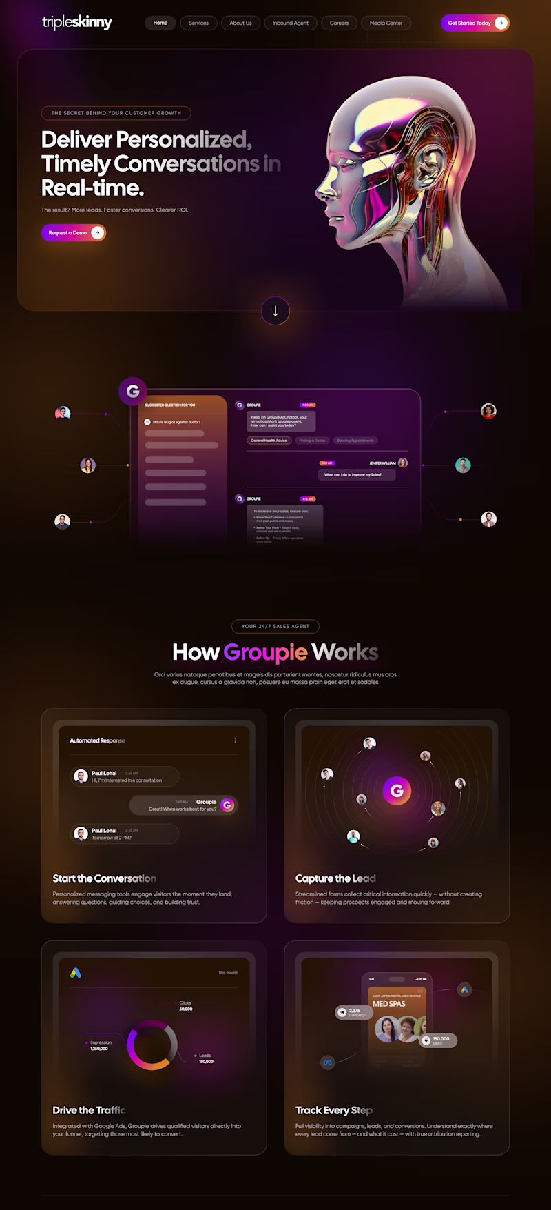
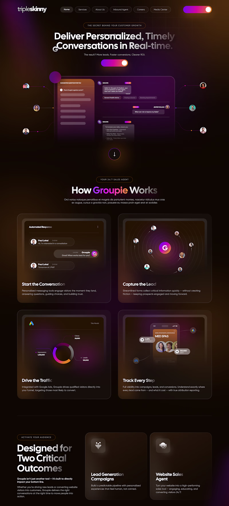
Same dark SaaS aesthetic. Same orange-to-pink gradient accents. Same glass-card UI elements. Two different entry points. But the hero tells a completely different story.
Which hero would make you request a demo? 👇
19 voted
73%
7 voted
27%
26 votes
Closed
Love this comparison. It’s a great reminder that great design isn’t just aesthetics it’s the story the hero tells. 👏
What can you create with Figma Motion?
Figma recently introduced Figma Motion, a new way to add animations directly inside your design file.
Of course, I had to try it myself.
I created this scene to test how it handles simple looping animations.
It’s still in beta, so there are a few limitations, but it’s already quite intuitive and beginner-friendly.
Sharing my process walkthrough in the comments.
Have you tried it yet?
Nice spin Petar! are you using Figma motion?
Challenges
View allTrending
Claude
Claude has entered the design space. How are you using Claude Design?
Contra University
Learn from expert creatives how to earn more using next-gen AI tools.
fifaworldcup2026
The World Cup is here and the whole world's watching. How are you designing for the world stage?
creativeaiflow
Creative AI workflows are evolving. What tools do you use, and what are their strengths and weaknesses?
freelancerlife
Freelancer life is wins, pivots, and everything in between. What’s yours right now?