The network for creativity
Join 1.25M professional creatives like you
Connect with clients, get discovered, and run your business 100% commission-free
Creatives on Contra have earned over $150M and we are just getting started
Back to feedPost

Branding that looks POP!!!
This is our one of vivid solar branding we did from stavrty.com
A colorful, strong, scalable & top minimal visual mark and presentation we chosen for Sunhouse®
Branding where consistency is main items, here you go with Us :)
Follow KahinurA


The network for creativity
Join 1.25M professional creatives like you
Connect with clients, get discovered, and run your business 100% commission-free
Creatives on Contra have earned over $150M and we are just getting started











Related posts

It’s been a minute since my last post here on Contra.
While my main focus usually lives in photo editing and digital design, I was digging through the archive recently and thought it’d be fun to share a couple of branding projects from the past:
Slide 1: Seart Visuals apparel & merchandise branding (1 year ago)
Slide 2: Choku Ladies Boutique identity and mockups (2 years ago)
Brand identity isn't my everyday lane, but tackling projects like these taught me a lot about visual consistency across different mediums. I’d love to hear your thoughts or see any feedback from fellow designers. Great to connect with the community again.

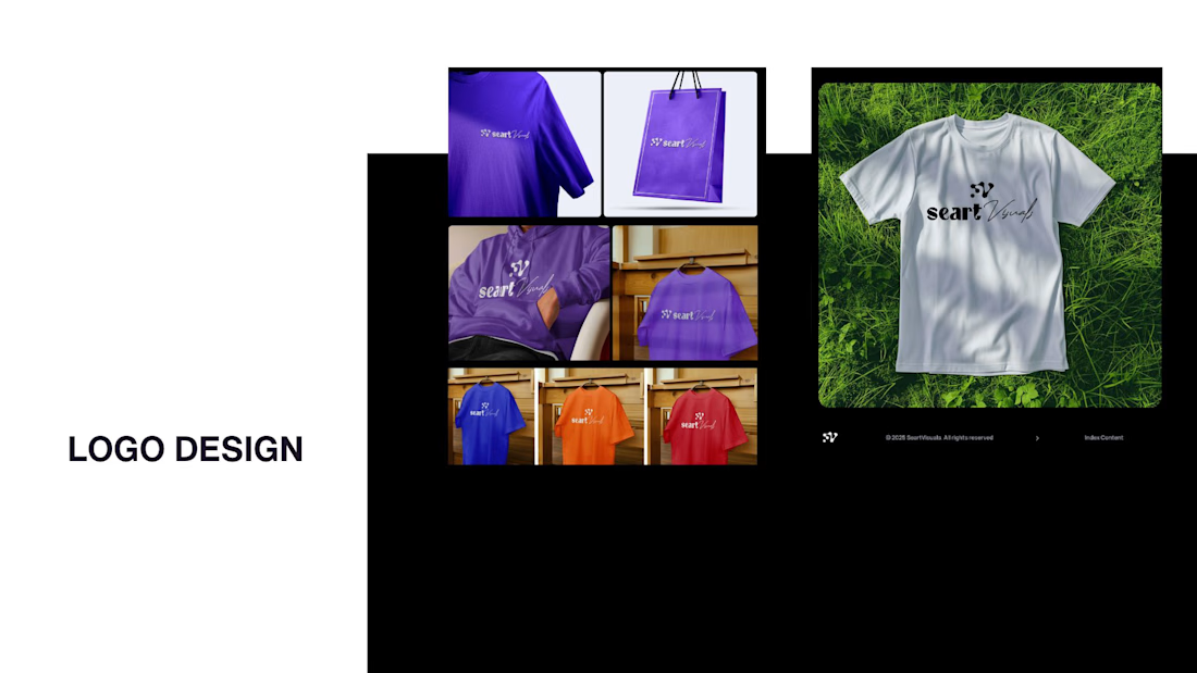
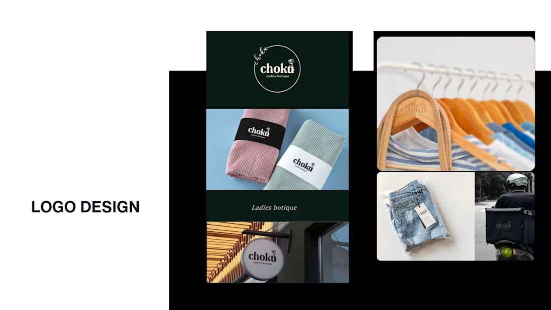

That's really great typography logo design❤️❤️


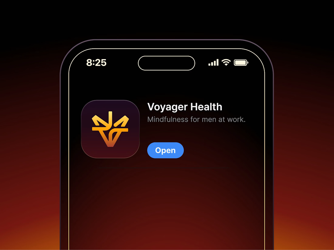

Aryna, that golden symbol pops so nicely against the plum background ✨


HEATD is a heated Pilates and yoga studio in Mableton, Georgia. The name already said it all, so we made one decision from day one: the heat would be the whole brand 🔥
Amazing project and amazing team.
Collab with @gerbzagency

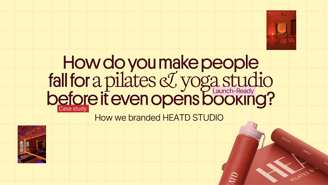
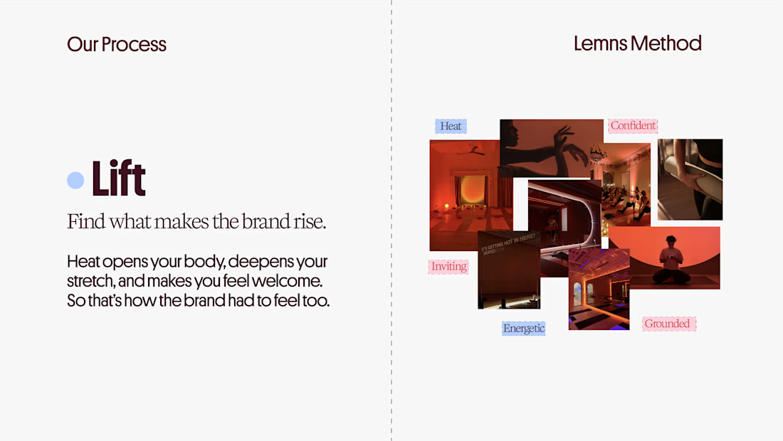
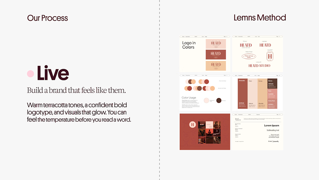
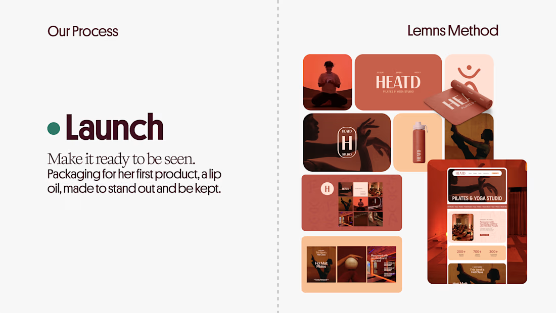

Curious how the terracotta palette got settled here: did the colour come first and the type follow, or the other way round? The heat idea reads as much through the warm tones as through the name itself.