The network for creativity
Join 1.25M professional creatives like you
Connect with clients, get discovered, and run your business 100% commission-free
Creatives on Contra have earned over $150M and we are just getting started
Back to feedPost

VC Phi
A professional venture capital platform built with Next.js 15, React 19, Tailwind CSS, and Supabase. Designed for wealth managers, family offices, and investor relations teams.
Features
Portfolio Showcase — Investment portfolio with status tracking, metrics (MOIC, IRR), and category filtering
AI Integration — Portfolio optimization and content assistance via Claude API
Dashboard — Admin interface for managing all content
Full Authentication — Email/password auth with profile management
And more ......


The network for creativity
Join 1.25M professional creatives like you
Connect with clients, get discovered, and run your business 100% commission-free
Creatives on Contra have earned over $150M and we are just getting started





Related posts


Rejected logo concepts exploring collaboration, shared expertise & working side by side

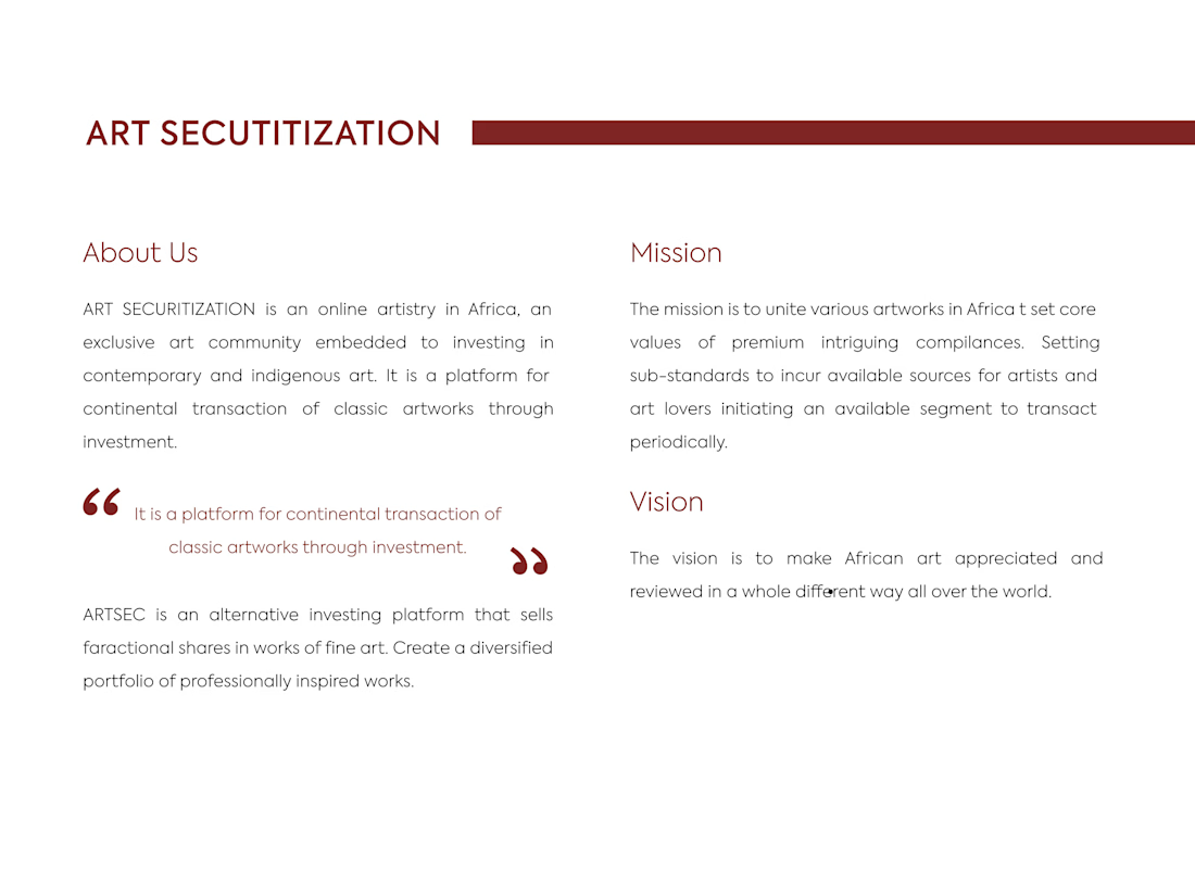
ARTSEC is an art investment platform focused on making African contemporary and indigenous art more accessible to collectors and investors.
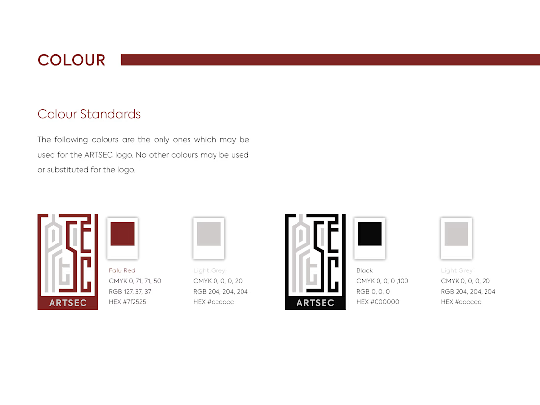
I developed a complete visual identity system for the brand, including the logo, colour palette, typography and usage guidelines.
The identity was designed to give ARTSEC a distinctive, consistent visual presence while reflecting its connection to African art and culture across print and digital applications.



Can't stop looking at this! 😍

How to create a simple cursor tracking effect for your website 👀
Cursor interactions are a simple way to make a website feel more responsive and engaging without adding too much complexity.
In this tutorial, I break down how to create the effect and how you can use it to add more personality to your web projects.
Watch the video, follow the steps, and try it in your next build.

Great work