The network for creativity
Join 1.25M professional creatives like you
Connect with clients, get discovered, and run your business 100% commission-free
Creatives on Contra have earned over $150M and we are just getting started
Back to feedPost
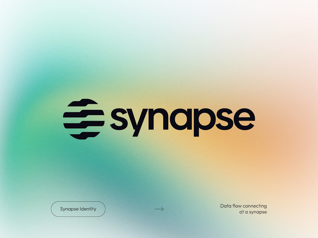
Synapse - Visual Identity & Logomark
This is the final logomark for "Synapse," a concept for an AI and data integration platform.
The Concept: The icon visualizes Systematized Connectivity. The parallel lines represent data streams, while the aligned notches (the "synapses") mark the precise moment of information transfer within a secure network (the circle).
The Typography: I paired the symbol with a bold, lowercase sans-serif typeface. The geometric structure of the letters mirrors the precision of the icon, while the lowercase approach keeps the technical brand feeling accessible and human-centric rather than rigid.
The Mood: Presented on a mesh gradient to highlight the modern, tech-forward nature of the brand.
As always, I'd love to hear your thoughts on the balance between the mark and the type!
The network for creativity
Join 1.25M professional creatives like you
Connect with clients, get discovered, and run your business 100% commission-free
Creatives on Contra have earned over $150M and we are just getting started
Challenges
View allTrending
Claude
Claude has entered the design space. How are you using Claude Design?
Contra University
Learn from expert creatives how to earn more using next-gen AI tools.
fifaworldcup2026
The World Cup is here and the whole world's watching. How are you designing for the world stage?
creativeaiflow
Creative AI workflows are evolving. What tools do you use, and what are their strengths and weaknesses?
freelancerlife
Freelancer life is wins, pivots, and everything in between. What’s yours right now?