The network for creativity
Join 1.25M professional creatives like you
Connect with clients, get discovered, and run your business 100% commission-free
Creatives on Contra have earned over $150M and we are just getting started
Back to feedPost

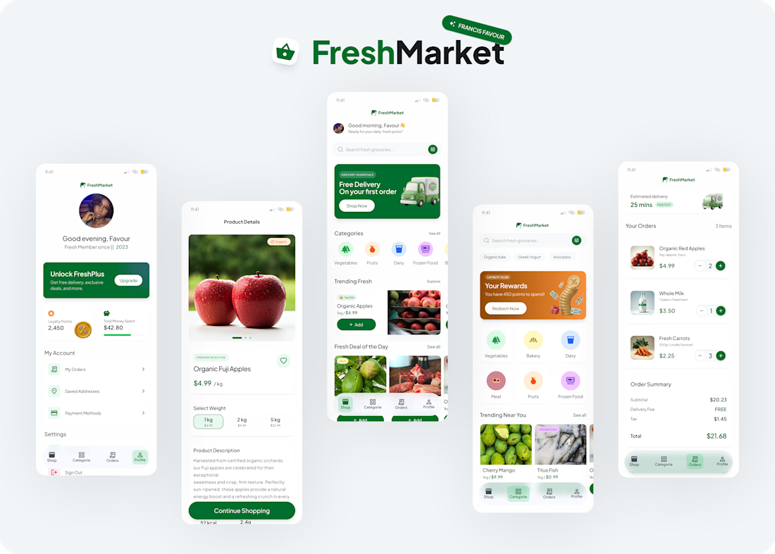
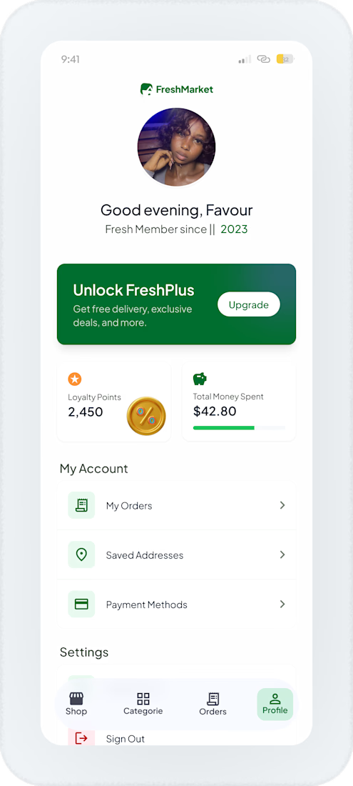
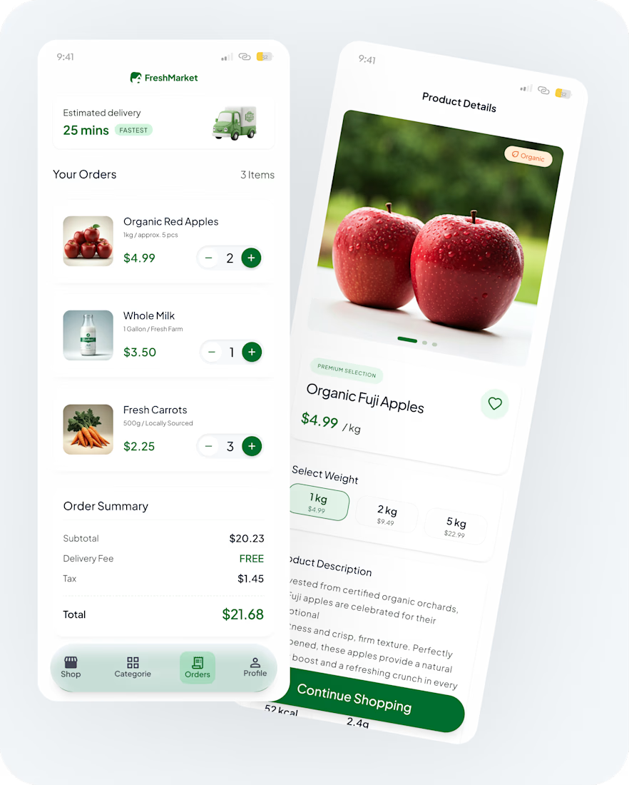
More screens on FreshMarket
I know it's a strange time to be a designer.
*Every week there's a new AI tool.
*Every month someone predicts the end of design.
And yet, I find myself enjoying the craft more than ever.
Because design was never about moving rectangles around a canvas.
It is about figuring out why a busy user should be able to navigate an interface in seconds, why a checkout flow should feel effortless, and why users should never have to think twice about what action comes next.
What I Focused On
* Visual Hierarchy
Making the most important content stand out, first deals, clear content prioritization ensures users immediately see what matters most. I made Important actions stand out without overwhelming the interface.
* Progressive Disclosure
Showing information when users need it, reducing clutter and making decisions easier.
* Consistency
Keeping layouts, typography, icons, and interactions uniform across every screen.
* Smooth Checkout Flow
Simplifying quantity updates, pricing visibility, and order summaries for faster purchases.
* Recognition Over Recall
Using clear icons, product imagery, and visual cues so users can navigate intuitively.
Visual Direction
Every color tells a story.
For FreshMarket, green wasn't just a branding choice, it was a signal. It instantly communicates freshness, health, reliability, and growth, which aligns naturally with how users perceive grocery shopping. I paired it with a neutral foundation to keep the experience clean and allow important actions and products to stand out.
Typography was intentionally simple and highly legible. Grocery shopping is often task-driven, so I wanted information to be easy to scan, helping users move through the experience without friction.
I also introduced custom 3D illustrations to give the product personality. Rather than relying on generic stock graphics, the 3D elements add warmth, create memorable moments, and help reinforce the brand's identity while making promotions feel more engaging and visually distinctive.
hashtag#UIUXDesign hashtag#ProductDesign hashtag#MobileAppDesign hashtag#UXDesign hashtag#UIDesign hashtag#DesignSystems hashtag#UserExperience hashtag#FigmaDesign hashtag#MobileDesign hashtag#GroceryApp hashtag#FreshMarket hashtag#InteractionDesign hashtag#VisualDesign hashtag#FrancisFavour
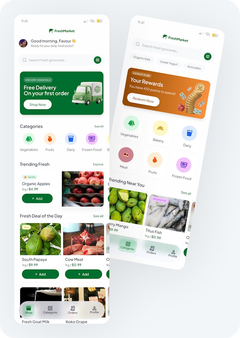
I rarely say this, but this project genuinely reminded me why I love design.
I am creating a concept for FreshMarket, and my approached is different this...

Great work
The network for creativity
Join 1.25M professional creatives like you
Connect with clients, get discovered, and run your business 100% commission-free
Creatives on Contra have earned over $150M and we are just getting started
Related posts

Design Duel ⚡
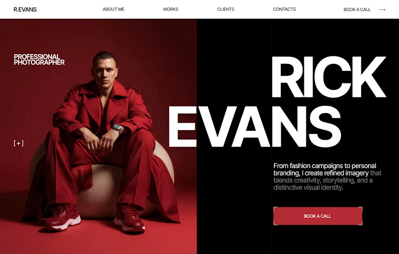
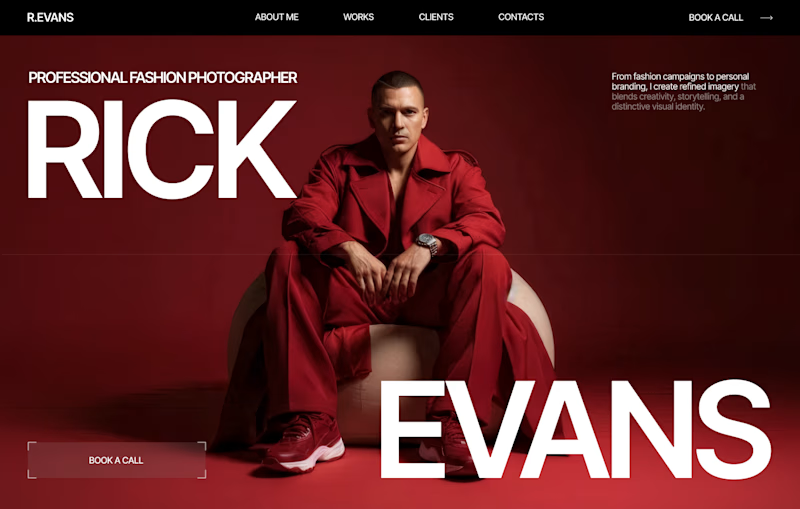
Two hero concepts. One fashion photographer.
🅰️ Structured split layout 🅱️ Full-screen editorial experience
Which one would you choose for your portfolio? Vote A or B and tell me why.


6 voted
20%
24 voted
80%
30 votes
Closed


I love your designs so much! 😍


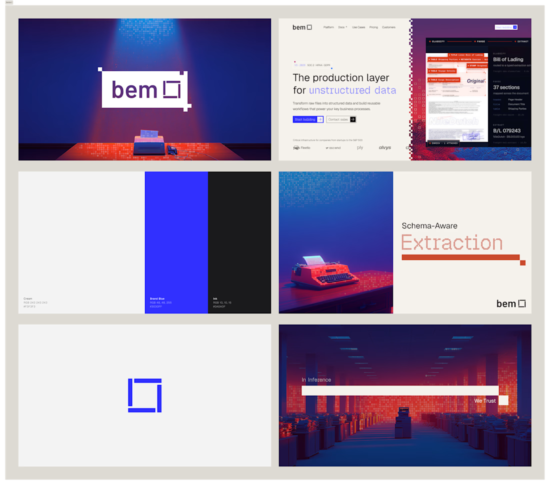
I've had so much fun working on bem. Came in with logo marks and colors, and we're looking for an identity to call home. After doing some research and inspiration exercises, we came up with this concept, which I absolutely love.

Impressive work !


Sharing one of our recent Kajabi projects 🚀
This project came with a unique challenge.
Our client had an AI-generated website mockup that captured the overall vision, but turning that concept into a real website required much more than simply recreating the design. The goal was to build a site that felt intentional, polished, and true to the brand – not like another generic AI-generated layout.
We recreated the design in Figma, refined the details where needed, and brought it to life in Kajabi using the client's branding, content, and imagery. We also set up the essential system pages and made sure everything was easy for the client to manage going forward.
It's always rewarding to bridge the gap between an AI concept and a website that feels human, cohesive, and ready for real visitors.


This is outstanding work
I can sight more of development than design just from this
Challenges
View all



Trending

Claude
Claude has entered the design space. How are you using Claude Design?

Contra University
Learn from expert creatives how to earn more using next-gen AI tools.
fifaworldcup2026
The World Cup is here and the whole world's watching. How are you designing for the world stage?
creativeaiflow
Creative AI workflows are evolving. What tools do you use, and what are their strengths and weaknesses?
freelancerlife
Freelancer life is wins, pivots, and everything in between. What’s yours right now?