The network for creativity
Join 1.25M professional creatives like you
Connect with clients, get discovered, and run your business 100% commission-free
Creatives on Contra have earned over $150M and we are just getting started
Back to feedPost

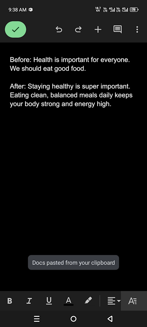
English blog paragraph rewrite - robotic to human tone

The network for creativity
Join 1.25M professional creatives like you
Connect with clients, get discovered, and run your business 100% commission-free
Creatives on Contra have earned over $150M and we are just getting started







Related posts

for my "3rd" submission i wanted to explore more with the 4-Stepped bar effect with @Invideo , so i made this nice edits
i had different clips i compiled in a compilation video, then placed the effect on the clips to make this edit.
how i did it? (check the comment section below, for my workflow)
Vicky, my Agent Two AI built the bar effect, then i told Vicky to place the bar effect on the first 2 seconds of every incoming clips
i prompted Vicky to build the bars in a rectangular-horizontal box,. with rounded corners.
i also told Vicky to add the SFX Sound you hear as the Bars lands/reveals, and i loved how that sounds lands alongside the bar effect.
❤️my first Contra submission - https://on.contra.com/zkgcpj
❤️my second Contra submission - https://on.contra.com/RdBPjt
N/B: Agent Two, created everything about this video,.. the only thing i did was upload the clips, trim each clips, and added the background song
👉my workflow is in the comment section, check it out to know how i made this edit

here's my workflow of how i made the above video edit in Invideo Editor

A minimal about me concept designed to reflect my creative journey as a writer.I believe in simple,meaningless,storytelling that inspires others:


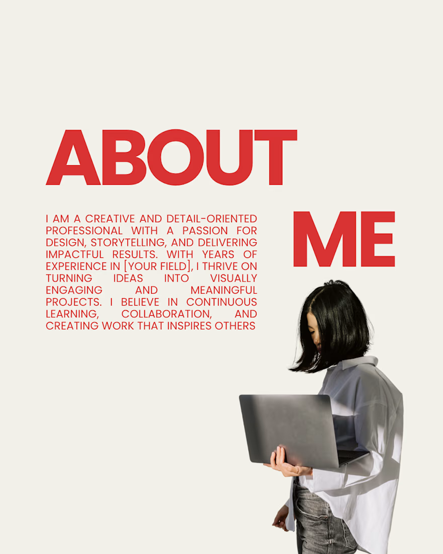

The phrase "simple, meaningless, storytelling" is a bold choice for a writer’s bio. Most clients hiring for copywriting or content creation are specifically looking for meaningful, persuasive narratives that drive action, not meaninglessness.

Reworked and refined the motion of an existing character animation of a company.
I spent time on the little things that are not really 'visible' but make a character feel more alive.
the pupil has a subtle pseudo curved effect using Rive path scripting. There’s a slight delay between the tilt, a bit of squish. You might not consciously notice these details, but they make a difference in how expressive the character feels.
(disney's principles are timeless)
what do you guys think : D
6 voted
60%
4 voted
40%
10 votes
Closed