The network for creativity
Join 1.25M professional creatives like you
Connect with clients, get discovered, and run your business 100% commission-free
Creatives on Contra have earned over $150M and we are just getting started
Back to feedPost

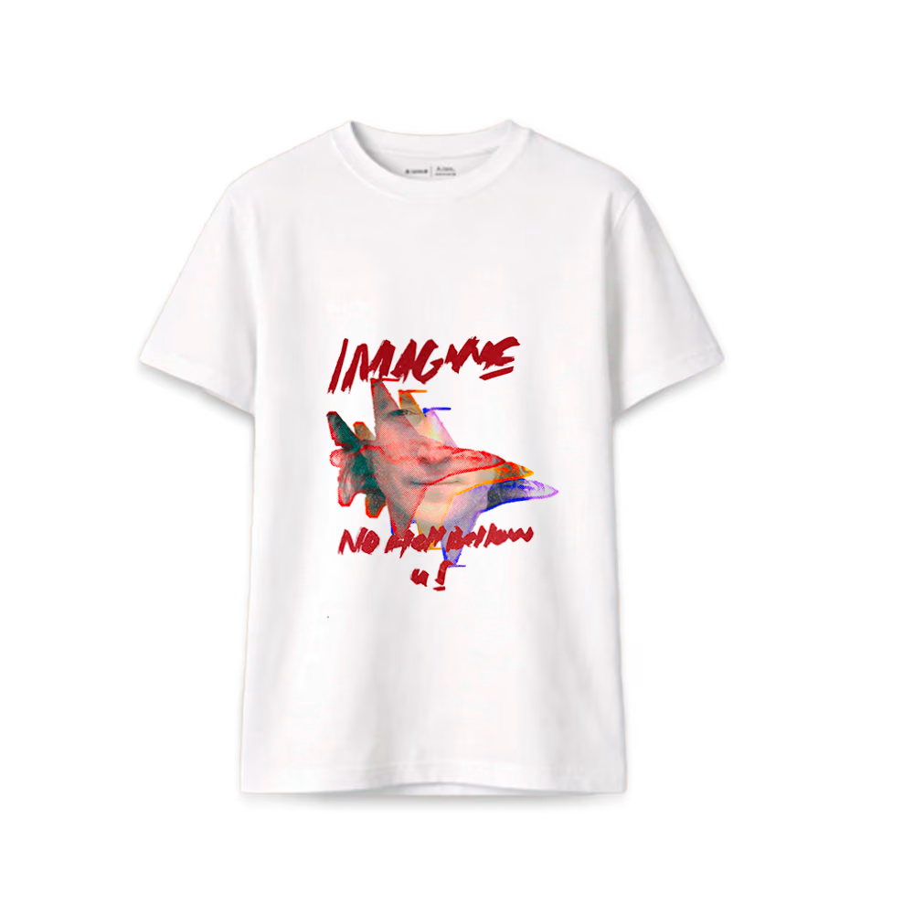
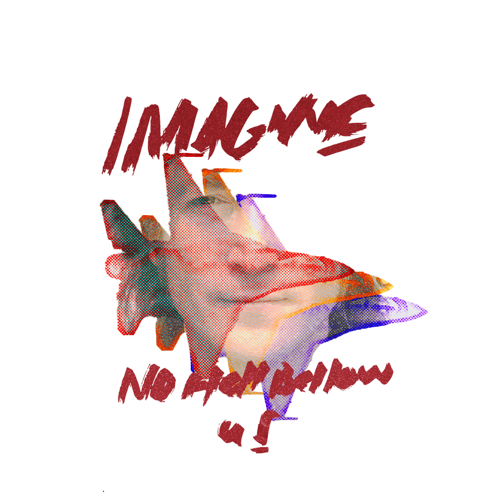
Look at this design i made from John Lennon, i think he would be proud
The network for creativity
Join 1.25M professional creatives like you
Connect with clients, get discovered, and run your business 100% commission-free
Creatives on Contra have earned over $150M and we are just getting started



Related posts

Like a lot of designers, I find my portfolio one of the hardest projects. There's no deadline, and it can always get better. Anyway, I think I'm happy with this one for a while.
Take a look:
davidguba.com


portfolio looks sharp


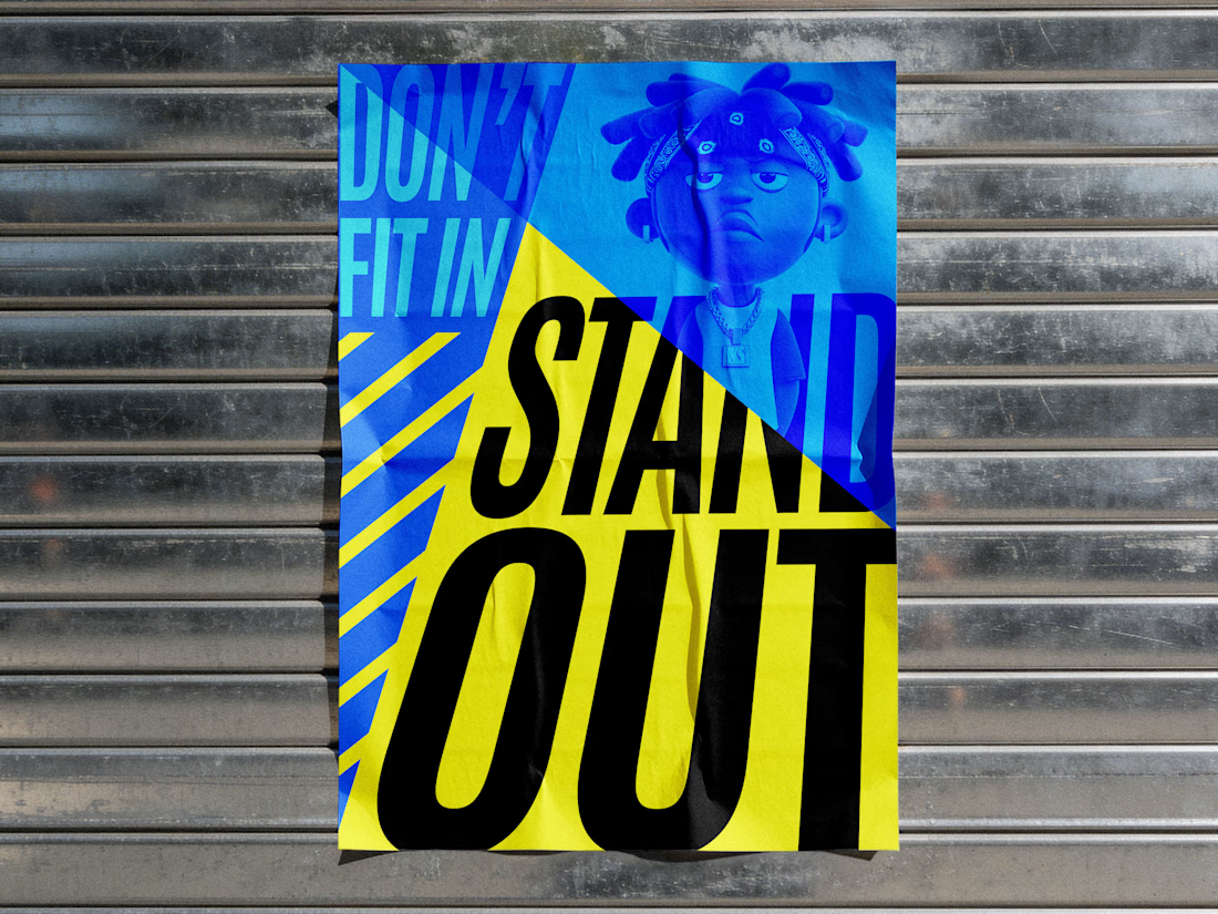
A bold poster celebrating individuality through vibrant colours, expressive typography and playful visuals, inspiring uniqueness.


The blue character against the yellow wedge is a great contrast, and the creased paper on the shutter sells the street poster look. Did you build the paper texture yourself in Photoshop?