The network for creativity
Join 1.25M professional creatives like you
Connect with clients, get discovered, and run your business 100% commission-free
Creatives on Contra have earned over $150M and we are just getting started
Back to feedPost

Your website could be costing you thousands without you even realizing it.
Here are the most common issues I see as a web designer.
It's not clear what you do. People don't have the attention span to read long, boring pages anymore. Show it visually.
You're making it hard to buy. Every extra click is a chance to lose someone. If people have to think, search, or figure things out, they're gone.
It looks AI-generated. People can tell. Especially the clients you actually want. If your website feels low effort, why would they trust your product?
The visual direction feels messy. Pixelated assets, inconsistent imagery, weak branding. It instantly lowers perceived value.
The mobile experience is bad. Let's be honest, we're all glued to our phones. People have no problem spending thousands from mobile, but only if the experience is seamless.
Your website isn't searchable. Missing SEO, weak copy, oversized images. Your website needs to speak google's language too.
Your website should work as hard as you do. If it isn't, it's time to fix it.


Could not agree more! As a video team, we see this exact same thing—if the visual direction is messy or the messaging takes too long, the perceived value drops instantly. Showing rather than telling is the only way to win now.


the "it looks AI-generated" one hits

The AI-generated point is the one people underrate. Clients notice a website that feels templated way before they can articulate why they don't trust it. Which of these do you find yourself explaining most to clients who don't see it yet?

Valiiiiddd

Spot on. Founders focus so much on getting visitors that they miss how much money a weak landing page is losing them.
The network for creativity
Join 1.25M professional creatives like you
Connect with clients, get discovered, and run your business 100% commission-free
Creatives on Contra have earned over $150M and we are just getting started





Related posts


Your homepage should answer one question: what do you do? If a visitor can't answer that in five seconds, everything below the fold doesn't matter.
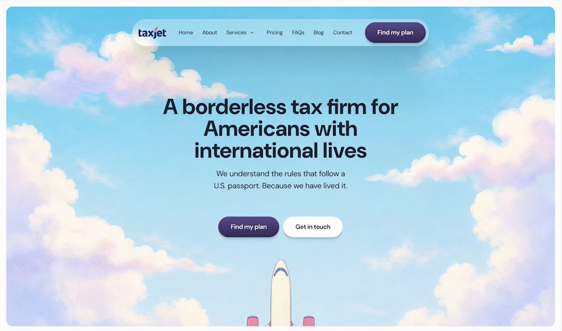

I just saw Bright Studios’ new website. You guys nailed it! Really like it.

September was a good month:
> crossed $10k+ in revenue on Contra
> shipped 3 projects: landing page, brand design, website
> went fully independent as a designer
> got referred to a big client by another designer
Now opening 2 spots for October.

Great work on this

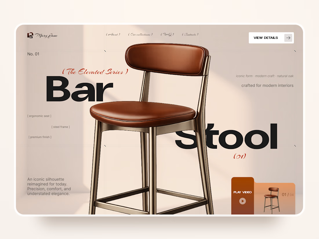
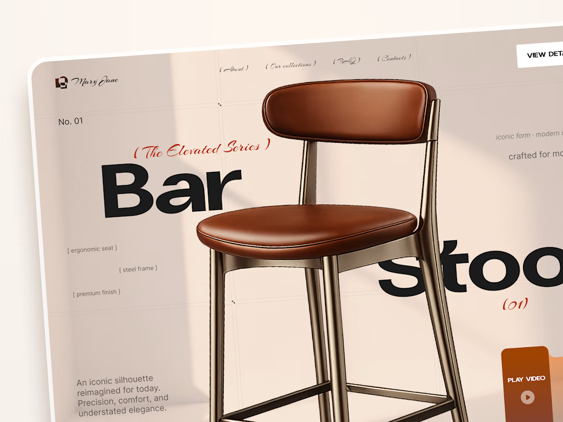
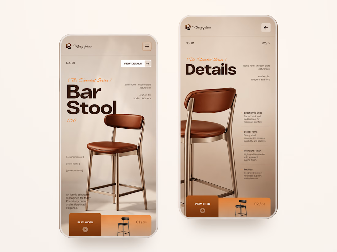
Mary Jane — Bar Stool Product Landing Page 🪑✨
A refined product landing page concept for a modern furniture brand, built around one statement piece
The design combines warm neutral tones, oversized typography, and editorial layouts to give the bar stool a premium, design-focused feel
Special attention was given to:
• Product-first composition
• Clean editorial typography
• Warm premium aesthetic
• Product details and features
• Video and 3D presentation
• Responsive mobile layout
The result is a simple, elegant experience that keeps the product at the center while giving the brand a distinctive visual character 🤎



Nice work