The network for creativity
Join 1.25M professional creatives like you
Connect with clients, get discovered, and run your business 100% commission-free
Creatives on Contra have earned over $150M and we are just getting started
Back to feedPost
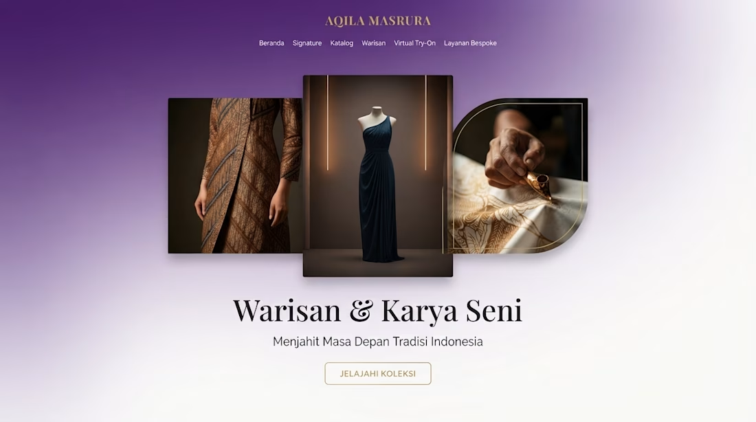
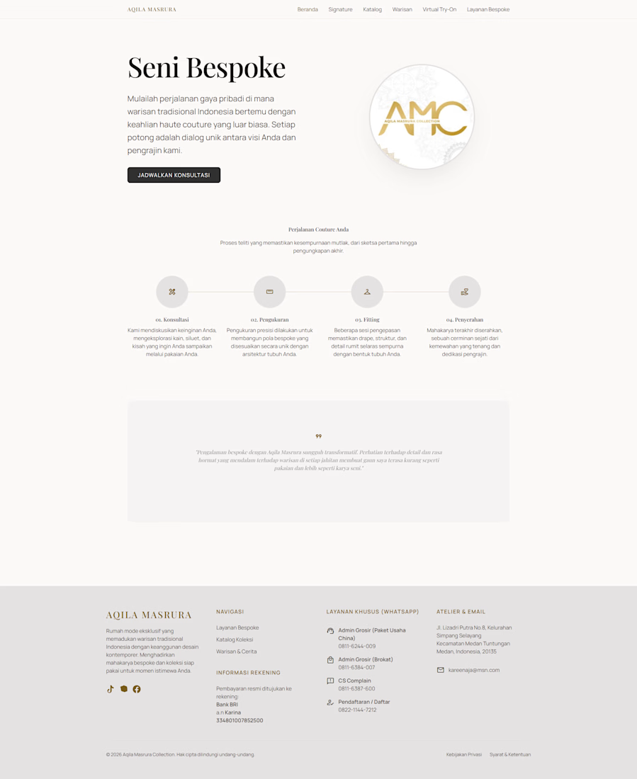
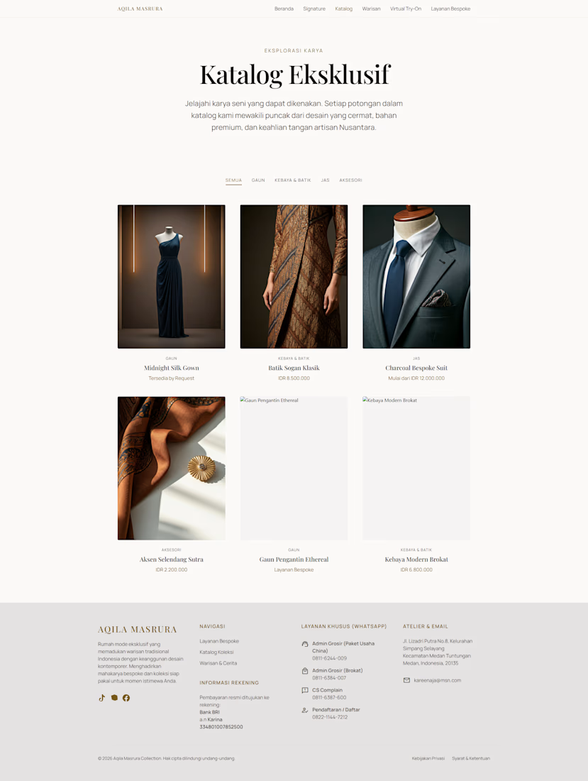
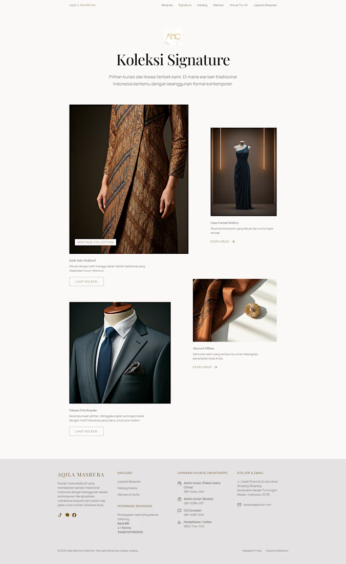
Excited to share the latest project I’ve been working on! I recently developed the landing page for Aqila Masrura Collection (AMC), a brand that beautifully blends traditional Indonesian heritage with contemporary formal elegance.
This project involved crafting a seamless digital experience that showcases their exquisite offerings:
- highlights their curated, timeless creations.
- features an intuitive interface for exploring their exclusive artisanal pieces.
- shares the brand’s deep-rooted philosophy and craftsmanship.
- design focuses on elegance, user experience, and sophisticated storytelling.
It was a pleasure to bring this vision to life. Check it out to see how we’ve married tradition with modern design.




thanks man 🔥

Great
apreciate it man thanks 😊
The network for creativity
Join 1.25M professional creatives like you
Connect with clients, get discovered, and run your business 100% commission-free
Creatives on Contra have earned over $150M and we are just getting started





Related posts





🔥 🔥


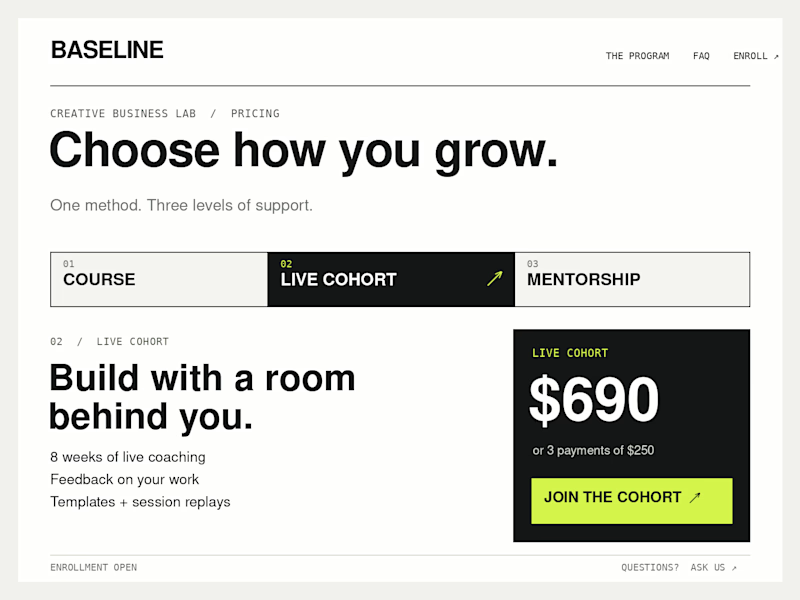
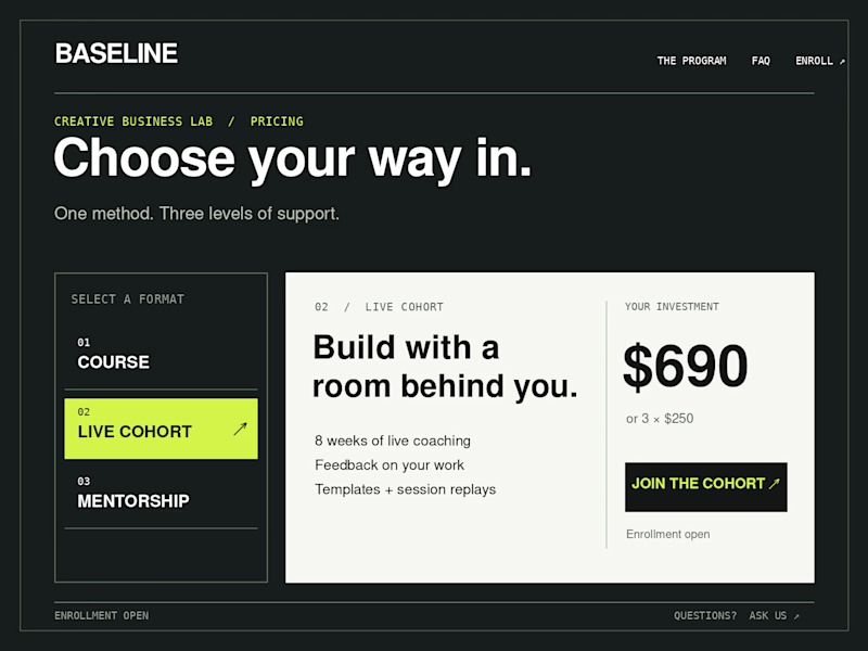
Which Kajabi pricing section would you ship?
Creative Business Lab has three paths: Course, Live Cohort, and Mentorship. Both designs show the same $690 Live Cohort with the same benefits. Only the presentation changes.
Vote Horizontal tabs or Side tabs, then tell me the one thing you’d improve before launch. Have a stronger third approach? Show it in the replies.

21 voted
50%
21 voted
50%
42 votes
Closed

Horizontal. side tabs read as nav, people skip them. though the stronger third option is no tabs at all, three cards side by side. both of these hide two prices behind a click and comparison is the one job a pricing section has.

Meet Mnemonist, a new Framer portfolio template for independent designers, creative studios, and art directors.
It’s built around an editorial layout with CMS-powered projects, large imagery, and a set of custom code components including a Step Grid Slider, Rolling Character interaction, Pull / Liquid Effect, and Infinite Wrap Gallery.
Preview: https://mnemonist.framer.website
Get : https://www.framer.com/marketplace/templates/mnemonist/
Would love to hear what you think.
