The network for creativity
Join 1.25M professional creatives like you
Connect with clients, get discovered, and run your business 100% commission-free
Creatives on Contra have earned over $150M and we are just getting started
Back to feedPost

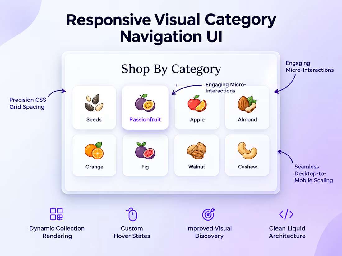
Custom Responsive Category Navigation UI for Shopify 🚀
Default Shopify themes don't always cut it. When a retail brand needed to upgrade their bulky homepage navigation to a sleek, visual grid, I built them a custom solution from the ground up.
The Build:
The Grid: Built a custom CSS Grid layout for a flawless 4-column (desktop) to 2-column (mobile) responsive shift.
The Feel: Integrated premium micro-interactions (soft hover lifts and color transitions) for a high-end, tactile user experience.
The Handoff: Engineered the section to be fully integrated with the Shopify Theme Editor, allowing the client to swap out categories and images without needing a developer on standby.
The result? A space-optimized, highly visual discovery tool that looks incredible on any device.
Option 3: Client-Centric & Benefit-Driven
Title: Giving Shopify Stores a High-End "SaaS" Feel 🎨
How do you make a growing catalog easy to navigate without cluttering the screen?
For my latest retail client, the answer was a custom, highly visual grid-based category navigation system. Their default theme was too bulky, so I coded a custom Shopify section designed specifically for elegant visual discovery.
What I Delivered:
Pixel-Perfect Scaling: A flawless 4-column to 2-column responsive shift powered by CSS Grid.
Elevated UX: Premium micro-interactions like soft hover lifts that make the e-commerce experience feel high-end and interactive.
Total Client Control: Built completely into the Shopify Theme Editor so the brand's team can update images and links on the fly.
Which style speaks to your portfolio the most—do you prefer focusing on the technical build, or the business value you brought to the client?


The network for creativity
Join 1.25M professional creatives like you
Connect with clients, get discovered, and run your business 100% commission-free
Creatives on Contra have earned over $150M and we are just getting started







Related posts


Apple Watch → Dynamic Island → Widget → Desktop Card → Mobile.
Same concept, different screens. Exploring how one UI adapts across devices.


Good work🔥👏👏


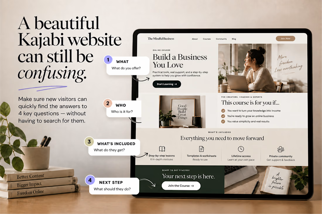
A beautiful Kajabi website can still be confusing.
One simple test:
👉 Can a new visitor understand what you offer, who it’s for, what they get, and what to do next without having to figure it out? If not, the problem may not be your design.
It may be your information hierarchy. Good UX doesn’t just make a Kajabi website look polished. It makes the right information impossible to miss.


Nice work, love it

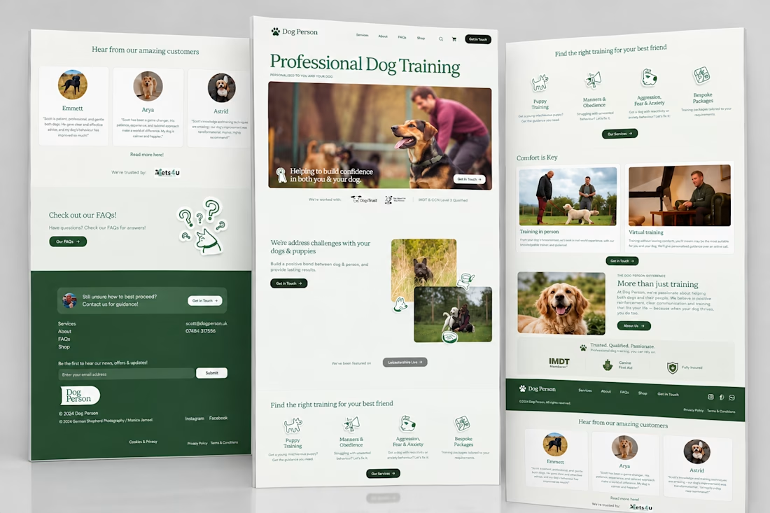
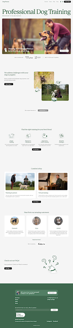
Designed and built a professional Framer website for a dog training business, focusing on clear service presentation, easy navigation, strong calls-to-action, testimonials, FAQs, and a responsive experience across devices.
What I did
- Framer website design and development
- Custom responsive layout
- Homepage design
- Services page
- About page
- FAQ page
- Contact page
- Service presentation
- Consultation and contact CTAs
- Testimonials section
- Trust and credibility sections
- Mobile responsive design
- User-friendly navigation
- Content structure and visual hierarchy
- Lead-generation focused design
- Professional branding integration
- Newsletter section
- Social media integration
- Etsy shop integration
- Image and content layout
- Conversion-focused user experience