The network for creativity
Join 1.25M professional creatives like you
Connect with clients, get discovered, and run your business 100% commission-free
Creatives on Contra have earned over $150M and we are just getting started
Back to feedPost
atrium space design for Ethiopian shipping and Logistics .T he concept was to create Aqua inspired Nature integration and feel.


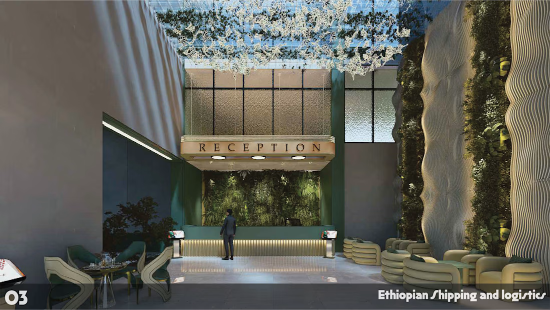

Such a breathtaking space, loved the flowy lines

Yes contemporary style it is. Thank you so much 🙌🙌


This actually blends with the company! Such an amazing concept
Thank you so much 🙏

the concept speaks through the design
Thanks alot

such an exquisite space, Ai is really optimizing our designs.

Feels like in the middle of forest
The network for creativity
Join 1.25M professional creatives like you
Connect with clients, get discovered, and run your business 100% commission-free
Creatives on Contra have earned over $150M and we are just getting started








Related posts

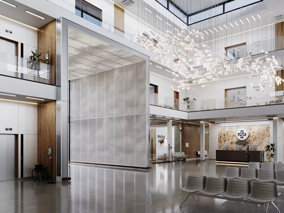
Can a clinic lobby feel calm instead of clinical? 🏥
Here’s a new medical atrium visualization: warm timber, a sculptural glass chandelier and clear wayfinding in one welcoming space.
Full case study on my profile.
Planning a healthcare or commercial project and need visuals your stakeholders can approve fast? Let’s talk.


Awesome ❤️🔥

VELOUR is a luxury perfume-store concept featuring a cinematic 3D entrance: the camera approaches the boutique, the doors open, and visitors discover the fragrances inside.
The experience includes interactive perfume bottles, animated spray effects, a personalized scent quiz, product filtering, bottle-size selection, and a shopping bag. A complete demo checkout takes visitors through delivery details to an order-confirmation screen.
Built with HTML, CSS, JavaScript, and WebGL, with responsive layouts and motion controls. This is a frontend showcase; checkout does not process real payments or orders.


The cinematic 3D entrance is a stunning way to sell luxury online, Arooj. Doors opening into the boutique makes the whole experience feel theatrical. A personalized scent quiz plus a full demo checkout shows you think beyond visuals.

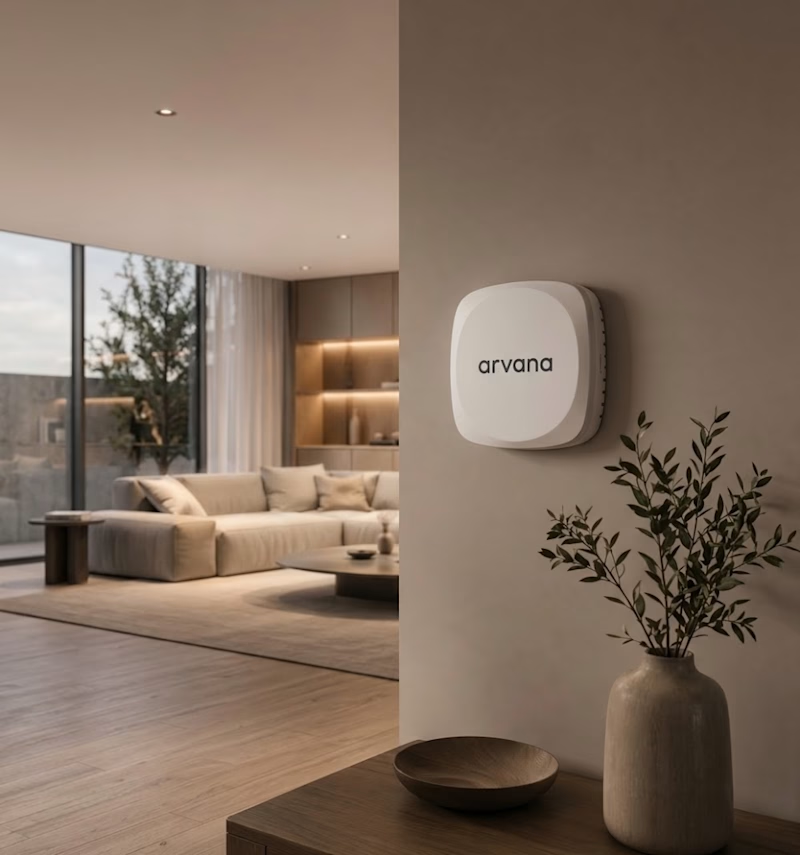
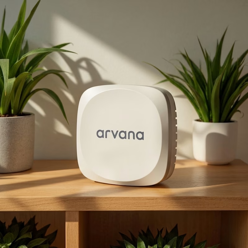
✨ Two renders. One product. Which Arvana visual do you prefer?
Exploring realistic 3D product rendering for Arvana, blending minimal design with warm, natural interiors. 🏡🤍
🏠 Option 1: Lifestyle & Ambient
☀️ Option 2: Clean & Product-Focused
Which one stands out to you? 👀 Cast your vote! 🗳️👇
3 voted
27%
8 voted
73%
11 votes
Closed