The network for creativity
Join 1.25M professional creatives like you
Connect with clients, get discovered, and run your business 100% commission-free
Creatives on Contra have earned over $150M and we are just getting started
Back to feedPost

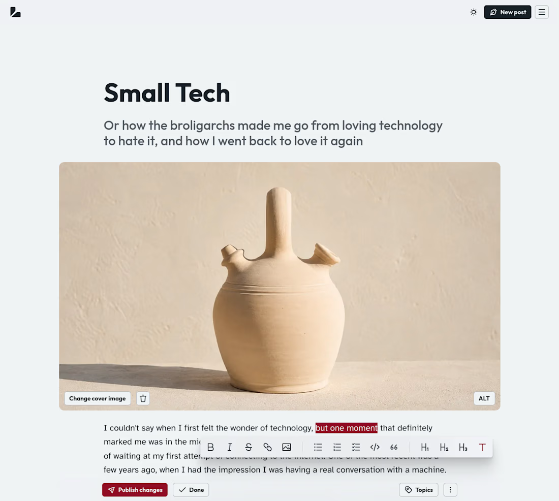
Well, well, well, my blogging and newsletter platform is looking good!
The network for creativity
Join 1.25M professional creatives like you
Connect with clients, get discovered, and run your business 100% commission-free
Creatives on Contra have earned over $150M and we are just getting started



Related posts

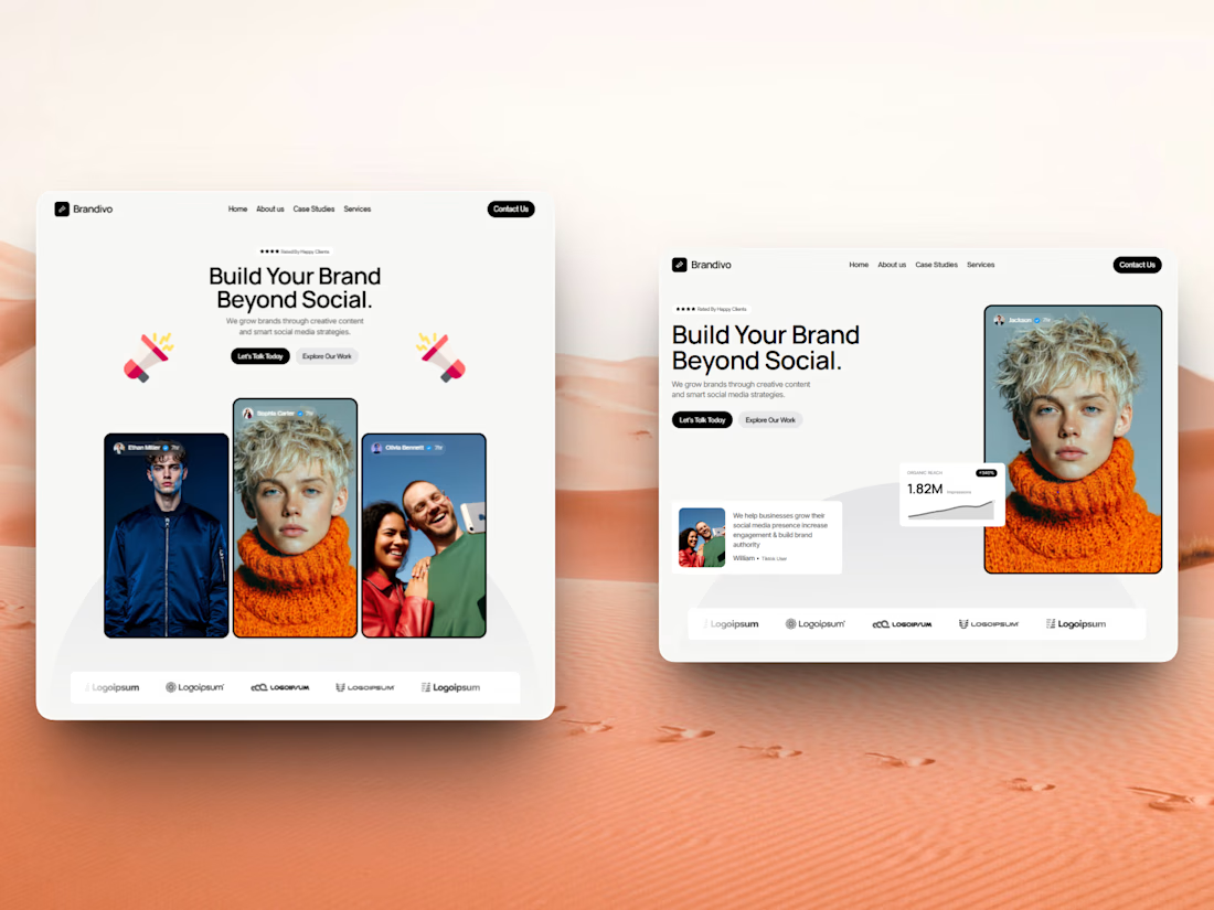

I'd pick the right one. The headline and image split is cleaner and the stats card gives proof right away, the left feels busier with three portraits. Is this template for Webflow?

Just celebrated 2,000 followers on LinkedIn. 🧡
Now I'm building my little corner here on Contra too.
We're only 4 for now, but every big community starts somewhere. 😂
Thank you to everyone already here. We're just getting started.
Let's build! 🚀


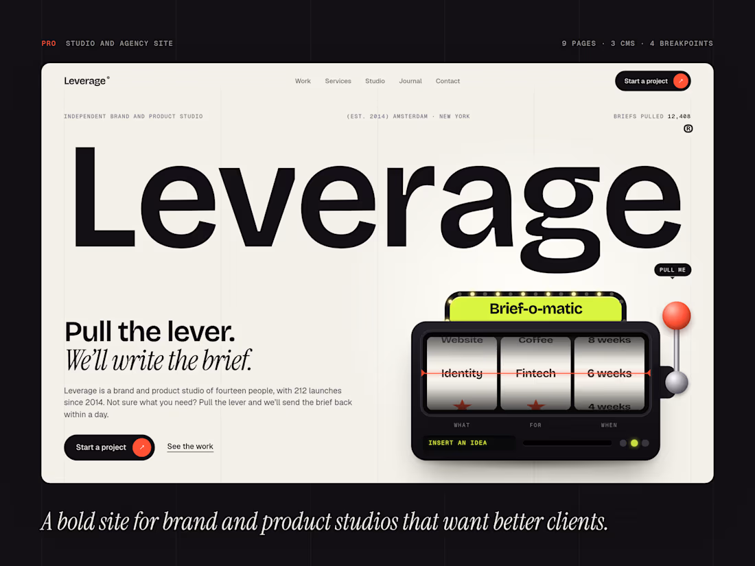
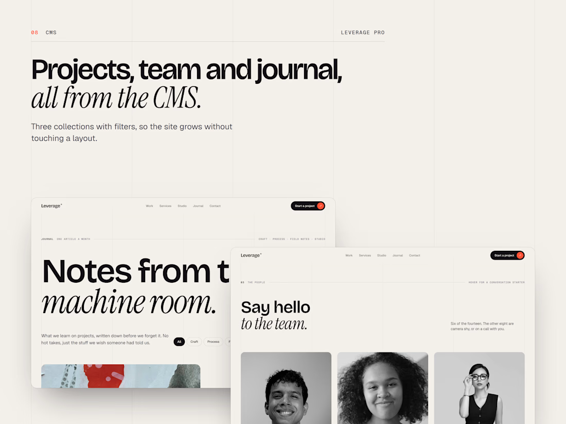
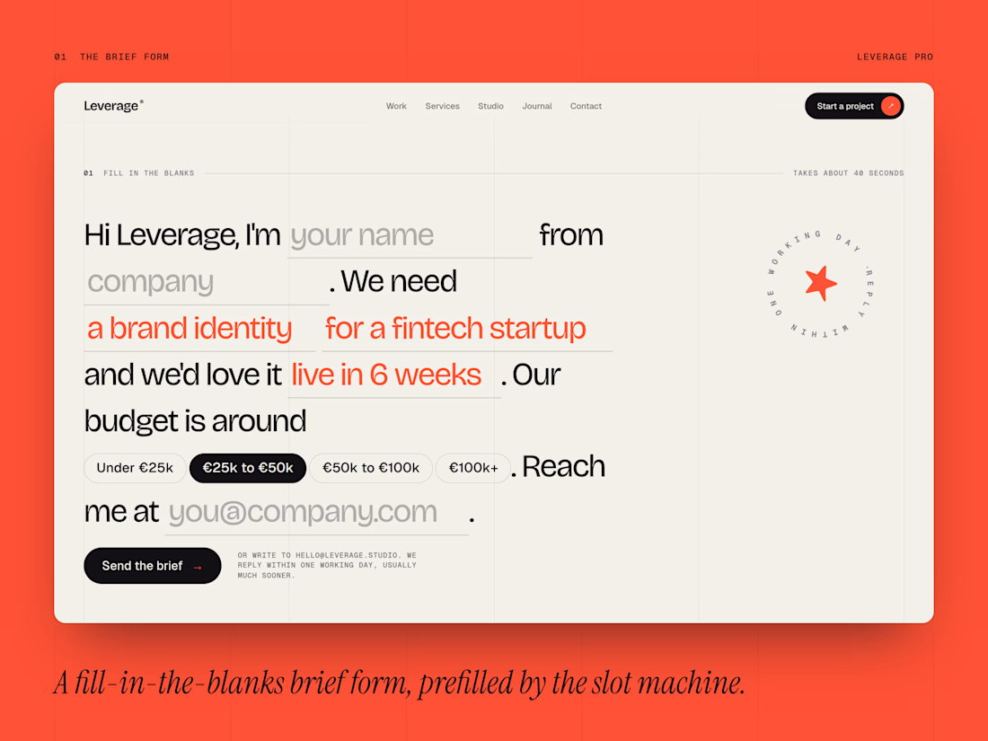
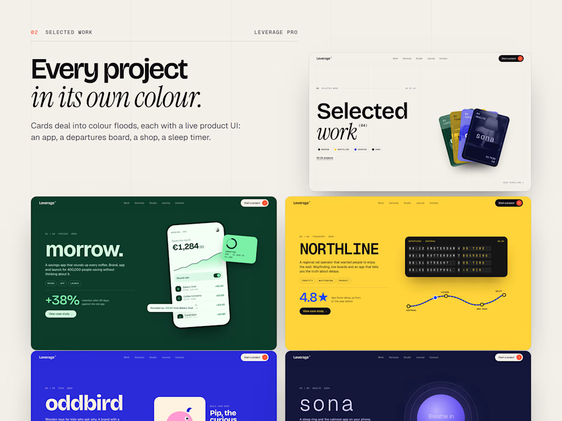
Just launched Leverage: a bold agency template with 9 pages, CMS connected case studies, full responsiveness and 100% SEO. Built to showcase your work.
Let me know what you guys think abou this! ;)
https://leverage-pro.framer.website/