The network for creativity
Join 1.25M professional creatives like you
Connect with clients, get discovered, and run your business 100% commission-free
Creatives on Contra have earned over $150M and we are just getting started
Back to feedPost
From Insights to Action: A Real-Time Look into Passenger Transport Data!
Instead of just showing static visuals, this time I’m walking you through the interactive Power BI dashboard I created for a Department of Transportation.
This tool isn’t just for presentation — it’s designed to help planners, decision-makers, and operators:
✅ Spot declining services before they become problems
✅ Benchmark fleet distribution across counties
✅ Understand how passengers shift between taxis, buses, and minibuses
✅ Identify underperforming companies and prioritize resources accordingly
💡 Every chart is interactive, filterable, and built with clarity in mind — no guesswork, just answers.
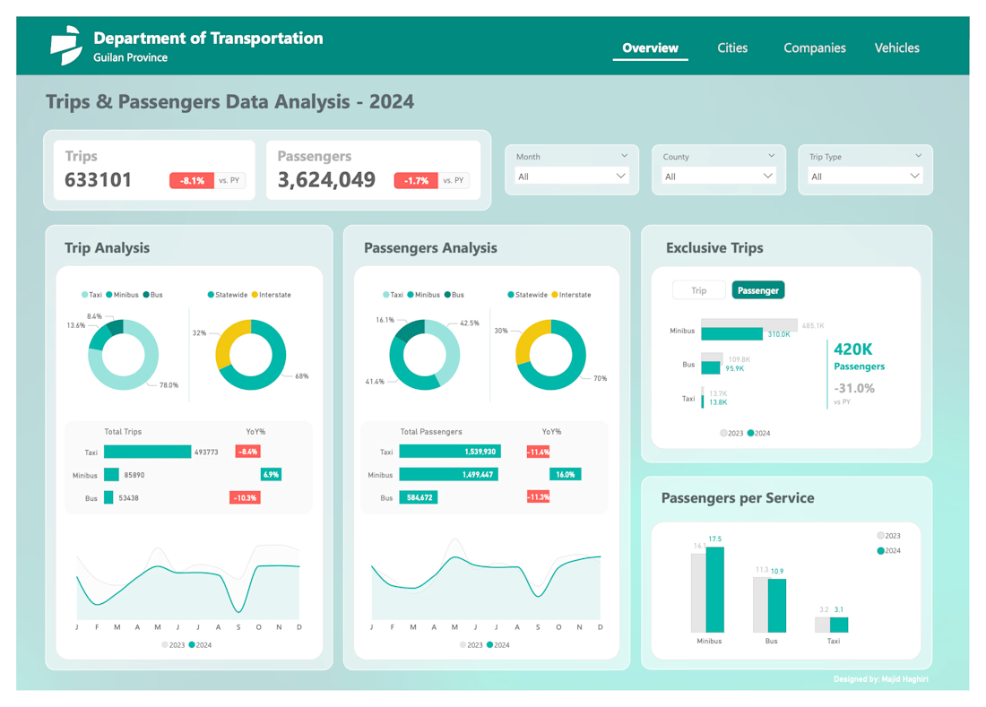
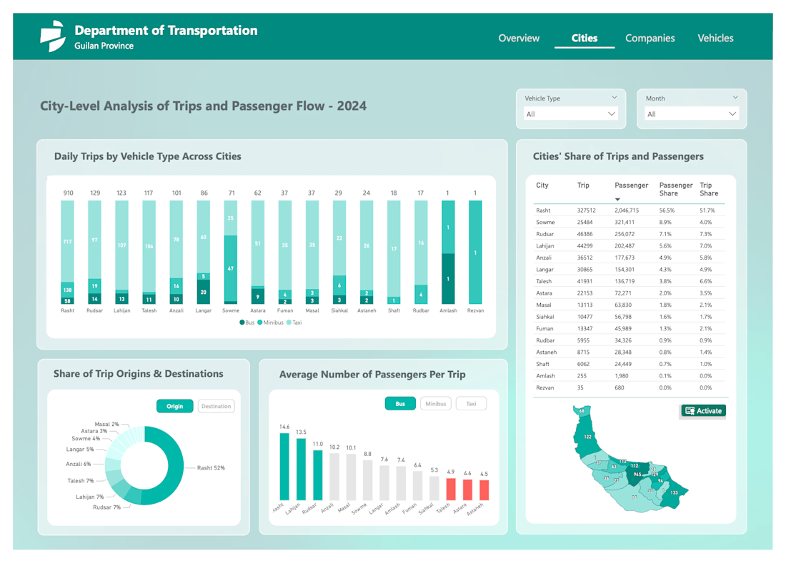
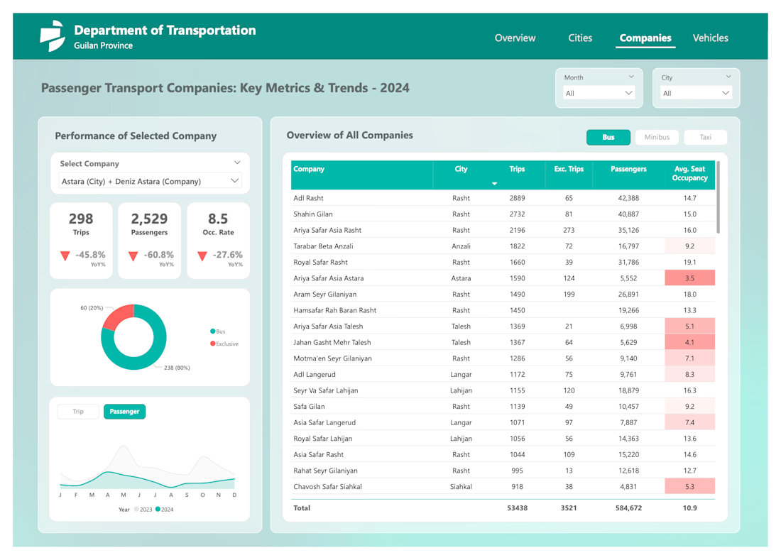
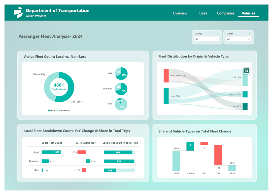

This design system implementation ensures scalability and consistency.

Really appreciate it! Building a system that holds up long-term was the priority, so your feedback means a lot. 🚀

Nice "minty" color palette btw 👍
Thanks so much! I wanted something subtle but modern — happy it came across. 😊
The network for creativity
Join 1.25M professional creatives like you
Connect with clients, get discovered, and run your business 100% commission-free
Creatives on Contra have earned over $150M and we are just getting started






