The network for creativity
Join 1.25M professional creatives like you
Connect with clients, get discovered, and run your business 100% commission-free
Creatives on Contra have earned over $150M and we are just getting started
Back to feedPost
Taste Test
I tend to lean towards simple but sometimes I want a little extra what do you think?
7 voted
58%
5 voted
42%
12 votes
Closed

I prefer the clean version

Thanks for your insight, me too


Brilliant design !
Thank you so much

The clean design looks good but that being said the second section which is the product carousel in the avant version looks better than the clean one.
I appreciate the feedback, always good to get another perspective

clean and simple
Thank you Sir

Mehn...Hard to pick
The network for creativity
Join 1.25M professional creatives like you
Connect with clients, get discovered, and run your business 100% commission-free
Creatives on Contra have earned over $150M and we are just getting started





Related posts

I just released FAR ENOUGH, a free Framer template for luxury travel. 🌴
Minimal on the surface, a lot of motion underneath:
→ an endless drag-to-explore masonry grid
→ a 3D Instagram carousel
→ a scroll-driven curtain gallery
→ an image trail that follows your cursor
→ light and dark mode with one click
10 pages, 4 CMS collections, fully responsive, with a reduced-motion fallback. Every animation is editable in the properties panel, no code needed.
Made for travel studios, villas, retreats and anyone who wants a site that feels far away in the best way.
Free on the Framer Marketplace: https://www.framer.com/marketplace/templates/far-enough/
Live preview: https://farenough.framer.website
#Framer #FramerTemplate #WebDesign #FreeTemplate


Nice website bro

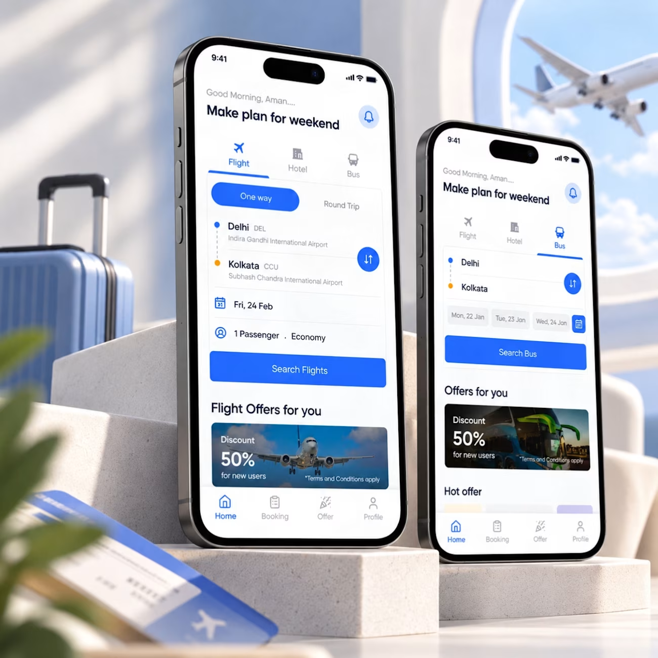
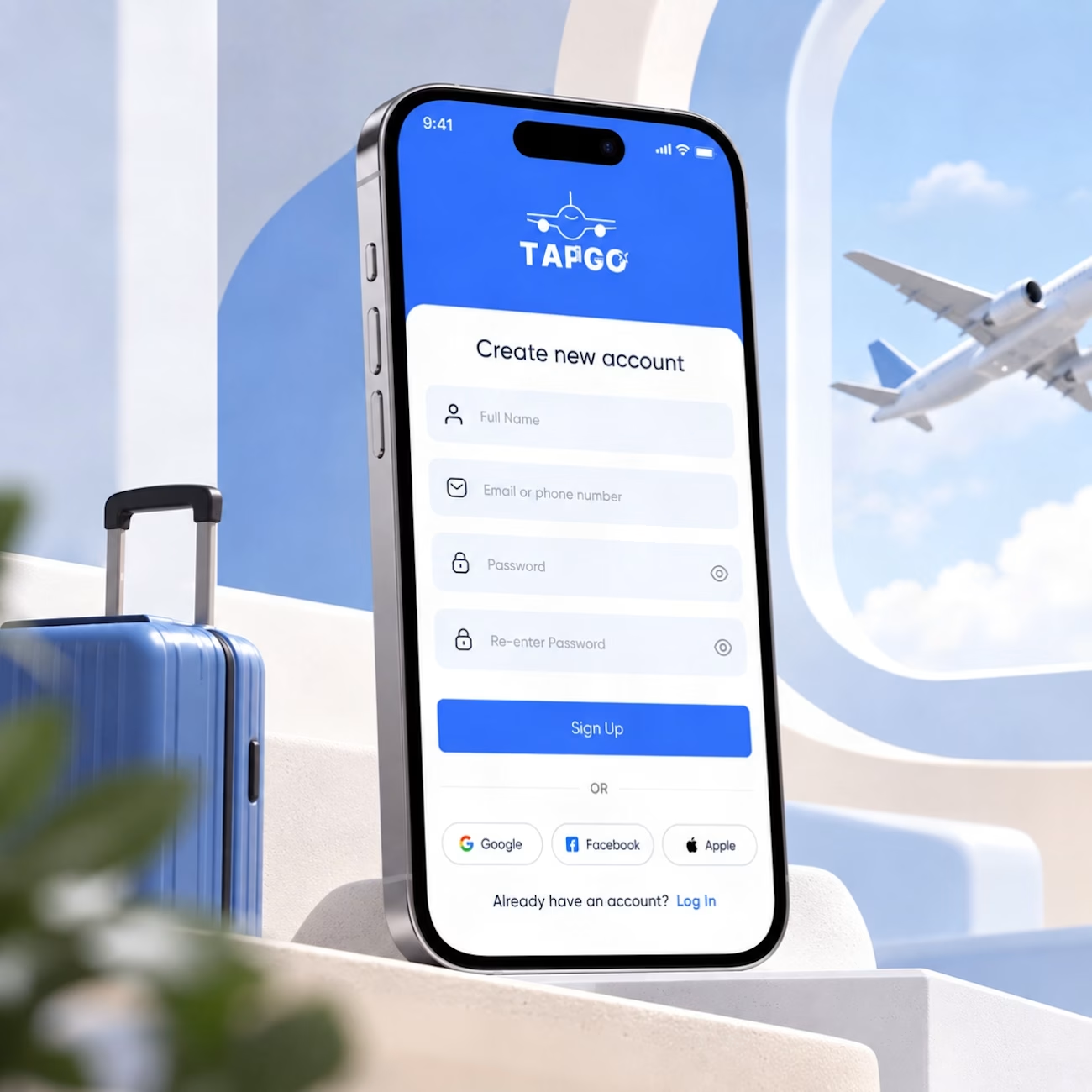
Making travel booking feel simpler. ✈️
A small look at a travel app concept I worked on, covering flight and bus booking experiences.
The focus was simple: keep the booking flow clear, make important information easy to scan, and give users a consistent experience across different travel options.
From route selection and dates to offers and navigation, every element is designed around helping users move through the experience without unnecessary friction.
A few things I focused on:
→ Clear visual hierarchy
→ Simple booking flows
→ Consistent components
→ Easy-to-scan information
→ Familiar mobile interactions
Good UI isn't about adding more. It's about making the important things easier to understand.
#ProductDesign #UIDesign #UXDesign #MobileAppDesign #TravelApp #Figma #InteractionDesign



Excellent work 👏🏻

Vintage Map Ad — Two Creative Directions
I’ve been testing two ways to reveal the product.
In one version, the space builds around it, creating a more magical feel.
In the other, I went for a more restrained approach — pulling back to reveal the setting without any transformation.
Which one would you go for?
4 voted
44%
5 voted
56%
9 votes
Closed

Pull back has it