The network for creativity
Join 1.25M professional creatives like you
Connect with clients, get discovered, and run your business 100% commission-free
Creatives on Contra have earned over $150M and we are just getting started
Back to feedPost

Website:
https://estheticiancontrademo.squarespace.com/?password=demo (password = demo)
I built Aesthetic Lab to solve a problem I keep seeing in the medical aesthetics space: most clinic sites are either cold and surgical, or they go way too soft and generic spa-like. I wanted to see if I could build the sweet spot in between.
My goal was to create a site that feels like flipping through a high-fashion editorial magazine, but still carries the trust and authority of medical-grade estheticians . By pairing high-contrast photography with unexpected pops of colour and subtle animations, it creates a website that visitors actually remember.
For me, Finish Layer was all about giving the site a genuinely live, tactile feel.
- Typography: I uploaded custom heading and script fonts to give key accent sections an artisanal, bespoke feel that matches the overall brand identity.
- Animations: I used animations intentionally. The circular 'flower shape block' rotation on the services section, subtle 'zoom' buttons under signature packages as well as text animations sliding in to the page as the user scrolls all act as a visual anchor that makes the user scroll further and makes the website feel more 'alive'
- Stacks and Layers: I used Stacks to group text in the 'signature packages' section so that on different screens, the text would not change formatting in relation to the outer rectangle shape block. The Layer panel was useful in the mobile section where I hid the rotating shape block as it interrupted the flow and could potentially divert the user's attention.
Key Design Decisions:
- Colour Palette: Deep purple, rich olive, and cream aren't standard choices for a medical site but pairing them with moody / monochrome imagery made it so that the website alternated and is a delight to scroll through.
The colours as well as the contrasting sections acted as a visual bridge transitioning the user from heading sections to more informative sections.
Social Post: https://www.instagram.com/p/DbJcBTDjC5z/?img_index=1
Video Walkthrough of the website: https://www.loom.com/share/bc5917b45e3945d985db7e4f4e61f0c9
Squarespace Circle Member: ✅
The network for creativity
Join 1.25M professional creatives like you
Connect with clients, get discovered, and run your business 100% commission-free
Creatives on Contra have earned over $150M and we are just getting started









Related posts

Squarespace Website Design, Development & Redesign
Looking for a professional Squarespace website that reflects your brand, communicates your services clearly, and makes it easier for visitors to take action?
I specialize in Squarespace website design, development, and redesign, helping businesses establish a strong online presence through visually appealing, user-friendly, and responsive websites.
From building a new website to improving an existing one, I focus on clean layouts, intuitive navigation, mobile responsiveness, and clear calls to action that guide visitors toward the next step.
Services I Offer:
Squarespace 7.1 Website Design & Development
Squarespace Website Redesign and Customization
Responsive and Mobile-Friendly Design
Landing Page Design
Service Pages and Contact Form Integration
Website Navigation and User Experience Optimization
Custom Styling and Squarespace Fluid Engine Layouts
Basic On-Page SEO Structure
Whether you are a consultant, coach, entrepreneur, or service-based business, I can help create a Squarespace website that aligns with your brand identity and business goals.
Let's build a website that presents your business professionally and gives your audience a clear reason to take the next step.



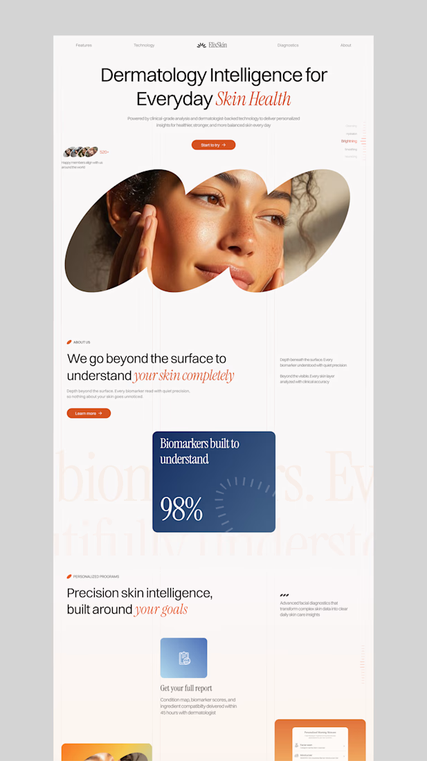
ElixSkin - Dermatology Intelligence Website
A dermatology website designed to make skincare feel smarter and more personal, with clean visuals, earthy tones, and science-backed care.
Want to create something like this?
Let's Talk!




Website design for Atelier Monolit, an architecture visualization studio.
In this design, the typography, the spacing, and the images are the main protagonists. In times of AI and speed, I believe it’s very important to take the time to think and create what we truly want, and not just what’s trending. In my case, I wanted a minimalist and editorial layout, and that’s not something easy to achieve with just a couple of prompts.


The pale blue canvas, tiny nav and generous empty space let the concrete render carry the page. Very calm, very architectural, and the small body copy sits tidy beside it.