The network for creativity
Join 1.25M professional creatives like you
Connect with clients, get discovered, and run your business 100% commission-free
Creatives on Contra have earned over $150M and we are just getting started
Back to feedPost
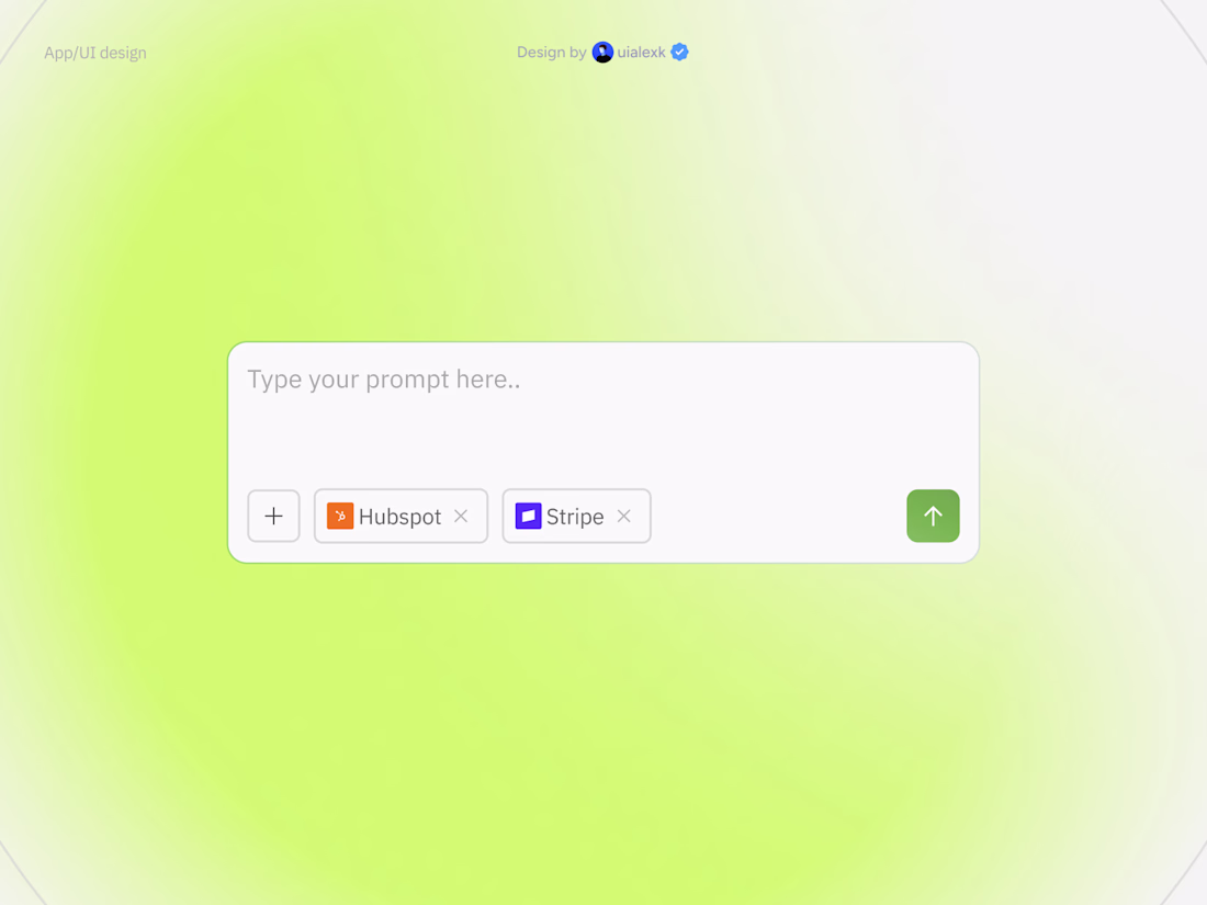
Taste Test
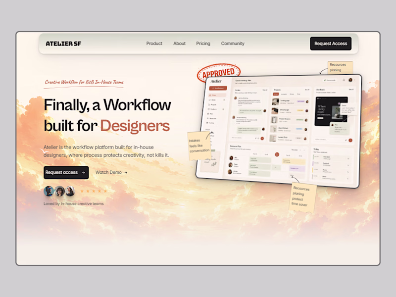
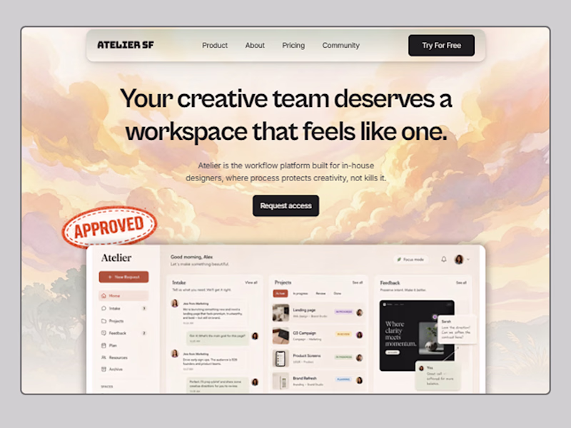
Designed a hero section for a landing page concept: Atelier SR DesignOps & Creative Workflow platform for B2B in-house teams.
The challenge: make operational software feel handcrafted and human. I built two directions around a "Paper & Pasteboard" design system, editorial typography, tactile textures, collage UI elements, and a dashboard that actually shows the product.
Which direction do you prefer? 👇
6 votes
Ends in 3h
Right now, the left design definitely feels like the cleaner. That said, the layout on the right has a ton of potential if you also correct the button padding and increase the top padding of the hero section so the content isn't hugging the header so tightly. What do you think?
I
The first version is the best
The network for creativity
Join 1.25M professional creatives like you
Connect with clients, get discovered, and run your business 100% commission-free
Creatives on Contra have earned over $150M and we are just getting started
Related posts
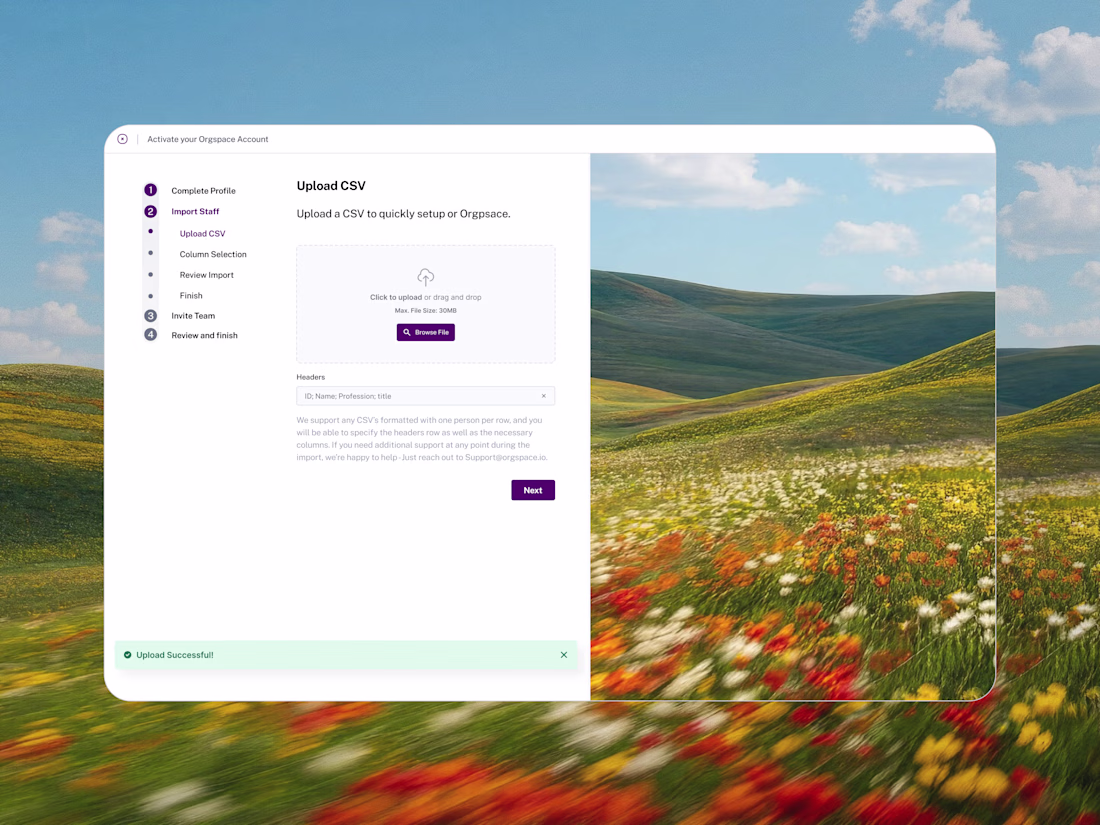
I shared a new case study for the work I did with Orgspace
Amazing!
Two layout directions for the same hero. Which do you prefer?
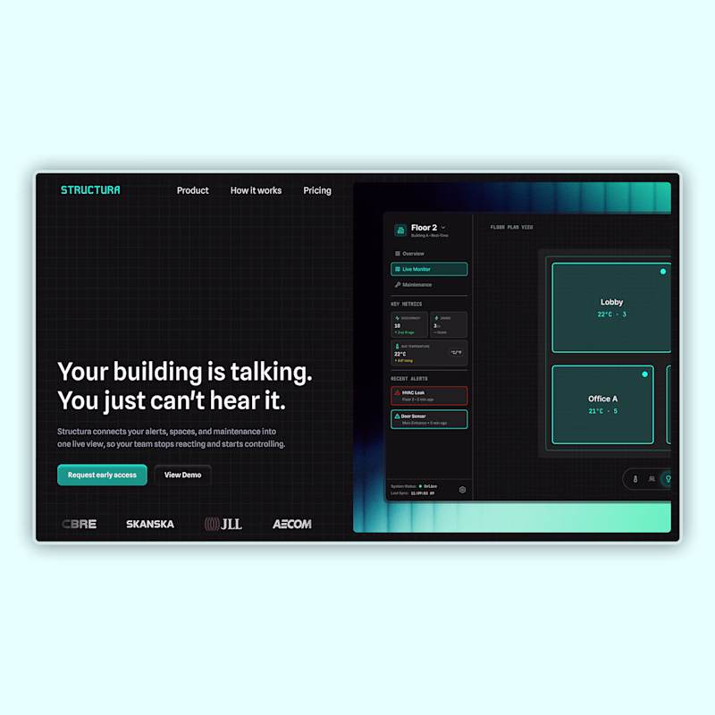
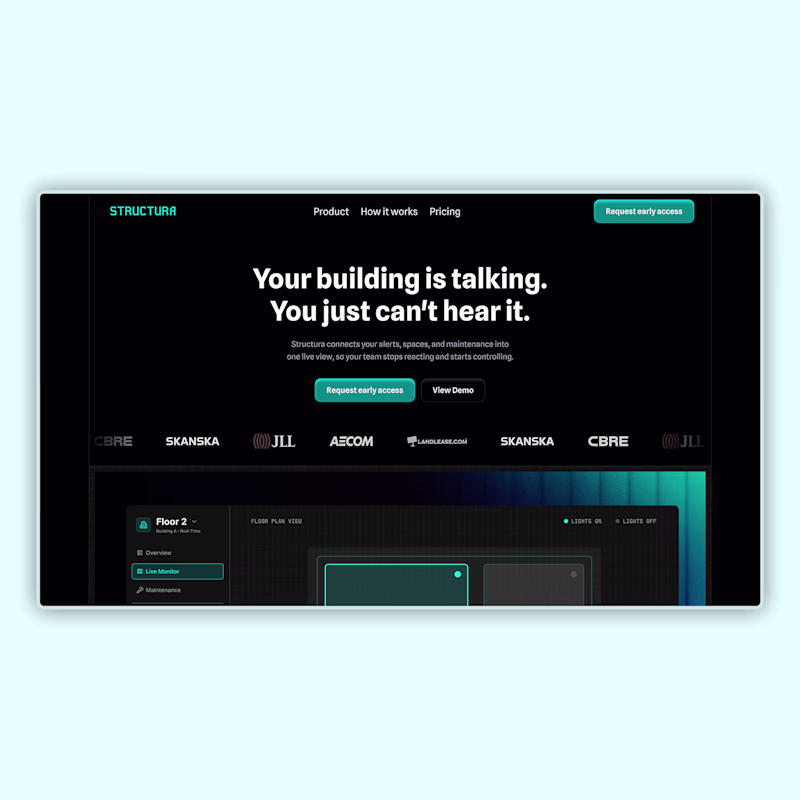
A building management SaaS dashboard. Dark, product-forward, built entirely in Framer.
1 voted
14%
6 voted
86%
7 votes
Closed
Excellent design !
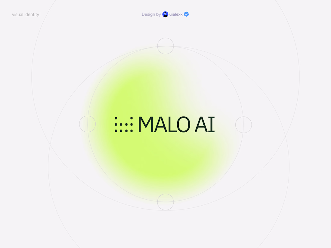
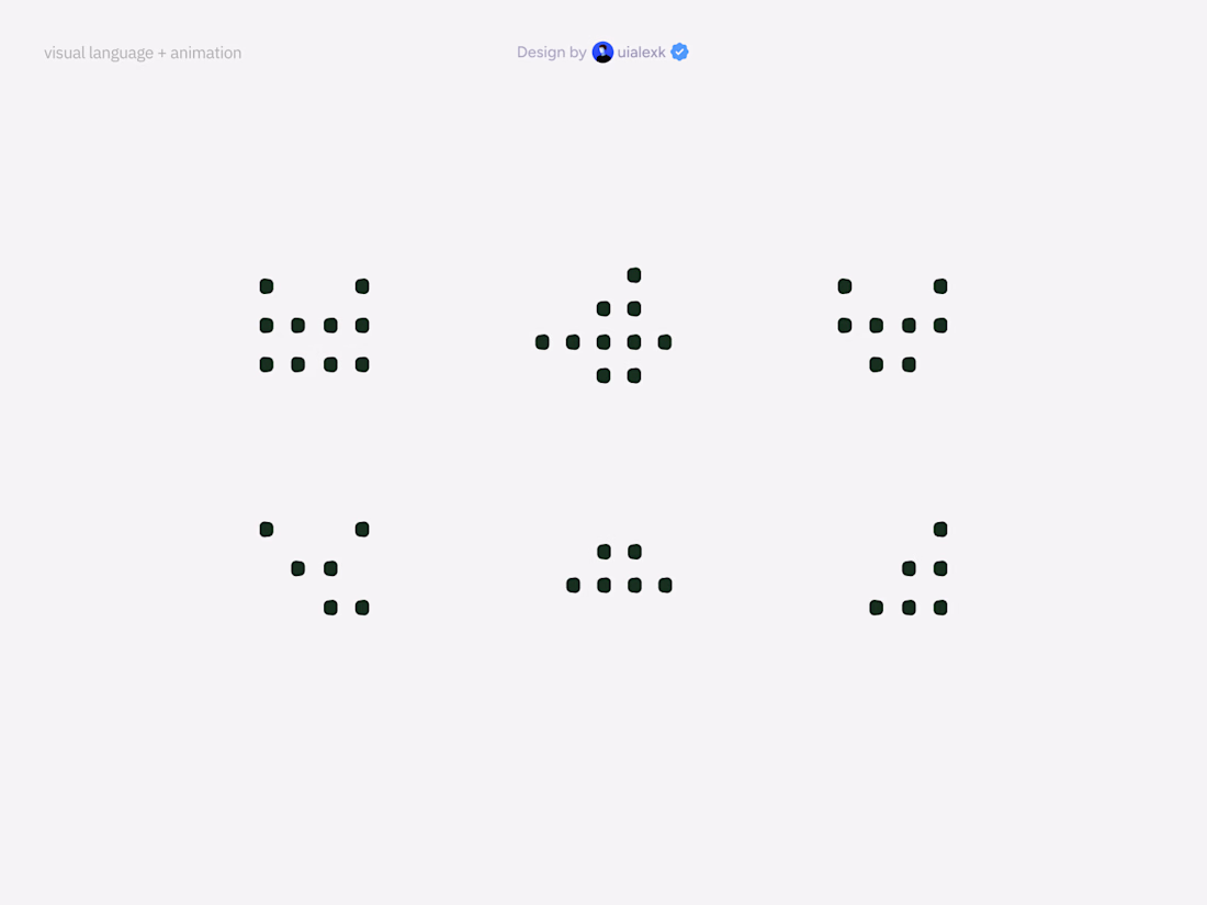
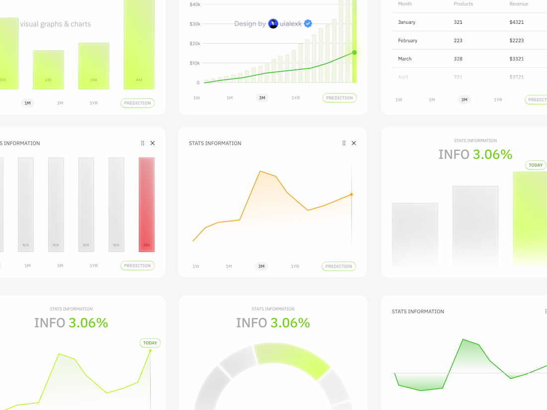
Recent visual design, motion, illustration, UI design exploration for an AI tool
Amazing!
Trending
Claude
Claude has entered the design space. How are you using Claude Design?
Contra University
Learn from expert creatives how to earn more using next-gen AI tools.
MagicPath
The canvas is infinite, and exploration is becoming the workflow. How are you using MagicPath?
creativeaiflow
Creative AI workflows are evolving. What tools do you use, and what are their strengths and weaknesses?
freelancerlife
Freelancer life is wins, pivots, and everything in between. What’s yours right now?