The network for creativity
Join 1.25M professional creatives like you
Connect with clients, get discovered, and run your business 100% commission-free
Creatives on Contra have earned over $150M and we are just getting started
Back to feedPost


Kimia came out of stealth earlier this month.
For this brand, we had to find a visual language for Chemical Intelligence - a category that doesn't really exist yet. No visual references. No precedent. Just the science, the founders, and a lot of iterations until it clicked.
Brand. Website. Animations. Design system. All built from scratch.
Super proud of where we landed.
Check it out here: https://kimia.ai/


Looks cool!
Thank you! A month in the making

Love this!
The network for creativity
Join 1.25M professional creatives like you
Connect with clients, get discovered, and run your business 100% commission-free
Creatives on Contra have earned over $150M and we are just getting started
Related posts

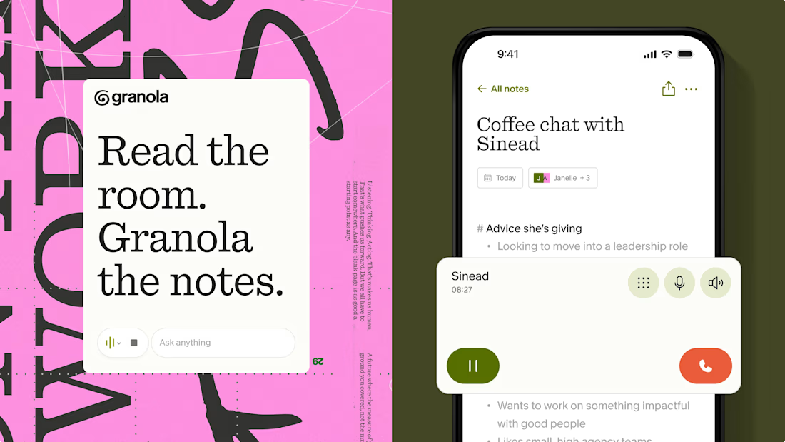
Not every AI company needs to look like an AI company.
One of my favourite recent examples is Granola's identity by Ragged Edge.
Instead of gradients, glowing orbs, and futuristic interfaces, they went with an imperfect hand-drawn logo, earthy colours, and a custom typeface based on the founder's actual handwriting.
And somehow, that makes the product feel much more approachable.
I think this is a good reminder that branding isn't about visually fitting into your industry. Sometimes the strongest decision is to look completely different from everyone else in it.
Especially in AI, where so many products are starting to look interchangeable.

AI for the masses, craft for the rich. What do you think about this? 👀
When anyone can generate “perfect” in seconds, the human touch becomes the distinctive thing.
Is AI becoming the look of mass market, while craft becomes the new luxury? 🤔


We *assembled* a brand identity for Project Assembly ;)


So cool!


