The network for creativity
Join 1.25M professional creatives like you
Connect with clients, get discovered, and run your business 100% commission-free
Creatives on Contra have earned over $150M and we are just getting started
Back to feedPost
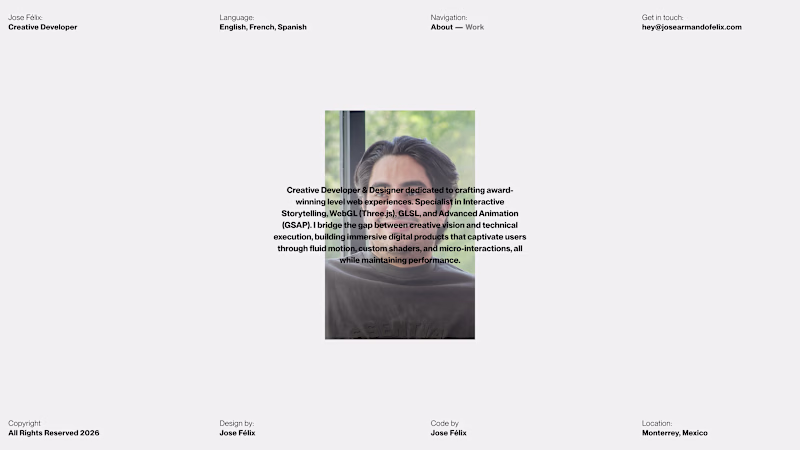
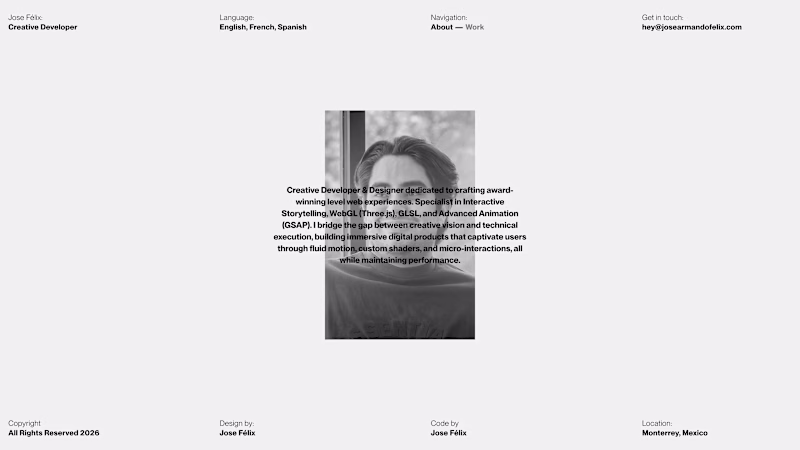
Taste Test
Hey there 👋
Explorations for my new portfolio about section. Which do you think is best?
1 voted
14%
6 voted
86%
7 votes
Closed
Both are great, but the photo needs to have a bit more of a contrast with the text. I think you can get away with it more on black & white photos! 🔥
You're right! Thanks for the feedback
nice! I'd recommend moving the text off the face and adding contrast there.
This looks nice although, keeping text above photo makes it little distracting and difficult to read.. May be you would like to explore little contrast or different layout.
The network for creativity
Join 1.25M professional creatives like you
Connect with clients, get discovered, and run your business 100% commission-free
Creatives on Contra have earned over $150M and we are just getting started
Trending
Claude
Claude has entered the design space. How are you using Claude Design?
Contra University
Learn from expert creatives how to earn more using next-gen AI tools.
creativeaiflow
Creative AI workflows are evolving. What tools do you use, and what are their strengths and weaknesses?
freelancerlife
Freelancer life is wins, pivots, and everything in between. What’s yours right now?