The network for creativity
Join 1.25M professional creatives like you
Connect with clients, get discovered, and run your business 100% commission-free
Creatives on Contra have earned over $150M and we are just getting started
Back to feedPost

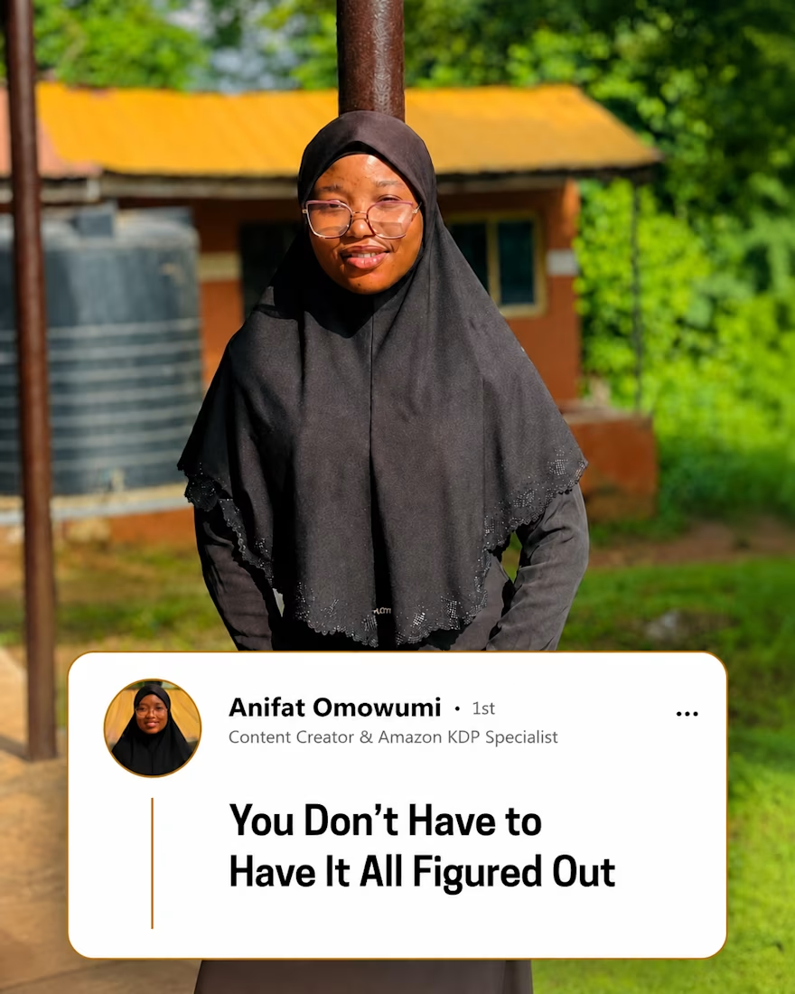
You don't need to have everything figured out before you begin.
Sometimes, clarity comes after you take the first step.
You learn by trying.
You improve by making mistakes.
You discover what works by doing.
Waiting until you feel completely ready can keep you stuck for a long time.
Start with what you know.
Take the next step.
Then learn from the experience.
You don't need to see the whole path.
Sometimes, you just need enough courage to take the next step.
What is something you've been waiting to feel “ready” for?

The network for creativity
Join 1.25M professional creatives like you
Connect with clients, get discovered, and run your business 100% commission-free
Creatives on Contra have earned over $150M and we are just getting started

Challenges
View all


Related posts


Sometimes the best ideas come from thinking clearer not necessarily harder.
When I made this concept, I was trying explore the visual distance between the noise and the work.
From my experience, a lot of times it's better to have clarity and space to breathe rather than overwhelm the users with information, which is what a lot of founders are trying to do.
That's how I came up with: Find the gap. Close the distance.


You spend 6 figures on a brand tracking agency. They spend three months "running the wave." You get a 100-page slide deck that tells you what happened in Q2 while you’re already halfway through Q3.
That’s a post-mortem, not a strategy.
We built the identity and product framing for Timelaps to represent the opposite: continuous visibility.
Research-grade data from 4,000+ consumers, flowing in real-time. No "waves", no dusty decks, just an always on dashboard that shows you if your marketing is actually landing before the budget is gone.
If you’re still waiting 90 days to see if your brand is growing, you’re flying blind.


I have to say, You leave an ipression everytime you appear in my feed. You have got great taste Daniel💪

I spent about 24 hours from yesterday to today developing the branding for Trellis, a fictional AI gateway for B2B SaaS teams.
I started by sketching out the logo shapes I had in my head and honestly, the first few were pretty bad. But after a while I had a rough idea that actually felt worth pushing, so I moved into Figma. Hallelujah.
From there, I started testing the colours I had in mind, playing with the proportions, and checking how the logo worked at different scales. That was probably the point where I started thinking, okay... this might actually work.
Once the base felt right, I started properly detailing and texturing everything. I went through a lot of iterations, and at one point I had to go back to the brief because I felt like something was still missing. Funny enough, that gave me the last bit of direction I needed.
I finished by trying the identity across a few designs and mockups until I was finally convinced by the direction.
Really enjoyed working through this one. Website is next, and I honestly can’t wait to see how the brand starts stretching into a full experience.


The jump from rough logo sketches to that tight blue/black system is great—Trellis feels cohesive without losing energy. The repeated glow treatment ties the launch visuals together nicely.