The network for creativity
Join 1.25M professional creatives like you
Connect with clients, get discovered, and run your business 100% commission-free
Creatives on Contra have earned over $150M and we are just getting started
Back to feedPost

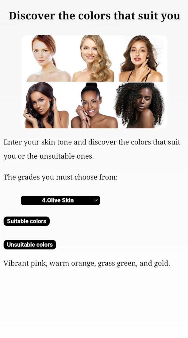
An interactive web application designed to help users identify their skin tone category accurately and choose matching color palettes.😊


The network for creativity
Join 1.25M professional creatives like you
Connect with clients, get discovered, and run your business 100% commission-free
Creatives on Contra have earned over $150M and we are just getting started

Challenges
View all


Related posts


Which 404 page design for a world-class film production studio would you choose - Pink or Black? ✨👠
404pagecreativedesignfashionwebsiteCreative Design Frontend DevelopmentWeb DesignFigmaJavaScriptWebflow


31 voted
40%
46 voted
60%
77 votes
Closed

Black version looks more editorial, tho the pink one is rly eye-catching

A little interactive experiment for Verdant 🌱
Writing unique code for animations makes iterating on reactive micro-interactions so much smoother. It completely transforms how a brand narrative feels in the browser.


Great job

Which AKARI Design Looks Better? 🍣
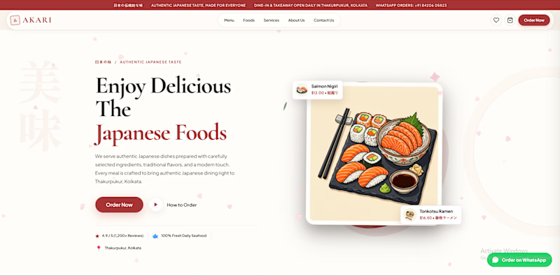
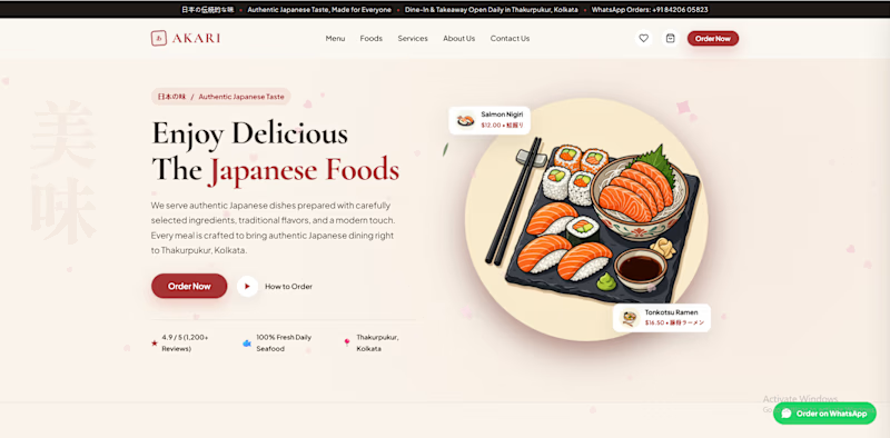
I’ve been working on AKARI (あかり) — a Japanese food restaurant website that I’m building both as a real-shop-ready concept and as a showcase of my web design & development work.
I’ve made two different versions of the design, and I want the Contra community to decide which direction looks better.
🅰️ Option A
Design 1 — More bold, structured and brand-focused.
🅱️ Option B
Design 2 — More minimal, clean and modern.
🅲️ Option C
Neither? 😅
Tell me what you would change, add, or completely redesign. I’m open to ideas!
👇 Vote A, B, or C in the comments.
Which one would you choose for a Japanese restaurant?
🍣 AKARI — あかり
Authentic Japanese Taste, Made for Everyone.
6 voted
46%
7 voted
54%
13 votes
Closed

I’d lean toward Design A—the bolder structure gives the restaurant a clearer point of view, while the centered dish still keeps the page inviting. The restrained palette and generous whitespace make the food do the talking.