The network for creativity
Join 1.25M professional creatives like you
Connect with clients, get discovered, and run your business 100% commission-free
Creatives on Contra have earned over $150M and we are just getting started
Back to feedPost

From Cluttered to Clear — Attorney Football Supporter Flyer Redesign
Client: “We have all the information we need, but the flyer doesn't communicate it clearly enough.”
My response:
“I’ll restructure the visual hierarchy, simplify the layout, strengthen the typography, and make the attorneys and contact information easier to recognize—while keeping the football-supporter identity.”
Result:
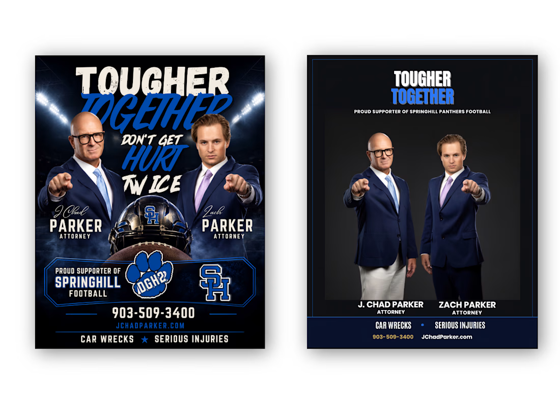
A cleaner Before → After transformation with stronger hierarchy, improved readability, better visual balance, and a more professional attorney-focused presentation.
Client Problem
The original flyer had strong content, but the overall design felt visually crowded and overly promotional. Too many elements competed for attention, making it difficult to immediately understand the attorneys, their names, services, contact information, and football sponsorship message.
BEFORE — Client's Problem:
The original concept contained all the necessary information, but the visual hierarchy was weak. Multiple headlines, images, football graphics, logos, and contact details competed for attention.
AFTER — My Solution:
I transformed the layout into a more structured and professional composition with a clear hierarchy, stronger typography, improved spacing, focused imagery, and easier-to-find contact information.
Final Result
The goal wasn't simply to make the flyer look different. The goal was to make the information easier to understand, strengthen the professional presentation, and preserve the client's football-supporter identity.
I redesigned this attorney promotional flyer by solving a common communication problem: too much information competing for attention.
The original design had strong imagery and messaging, but the hierarchy was crowded. I reorganized the content, strengthened typography, improved spacing, created a clearer information structure, and balanced the football-supporter theme with a professional legal identity.
The result: a cleaner, more focused flyer that communicates the message faster while keeping the original brand personality.
Tools: Adobe Photoshop, Adobe Illustrator
Service: Flyer Design • Graphic Design • Print Design • Layout Design • Advertising Design
Focus: Visual Hierarchy • Typography • Information Architecture • Branding • Readability
Hashtags
#GraphicDesign #FlyerDesign #FlyerRedesign #BeforeAndAfter #DesignCaseStudy #AdobeIllustrator #AdobePhotoshop #PrintDesign #AdvertisingDesign #Typography #VisualHierarchy #Branding #CreativeDesigner #AttorneyMarketing #ProfessionalDesign


The network for creativity
Join 1.25M professional creatives like you
Connect with clients, get discovered, and run your business 100% commission-free
Creatives on Contra have earned over $150M and we are just getting started











Related posts

Second Serve Club — Exploring Visual Identity Through AI & Design.
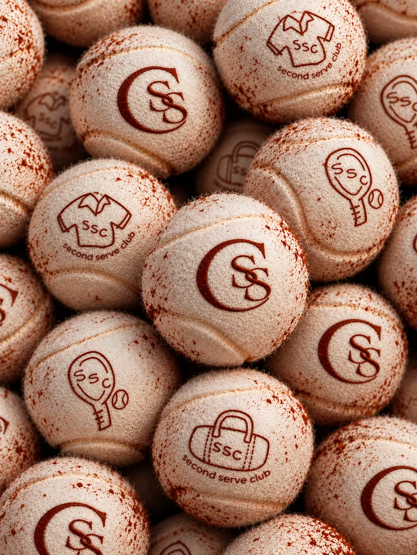
For this branding challenge, I created a series of original logo marks in Adobe Illustrator, inspired by vintage tennis culture.
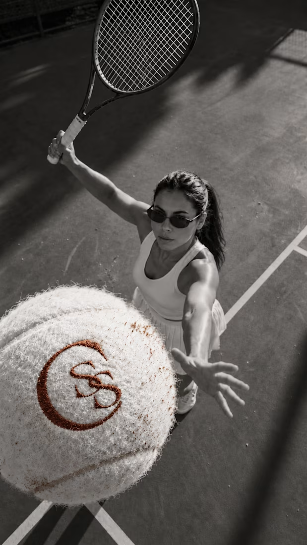
I then explored how these designs could come to life by combining my own typography, monograms and colour identity with AI-generated visuals using ChatGPT.
From the texture of a clay court to embroidered details on tennis balls, the goal was to bring the brand identity into a more tangible, realistic setting.
An exploration of how traditional graphic design and AI can work together to create a cohesive visual world.
Designed by me. Visualised with AI. 🎾
Full brand identity case study coming soon.
#BrandIdentity #VisualIdentity #GraphicDesign #AIDesign #ChatGPT
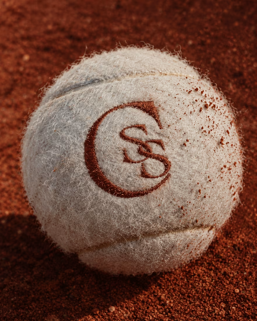

The SS mark stamped into the tennis ball felt is a great detail. Looks very real on the clay court.

i've been making my business card today, which version do you prefer? what do you think about it?
2 voted
18%
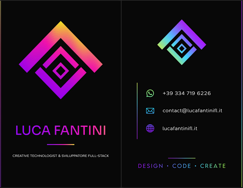
9 voted
82%
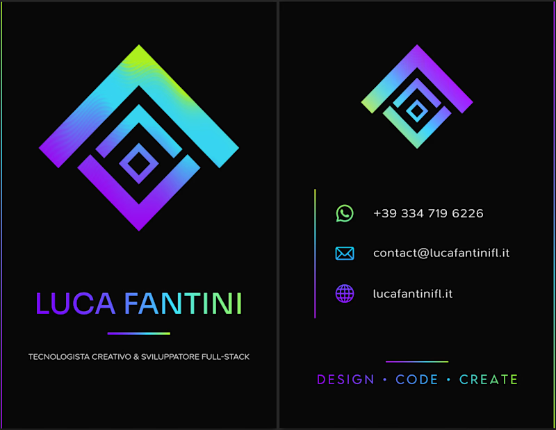
11 votes
Closed

I'd lean toward the single palette. The cooler gradient keeps the contact icons readable, while the magenta in the second one starts competing with the logo mark. Worth proofing the neon on paper too, since it can shift a lot in CMYK.

Finally a Contra Top Independent!
Been part of this community for a few years now, sharing my work, joining challenges, meeting some great people, and even picking up a few wins along the way.
I've genuinely enjoyed being part of Contra and seeing how much the platform has grown.
This one means a lot. Big thanks to the Contra team for the recognition!
More to come!
