The network for creativity
Join 1.25M professional creatives like you
Connect with clients, get discovered, and run your business 100% commission-free
Creatives on Contra have earned over $150M and we are just getting started
Back to feedPost

I get a lot of messages from founders, consultants, and agency owners asking if I can review their pitch deck, presentation, or LinkedIn outreach and tell them what needs improvement.
So I decided to open a few free 15-minute audit slots every week.
In this call, I can go through your current slides or outreach, point out what may be hurting your credibility, and suggest how to make your message clearer and more convincing when speaking with investors, clients, or partners.
This is useful if you are working on:
Pitch decks
Company profiles
Sales presentations
LinkedIn outreach/lead generation
You can book a free slot below: https://calendly.com/syedzeeshannrahber/15min
I will keep the slots limited each week.
#pitchdeck #presentations #founders #linkedinoutreach #startups #b2bmarketing #leadgeneration

The network for creativity
Join 1.25M professional creatives like you
Connect with clients, get discovered, and run your business 100% commission-free
Creatives on Contra have earned over $150M and we are just getting started





Related posts

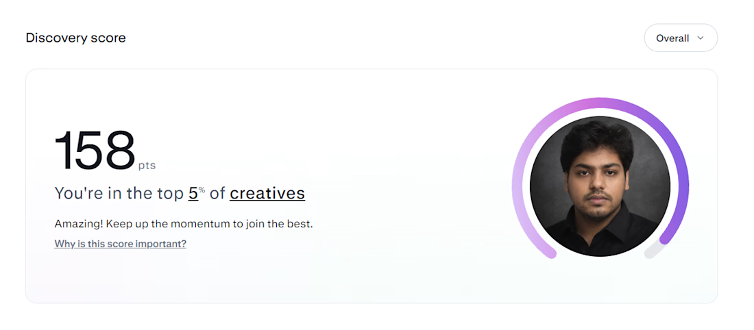
Two months later: 141 → 158. Still top 5%.
Last time I posted, my Contra Discovery Score was 141.
Today it’s 158, and I’m still in the top 5% of creatives.
A few things changed since then.
I became a Lummi Expert, which gave me an expert badge, featured placement, and more visibility inside Contra.
I also stopped treating my portfolio like a gallery and started treating it more like proof.
Recently I added a full Aegir Aqua case study series:
Brand identity, packaging & 3D
Presentation design
Website design & development
Same client, but split into separate case studies so each type of work is easier for clients to understand.
That has probably been the biggest portfolio improvement for me lately.
I’m also still sending proposals consistently.
That part hasn’t changed.
My last post was basically saying: if your profile is already strong, the problem is often not the profile it’s volume.
I still believe that.
But now I’d add one thing:
Volume gets you seen. Proof gets you taken seriously.
A strong proposal gets the click.
A strong case study gives the client a reason to stay.
And having both working together is where things start compounding.
So the progress since August:
141 → 158 Discovery Score
Still top 5%
Lummi Expert badge
More complete case studies
Better positioning across brand, packaging, 3D and web
Still refining. Still applying. Still learning what actually moves the needle.
If anyone is working on their Contra profile, case studies, or proposals, happy to share what’s been working for me.



Hey Asad congratulations on your growth. 😍 I am new to contra and I am still learning and your post was very informative for me. Could you plese guide me more on how I can grow here?


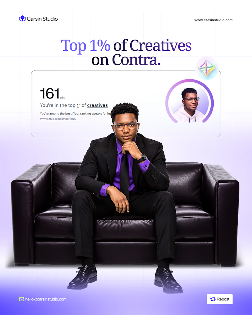
After making my first $1K on @contra, I just hit the top 1% of creatives.
Want a higher visibility score?
• Complete your profile
• Add 3+ strong projects
• Add 2+ services
• Get client recommendations
• Stay active and responsive
• Keep your work fresh
Don’t just create a profile and wait for clients.
Build it. Stay active. Get seen.

Well deserved! Reaching the top 1% on Contra takes real effort. These tips are super helpful for anyone looking to grow. Congratulations and keep crushing it!

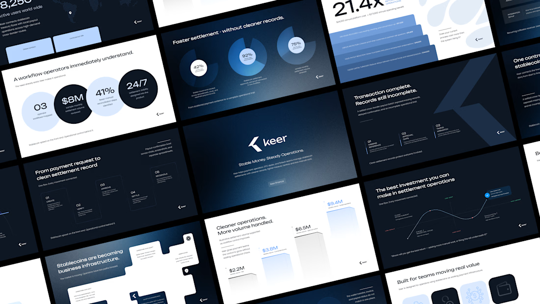
Minimalism isn't a style choice. It's a discipline.
Anyone can strip a slide down to one line and call it clean. The harder part is knowing what to keep, and why every element that stays has a reason to be there.
This deck runs on that principle. Dark base because contrast is the fastest way to direct attention. One accent color because more than one is a decision you haven't made yet. Grid-locked layouts because when the structure holds, the content doesn't have to fight for space.
I design across industries. Tech, finance, healthcare, consumer brands. But there's something about high-stakes products, the ones where a single presentation can move serious money, that pushes the design thinking further.
This is one of those.
I didn't design this to look like a fintech deck. I designed it to look like a decision has already been made, and the slides are just showing you why.
Does the vibe land for you?
Full case study Keer





minimalism is a discipline,, 100% agree