The network for creativity
Join 1.25M professional creatives like you
Connect with clients, get discovered, and run your business 100% commission-free
Creatives on Contra have earned over $150M and we are just getting started
Back to feedPost

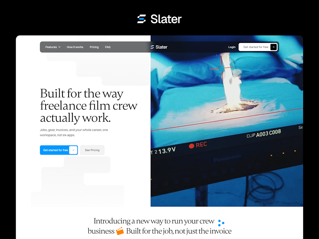
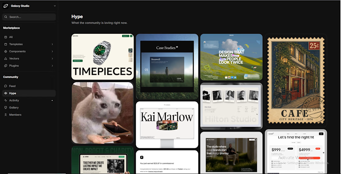
#1 hype on @framer marketplace Happy to see People are loving my content Thanks Everyone

The network for creativity
Join 1.25M professional creatives like you
Connect with clients, get discovered, and run your business 100% commission-free
Creatives on Contra have earned over $150M and we are just getting started





Related posts


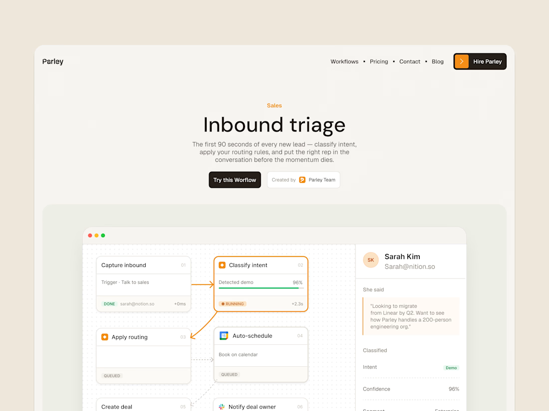
parley’s inbound triage page, with the workflow laid out below the introduction.
get it free now → https://framer.link/s1Llkdh

Nice work!


hey!
we just published the new site for Nossara
handcrafted towels from imabari, japan
Shopify x Framer, powered by Framer Commerce


like the top-notch execution


This is fire 🔥