The network for creativity
Join 1.25M professional creatives like you
Connect with clients, get discovered, and run your business 100% commission-free
Creatives on Contra have earned over $150M and we are just getting started
Back to feedPost


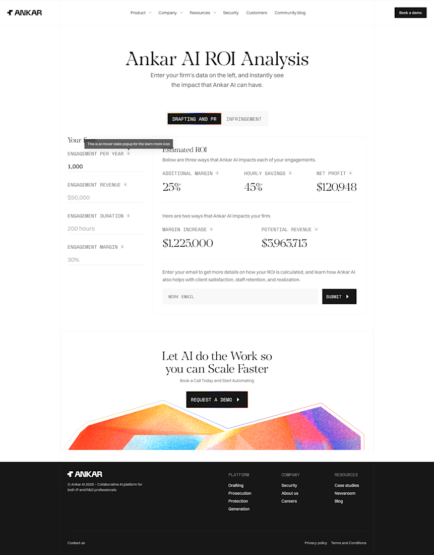

sleek work


nice calculator layout

Great work🔥


Clean work. The ROI story comes through really clearly.

looks cool!
The network for creativity
Join 1.25M professional creatives like you
Connect with clients, get discovered, and run your business 100% commission-free
Creatives on Contra have earned over $150M and we are just getting started





Related posts

Which one's more cooked for LayerDock's Chrome Store screenshot? 👀
3 voted
15%
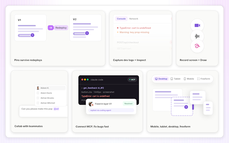
17 voted
85%
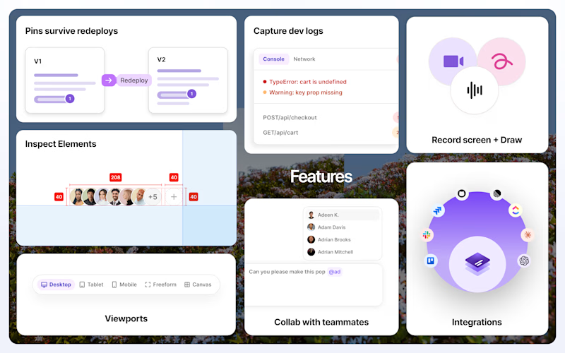
20 votes
Closed

2 'pops' in the best way.

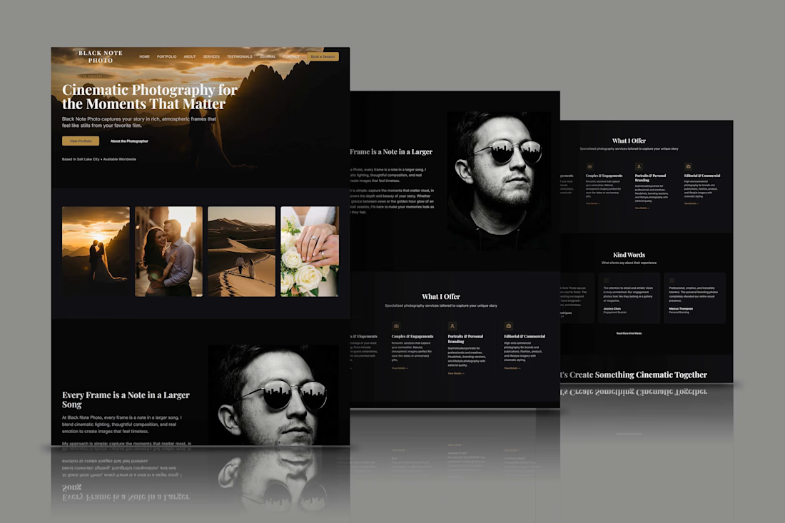
Designed a photography website focused on portfolio presentation, visual storytelling, and client conversion. The project combines photographer website design, photography portfolio, wedding photography, couples photography, personal branding, responsive web design, UX/UI design, and booking website functionality. The cinematic layout uses calls-to-action, service sections, testimonials, and image led content to build trust and guide visitors from exploring the photographer’s work to making an inquiry. The structure supports mobile friendly browsing and a polished creative brand experience.


Which one's more cooked for LayerDock's Chrome Store screenshot? 👀
2 voted
25%
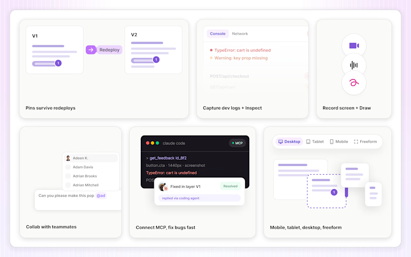
6 voted
75%
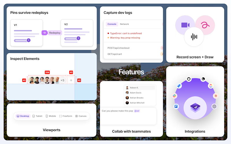
8 votes
Closed

That's great bold detailed is better ❤️❤️