The network for creativity
Join 1.25M professional creatives like you
Connect with clients, get discovered, and run your business 100% commission-free
Creatives on Contra have earned over $150M and we are just getting started
Back to feedPost


The network for creativity
Join 1.25M professional creatives like you
Connect with clients, get discovered, and run your business 100% commission-free
Creatives on Contra have earned over $150M and we are just getting started




Related posts

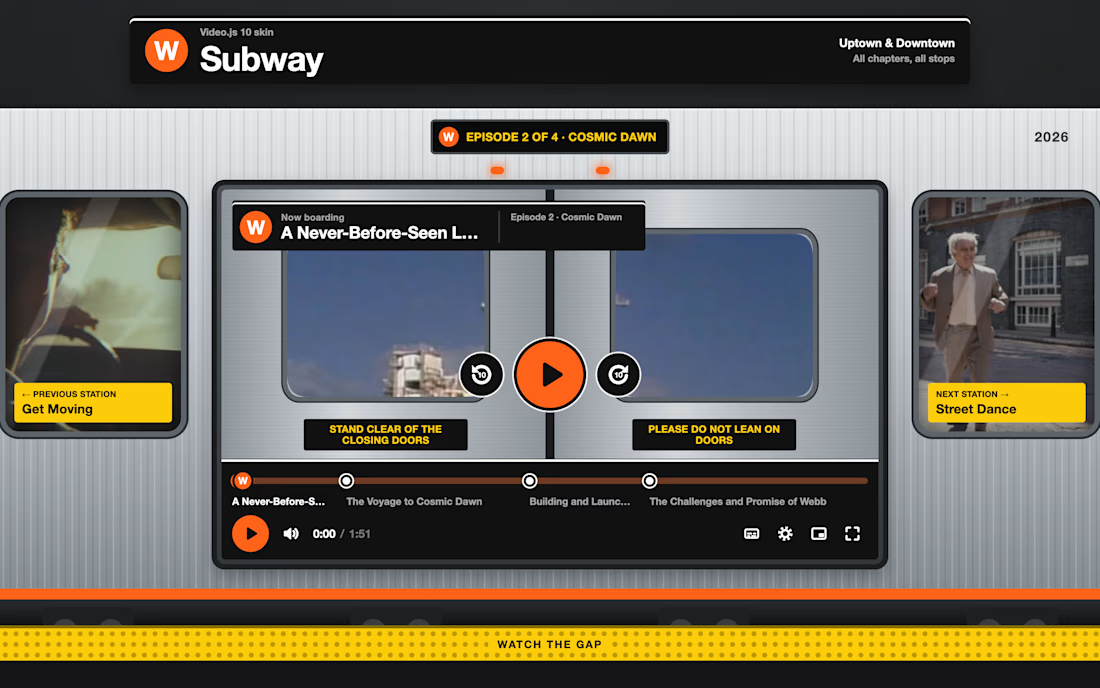
Subway turns the player into a train.
Chapters become stops on a line, the sign tells you the next stop, and pausing closes the doors, with windows so you never lose the picture.
Previous and next episodes wait in the side windows. Every control sits on a solid signage panel, so it stays readable over any footage, and with reduced motion the doors simply fade instead of sliding.
Built on Video.js 10 with a custom heavy-stroke icon set.

Chapters as train stops is brilliant, and closing the doors on pause made me smile. Very clear and very fun.

Like a lot of designers, I find my portfolio one of the hardest projects. There's no deadline, and it can always get better. Anyway, I think I'm happy with this one for a while.
Take a look:
davidguba.com


portfolio looks sharp

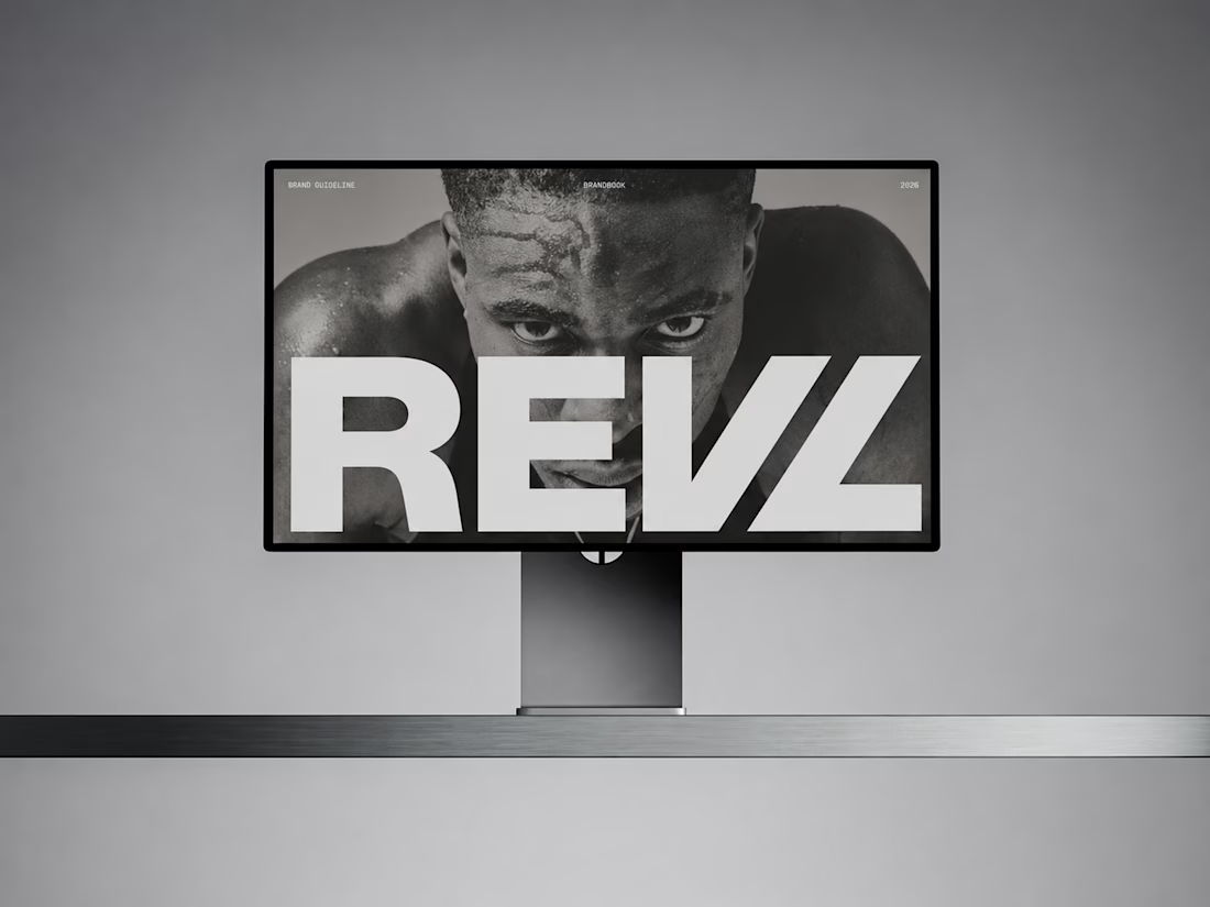
For REVL, I created a bold brand identity and presentations that position the brand as a fresh, performance-driven leader in functional fitness.