The network for creativity
Join 1.25M professional creatives like you
Connect with clients, get discovered, and run your business 100% commission-free
Creatives on Contra have earned over $150M and we are just getting started
Back to feedPost

Building a Digital Presence That Reflects the Quality of the Work
A great service-business website should do more than look professional — it should build trust before the first conversation even happens.
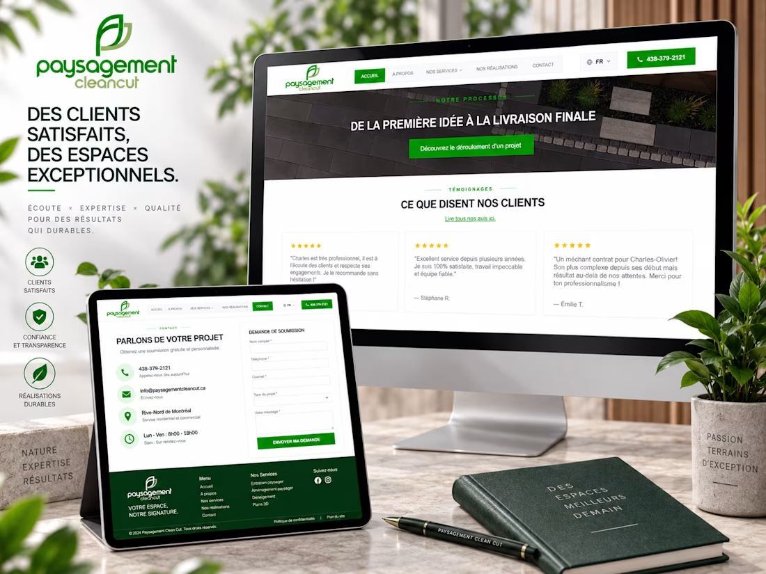
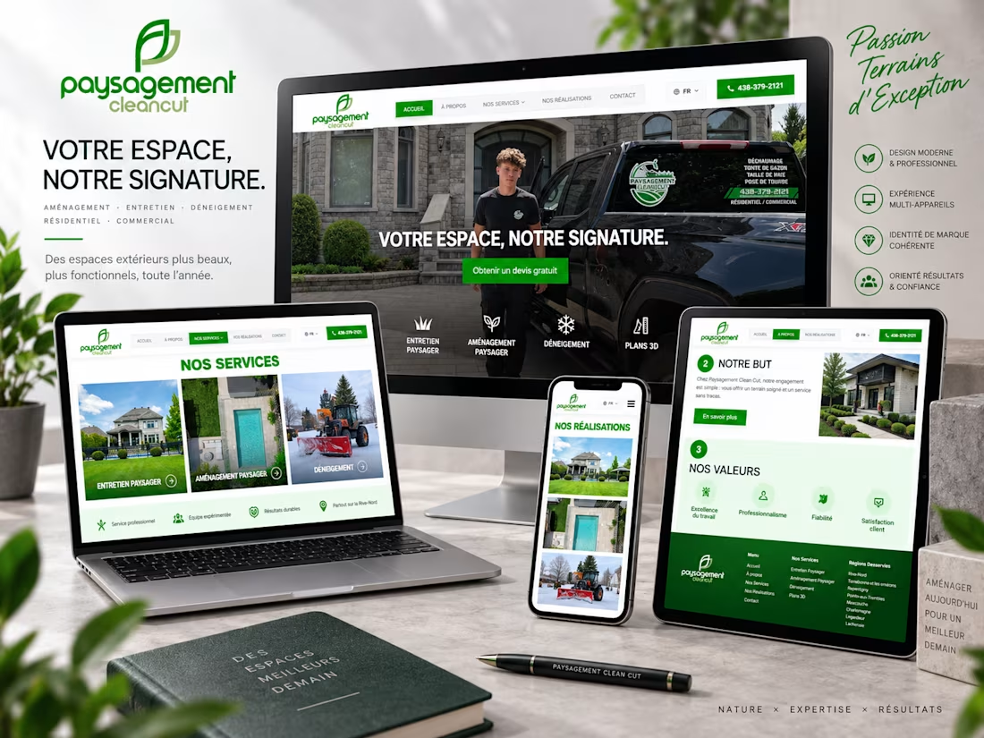
For Paysagement Clean Cut, I worked on creating a clean, modern digital experience that puts their landscaping expertise and completed work front and center.
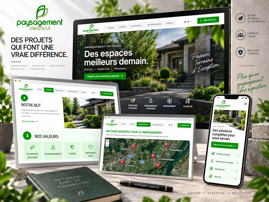
The goal was simple: make it easy for potential customers to understand their services, explore previous projects, see the areas they serve, and request a quote from any device.
The design uses the brand’s green identity throughout while keeping the interface spacious, professional, and focused on conversion. Every page was designed to feel consistent across desktop, tablet, and mobile.
🌿 Key areas I focused on:
Responsive UI/UX • Service presentation • Project showcase • Quote generation • Service-area experience • Strong CTAs • Brand consistency
I especially enjoyed turning a traditional landscaping business into a polished digital experience without losing the local, trustworthy feeling behind the brand.
If you run a landscaping, construction, home-service, or local business and want a website that looks professional and helps turn visitors into customers, feel free to reach out.
Available for freelance projects & collaborations.


The network for creativity
Join 1.25M professional creatives like you
Connect with clients, get discovered, and run your business 100% commission-free
Creatives on Contra have earned over $150M and we are just getting started



Related posts

AI can build your website.
It cannot understand who you are, how you are different and how to explain that to people through a website.

A clear story takes judgment.

Small Detail. Big Effect. 🚀
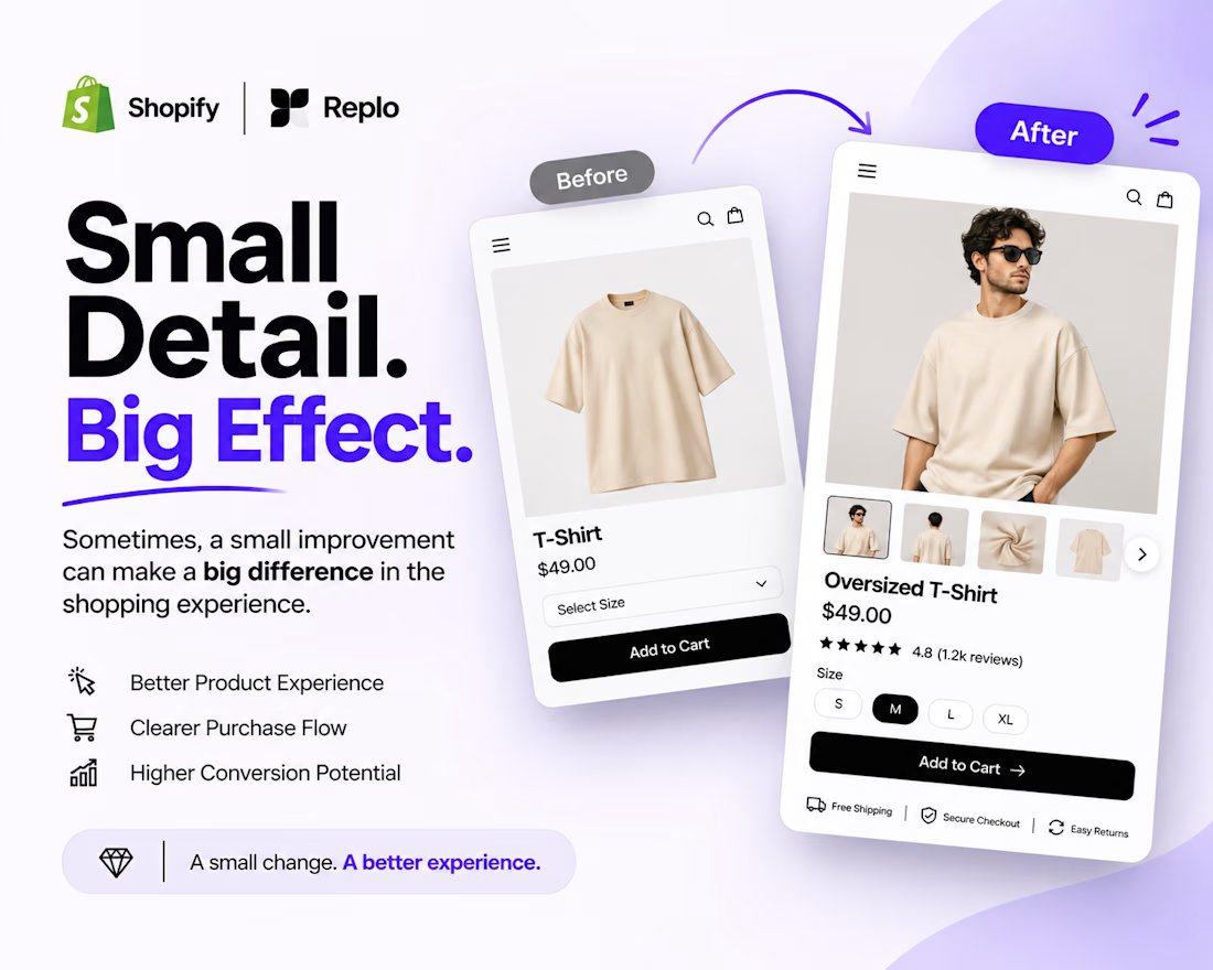
Sometimes, a better shopping experience doesn't require a complete website redesign.
It's the small details that matter.
Think about:
Clearer product image galleries.
Better product variant selection.
Easy-to-use size options.
More visible Add to Cart buttons.
A smoother product page experience.
When building with Shopify + Replo, I focus on these details to create cleaner, more intuitive e-commerce experiences.
Because great e-commerce design isn't just about how a page looks. It's about how easily customers can use it.
Small improvements. Thoughtful design. Better experiences.
Working on a Shopify store or planning a Replo landing page?
Let's connect!



Agreed, small product page fixes often beat a full redesign. Clear variant selection and size options remove hesitation right at the point of buying.


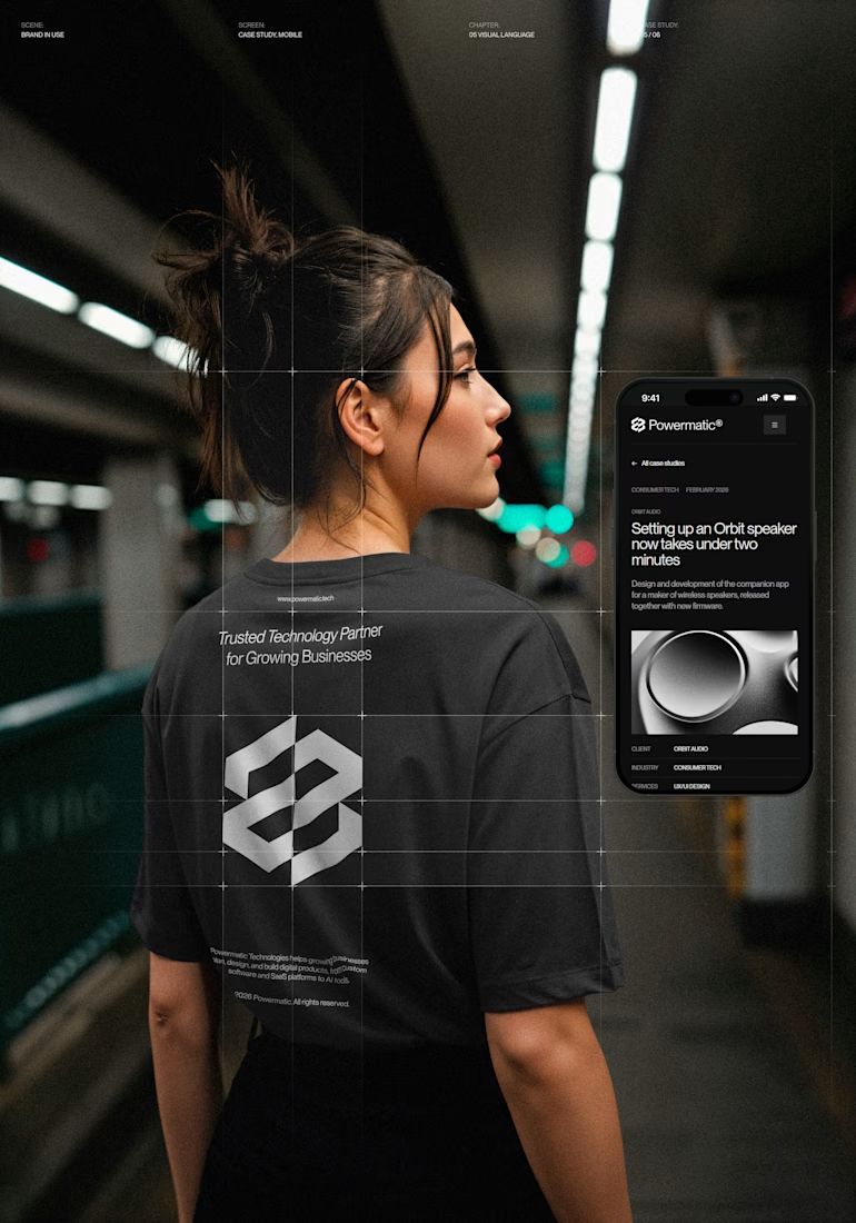
I've just put a new case study live.
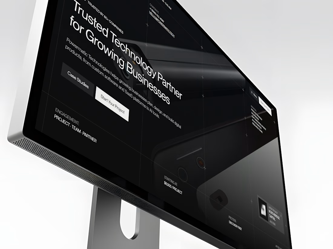
Powermatic Technologies helps growing companies with strategy, design and software. I did the whole project on my own: the logo and identity, the design in Figma, the code and the copy on the site.
The site sits on a four-column grid, and you can see its lines on the screen. Graphite palette with no pure black or white, PP Neue Montreal, and a bit of ASCII art.
The page I'm happiest with is Careers. My first idea was to repeat the home page layout. I dropped it. Now the page opens with the open roles set in 72 px type, with a filter by team. A candidate sees the role, the city and the pay before they scroll.
The menu turns like a drum. You can drag it or use the arrow keys, and it opens on the section you're reading.
It's all hand-written HTML, CSS and JS, no framework. It holds up from a phone to an ultrawide monitor.
The live site is open, so you can click through it yourself.



Nice!