The network for creativity
Join 1.25M professional creatives like you
Connect with clients, get discovered, and run your business 100% commission-free
Creatives on Contra have earned over $150M and we are just getting started

The network for creativity
Join 1.25M professional creatives like you
Connect with clients, get discovered, and run your business 100% commission-free
Creatives on Contra have earned over $150M and we are just getting started


Related posts

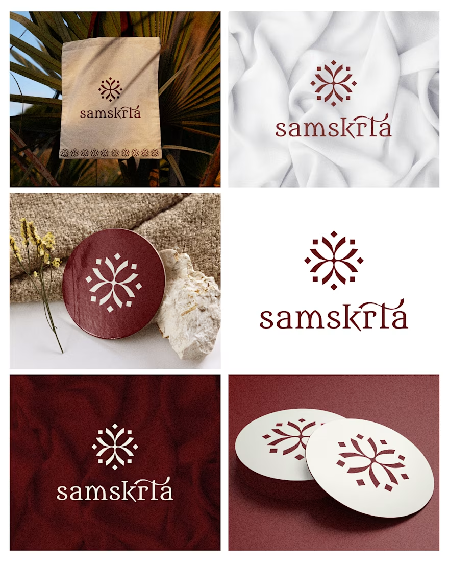
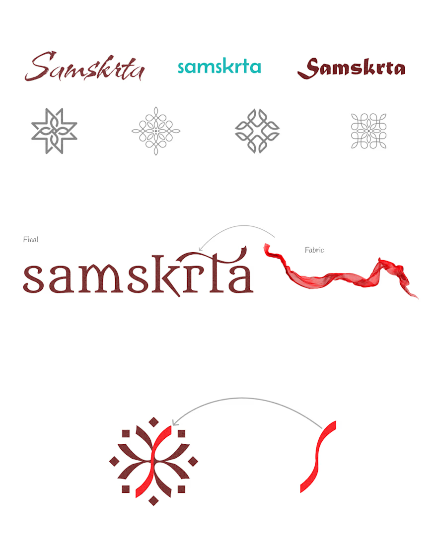
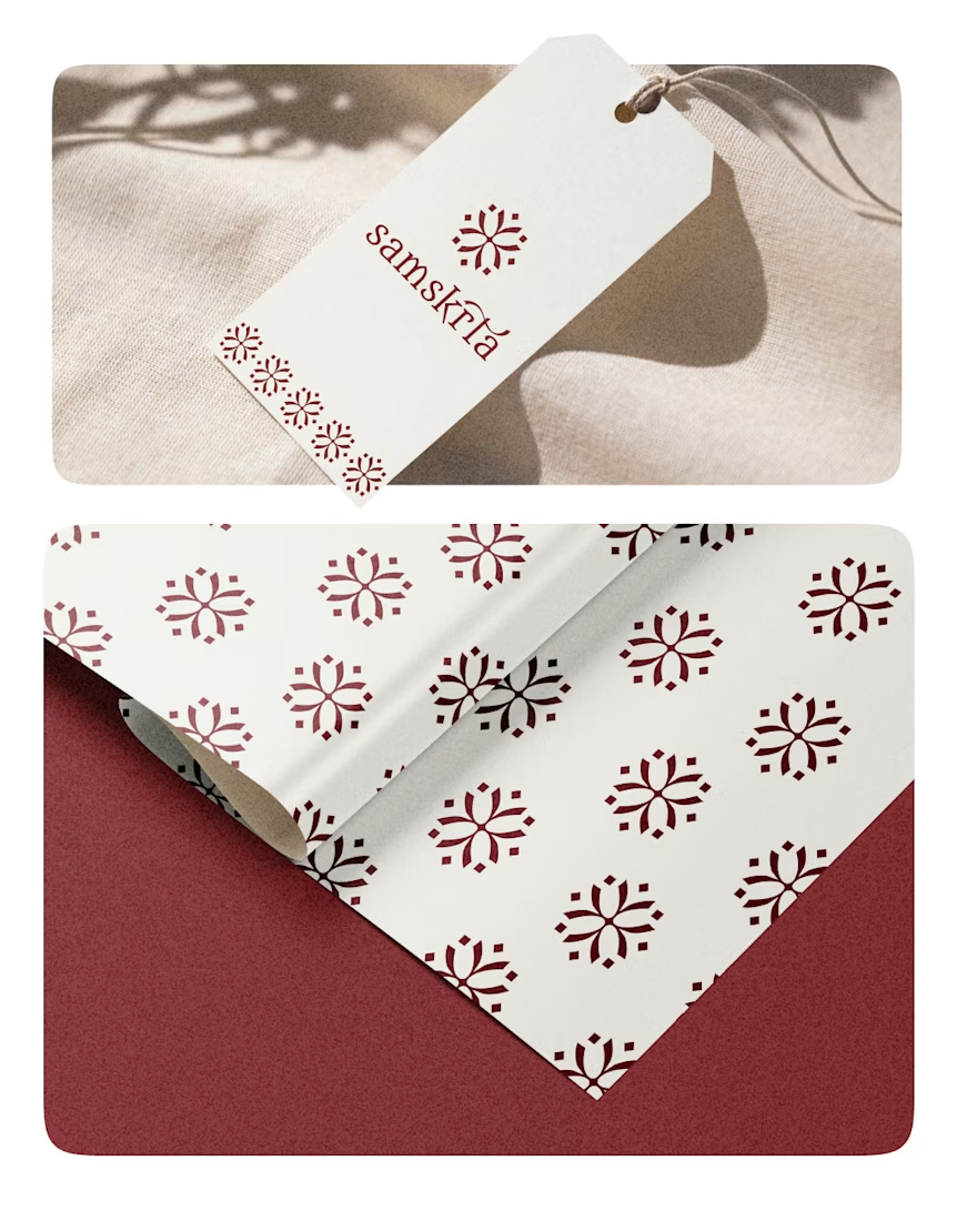
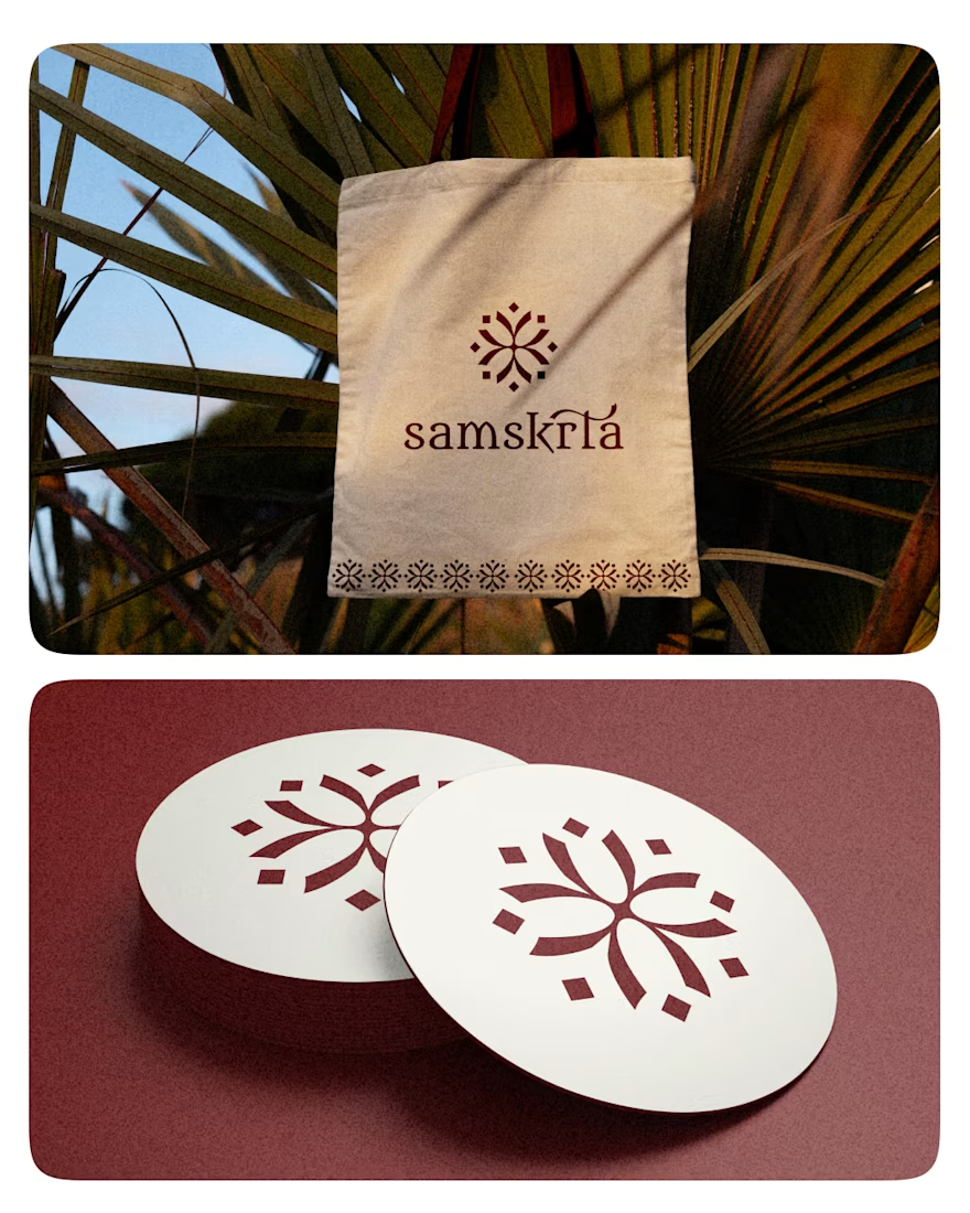
A little Kerala, a lot of craftsmanship. 🌿
Introducing Samskrata's logo identity, inspired by Kerala's rich cultural heritage and the timeless beauty of handloom.
Tradition, with a modern expression.
#Samskrata #LogoDesign #BrandIdentity #Handloom

Mainsplash - brand refresh
Mainsplash is a creative marketing agency focused on helping small businesses grow through clear, effective, and accessible marketing.
We explored how to bring those qualities into the visual language: a bold typo, icons with different stroke weights and proportions to create contrast and give them a more distinctive character and illustrations that bring a more playful and human side to the identity.
#BrandIdentity #VisualIdentity #BrandDesign #Illustration #IconDesign

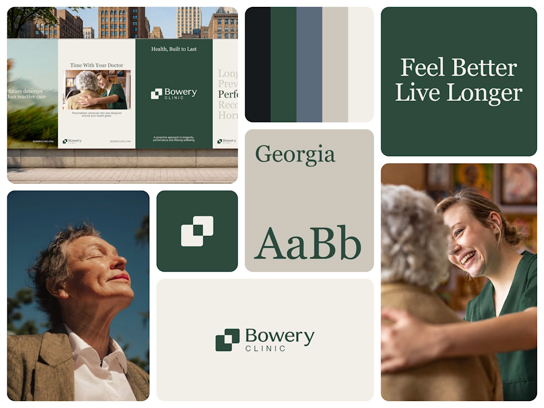
Bowery Clinic is built on a simple promise Health, Built to Last.
The identity had to feel trustworthy and human, not clinical. We paired a mark of two overlapping squares with a deep forest green palette, a confident Georgia serif and warm, sunlit photography. The tone is proactive, physician led and calm and it carries from billboards to every patient touchpoint.
Feel Better. Live Longer.
What makes a healthcare brand feel trustworthy to you its warmth or its authority?
#BrandIdentity #LogoDesign #HealthcareBranding #VisualIdentity #BrandDesign