The network for creativity
Join 1.25M professional creatives like you
Connect with clients, get discovered, and run your business 100% commission-free
Creatives on Contra have earned over $150M and we are just getting started
Back to feedPost

🚀 Micro-Interactions That Convert: Fluid Segmented Action Dock
Most web applications rely on static navigation that wastes space and feels outdated. I developed this Fluid Segmented Action Dock to create a cleaner, more engaging user experience for your websites.
✨ Dynamic width transitions
✨ Smooth state management
✨ Zero layout shift
✨ Mobile-friendly interactions
✨ Performance-optimized animations
Built with Next.js, React.js, HTML, and CSS, this component is made for SaaS platforms, AI products, dashboards, Web3 applications, and modern startup products.
Premium UX isn’t created through features alone—it’s created through details users feel.
#buildinpublic #css #web #saas #html #reactjs #nextjs #webdev #frontend #coding #programming #websites #website #landingpage #landingpages #dashboard #dashboards #producthunt #ui #uicomponents #webcomponents #ux #indiehackers #animations #microinteractions #webdevelopment #frontend #frontenddevelopment #founders #startups #ceo #entrepreneur #project #websitedevelopmentservices #landingpagedevelopmentservices


The network for creativity
Join 1.25M professional creatives like you
Connect with clients, get discovered, and run your business 100% commission-free
Creatives on Contra have earned over $150M and we are just getting started





Related posts


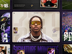

Congrats on the Awwwards nomination. Which part of the build was the toughest to get right?

I found a bug on Iteluvia's 404 page and I'm not sure I want to fix it.
While building a new 404 page for Iteluvia, I rendered the digits with a WebGL shader. They glow, drift like smoke, and lean toward your cursor. Then I noticed the whole thing was upside down. A canvas stores pixels top-down, WebGL reads textures bottom-up, and I'd skipped the one line that flips them.
The fix took ten seconds. Deciding whether to keep it is taking a lot longer.
The case for upside down: a 404 means you're lost. A page that's literally flipped says that before you read a single word. And it looks cool.
The case for right side up: it's clean, it reads instantly, and nobody wonders if the site is broken.
A: Upside down
B: Right side up
Which would you ship? I'm leaning A, so tell me if I'm wrong.

1 voted
20%
4 voted
80%
5 votes
Closed

A is better because it was dynamic but if you can flip 404 as it is back again that will be better idea ❤️❤️

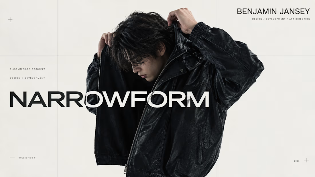
I wanted to create something that felt like a real fashion brand had already existed for years.
Not just a homepage. Not a collection of pretty screens. An actual store, with its own identity, imagery, products, interactions and all the small details that make a website feel complete.
That idea became NARROWFORM.
I created the brand and name, developed the art direction, produced the fashion and product imagery, designed the entire interface and shopping experience, and built the website myself.
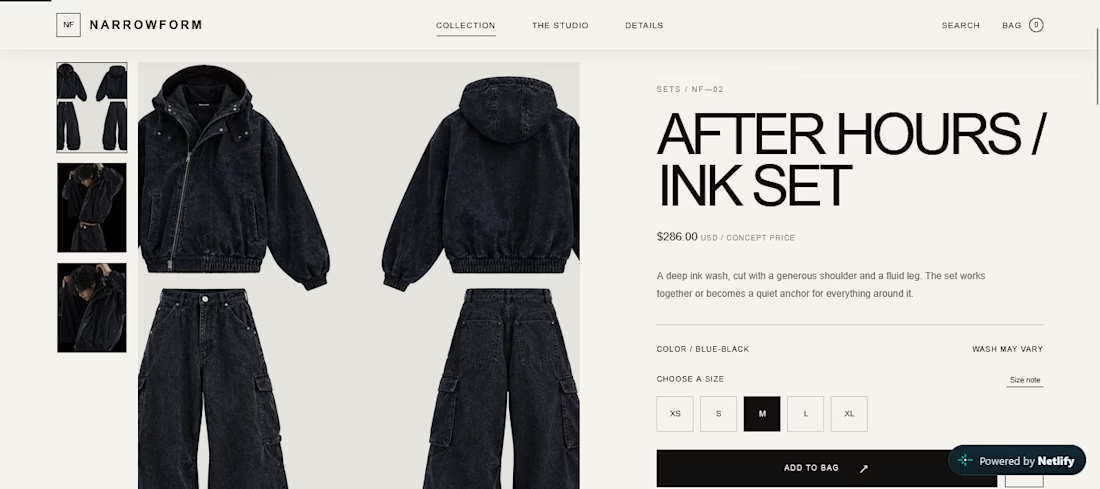
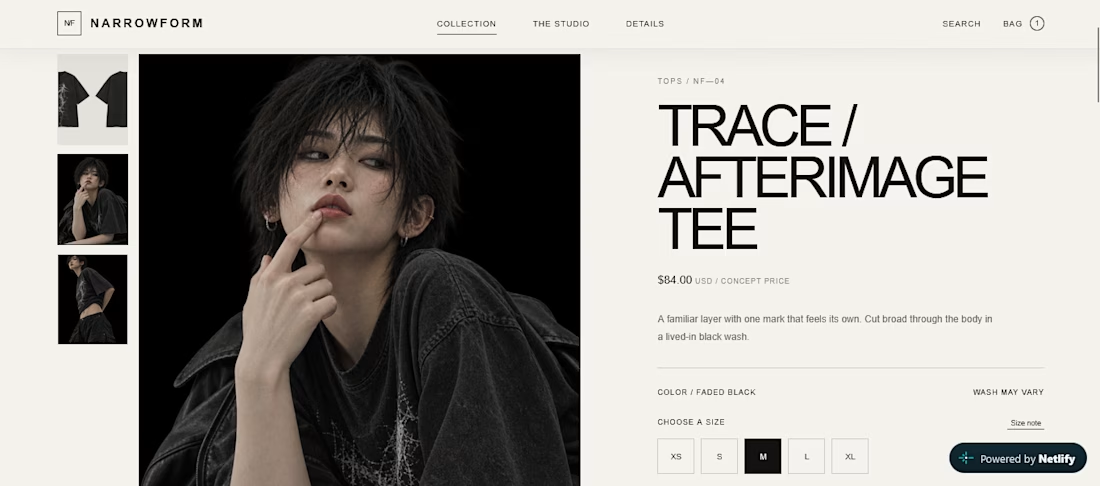
I wanted the concept to hold up beyond the first impression, so I built the experience all the way through:
Product discovery
Product pages
Cart interactions
Checkout
Simulated payment
Cookie consent
Responsive layouts
Mobile interactions
And the smaller interface states throughout the experience
The imagery was created specifically for NARROWFORM using generative tools, then refined and directed to fit the same visual language as the website.
The result is a complete fashion e-commerce concept that you can actually explore.
This is probably the most involved project I've made so far, because I wasn't trying to design a website around an existing brand.
I wanted to create the brand, then build the website that belonged to it.



Creative work