The network for creativity
Join 1.25M professional creatives like you
Connect with clients, get discovered, and run your business 100% commission-free
Creatives on Contra have earned over $150M and we are just getting started
Back to feedPost

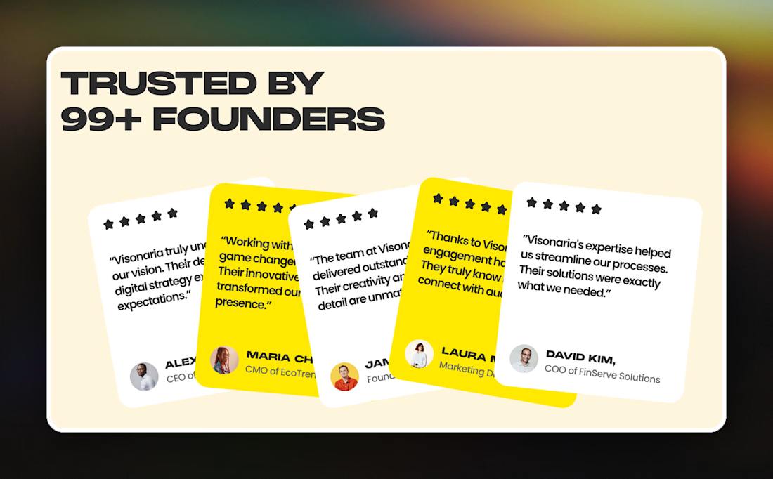
Most testimonial sections I see are a tidy three card grid or a slider. On Visonaria, a digital agency template, the five quotes are fanned out like a hand of cards in white and yellow, so only the last one reads in full.
Not sure cutting off four quotes is a fair trade for the look.

The network for creativity
Join 1.25M professional creatives like you
Connect with clients, get discovered, and run your business 100% commission-free
Creatives on Contra have earned over $150M and we are just getting started




Related posts


Tash rendered in a custom holographic alphabet, built from patterned letterforms in Figma.
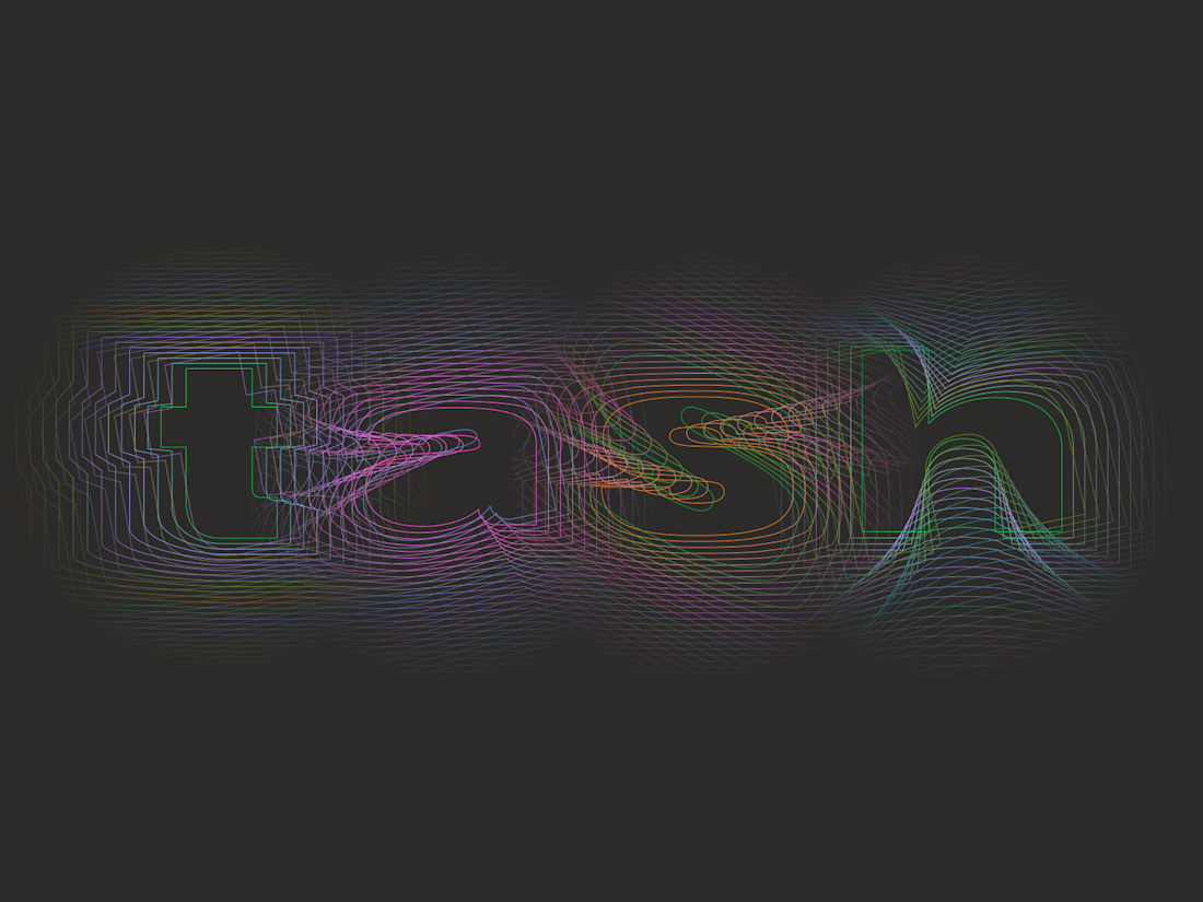

The holographic effect makes it really stand out.


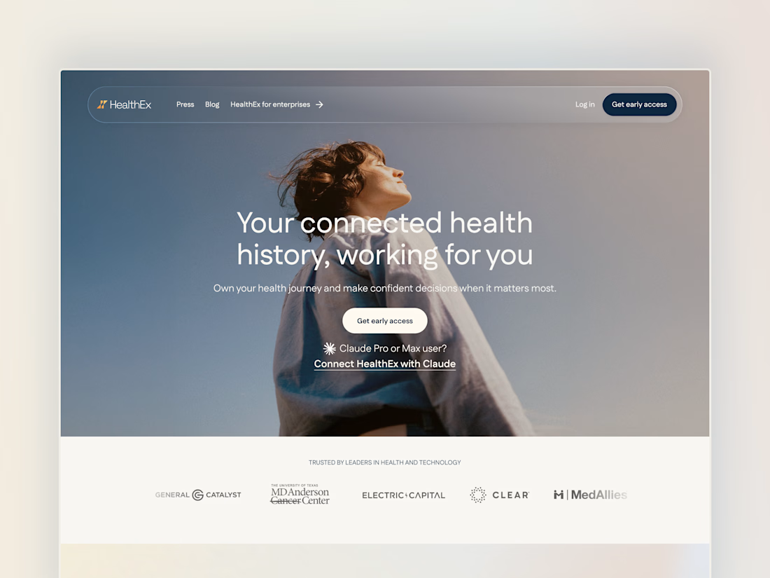
Project back from December 2025: Secret City designed the HealthEx website and hired me to build it in Framer.
P.S. they've gone through several site restructures since then (so it looks different from my snapshots), but it goes to show how easy Framer makes it for clients to manage and update their site independently.


Awesome😍

A closer look at Sagebio.
Designed a clean, simple website experience for a complex health-tech product.
explore the live site: https://www.sagebio.com/
#WebDesign #UXDesign #ProductDesign #HealthTech #EiderDesign