The network for creativity
Join 1.25M professional creatives like you
Connect with clients, get discovered, and run your business 100% commission-free
Creatives on Contra have earned over $150M and we are just getting started
Back to feedPost

Project Title
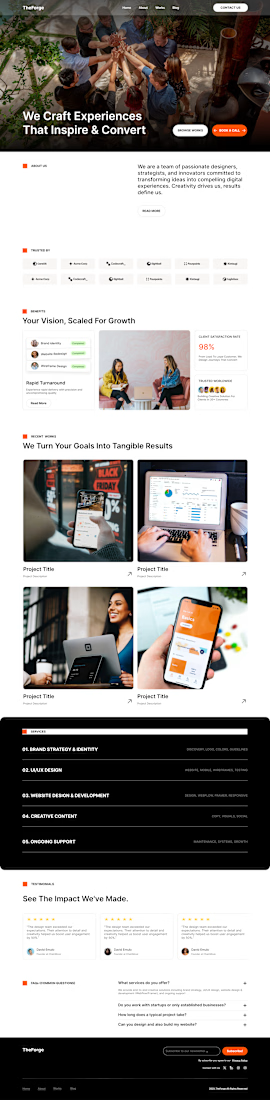
TheForge — SaaS Dashboard & Analytics UI/UX Design
2. Project Description
Overview
TheForge is a modern SaaS analytics and management dashboard designed to streamline workflow tracking and complex data visualization. The goal of this project was to transform dense metrics into a clean, intuitive, and data-dense user interface.
Key Highlights & Design Features:
Data Visualization: Structured layout featuring clear data hierarchy, metric cards, and clean visual navigation.
Scalable Architecture: Designed using auto-layout, standardized design tokens, reusable components, and dark/light system flexibility in Figma.
User-Centric UX: Focused on reducing cognitive load for platform users navigating complex administrative workflows.

The network for creativity
Join 1.25M professional creatives like you
Connect with clients, get discovered, and run your business 100% commission-free
Creatives on Contra have earned over $150M and we are just getting started








Related posts

ZENO: 3D Landing Page for a Camera Drone
I designed the layout and visual system in Figma, then built the interactive 3D hero in Spline together with Claude. I set the art direction, composition and mood. Claude worked directly inside Spline and helped assemble the drone scene, the materials and the interaction. I directed and refined every iteration.


Ohhhhh this is really nice

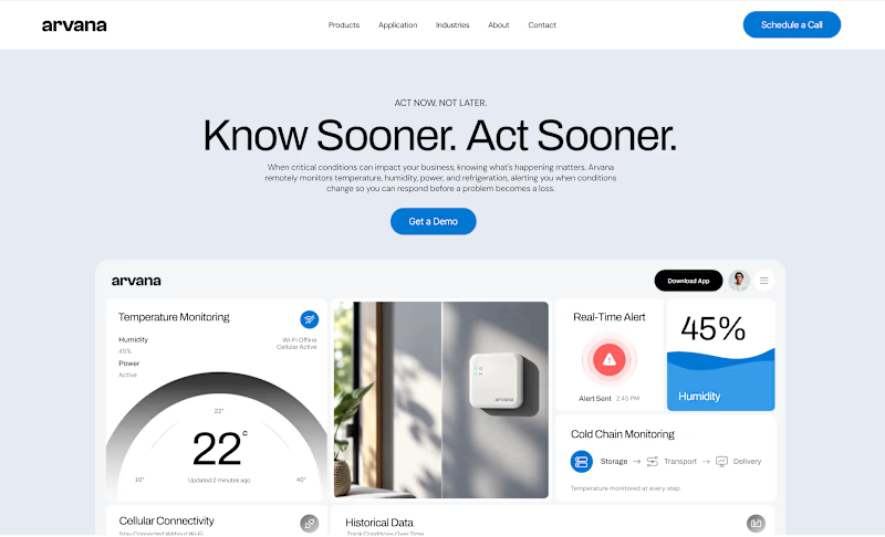
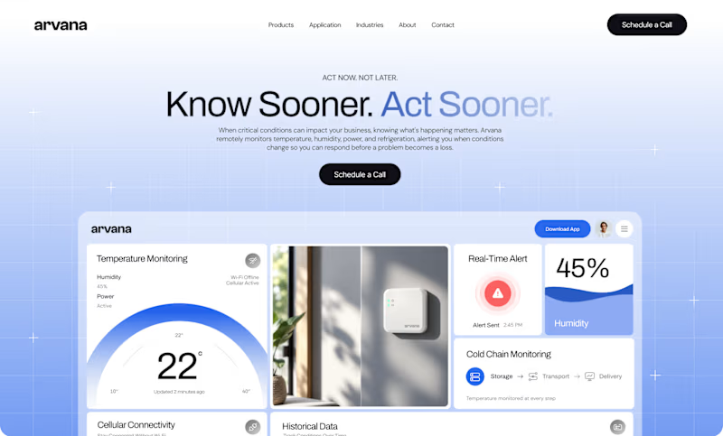
Worked on two hero directions for Arvana. Both show the same dashboard UI but the background treatment changes everything.
Which one do you click? 👇
6 voted
18%
27 voted
82%
33 votes
Closed

🔥

I Built "My Perfect Interior" an Interior Design company website.
This website combines a premium, editorial design experience with AI-powered room visualization. Visitors upload a photo of their empty room, describe their vision, and receive a generated design concept. Each submission is automatically saved to a studio dashboard with the client's email, original photo, generated concept, and design brief.
This addresses a key challenge in interior design: translating a client's imagination into something a designer can understand and act on. By automating early-stage visualization and enquiry collection, the platform helps interior design businesses understand client needs faster, reduce repetitive consultations, and turn ideas into actionable project leads—all within a beautifully designed, responsive experience.


Solving the imagination translation problem is the smart move here, Charles. Letting visitors upload a room photo and get back a generated design concept turns the early consultation into something genuinely productive, and saving every brief to the studio dashboard makes the whole flow work like a real business.