The network for creativity
Join 1.25M professional creatives like you
Connect with clients, get discovered, and run your business 100% commission-free
Creatives on Contra have earned over $150M and we are just getting started
Back to feedPost

The best digital creativity lesson of the year comes strictly from the physical world.
Figma launched a YouTube series called "Source Material," inviting industry leaders to showcase the tangible objects that spark their inspiration.
As an audiovisual director who constantly navigates between the mathematical precision of digital vectors and the chaotic, tactile texture of real life, this series felt like a mandatory pause.
Watching top-tier creatives be vulnerable and share their physical anchors reminds us that the creative spectrum doesn't start on a screen, but in the observation of our surroundings.
Beyond the human value of the narrative, there is a flawless technical execution. As a video editor, I want to highlight three editorial choices that elevate this production:
+ Pacing and Montage: There is no rush. The edit breathes, giving each object the visual weight the guest emotionally assigns to it.
+ Sound Design: The foley work used to highlight the textures of the physical objects (the rustle of paper, the cold weight of metal) grounds the viewer in a deeply tactile experience.
+ Brand Integration: They manage to inject Figma's visual identity organically, using subtle motion graphics that support rather than overpower the main narrative.
An absolute recommendation for any creative needing to unblock their workflow by returning to physical basics, and an editorial masterclass for those of us in post-production.
Do you have a physical object on your desk that serves as your "Source Material"?


Love this concept!!
The network for creativity
Join 1.25M professional creatives like you
Connect with clients, get discovered, and run your business 100% commission-free
Creatives on Contra have earned over $150M and we are just getting started



Related posts

Photographer Portfolio Website
"Capturing light, emotion, and the moments you never want to forget." That line set the tone, and the layout follows it.
The hero is one motion-blurred portrait washed in red. The photographer's name runs across the bottom in a condensed white face, so large the screen cuts it off. The photo keeps its soft focus, and the name still reads first.
Thin grid lines split the page into narrow columns, and the small copy sits justified inside them. The loose photo gets a strict structure to lean on.
A single round red button with an arrow sits right on the letters and marks where to go next.
Designed by the Hue & Machine team.
#WebDesign #Photography #PortfolioWebsite #EditorialDesign #Typography #UIDesign #ProductDesign #CreativeDirection #ResponsiveDesign #FigmaDesign


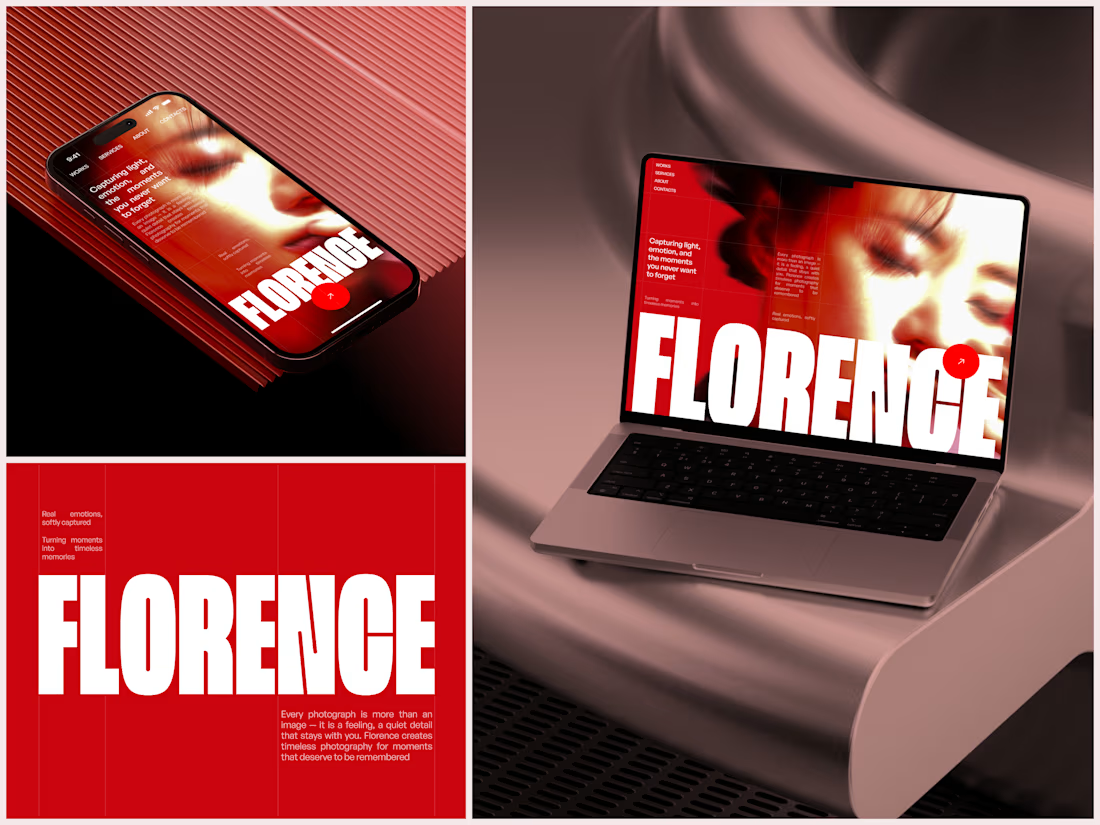

The heavy condensed white FLORENCE over the red portrait is bold, and keeping the same red across phone, laptop and type tile makes the case study read as one system. Did the red come from the photographer's own work, or was it your call?

New case study for the brand and digital work we did for Seeper Studios.
Go Check it out


Evolving a brand with almost 30 years of history is the hard version of brand work. You have to keep what people already trust while making it feel current. Nice job balancing both.

A website hero and motion identity concept for Cycle.
The experience takes the viewer through seven historical eras in one continuous forward journey, while the logo, camera path and core composition remain consistent.
The concept explores how a static identity can become a living digital experience through motion, environment and interaction.
Workflow included Spline, Claude via MCP, Midjourney and SeaDance.
Available for brand identity, motion and digital design projects.


I fall in love, It is like Encarta, but 1000% better


