The network for creativity
Join 1.25M professional creatives like you
Connect with clients, get discovered, and run your business 100% commission-free
Creatives on Contra have earned over $150M and we are just getting started
Back to feedPost
Taste Test
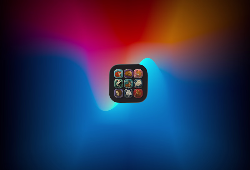
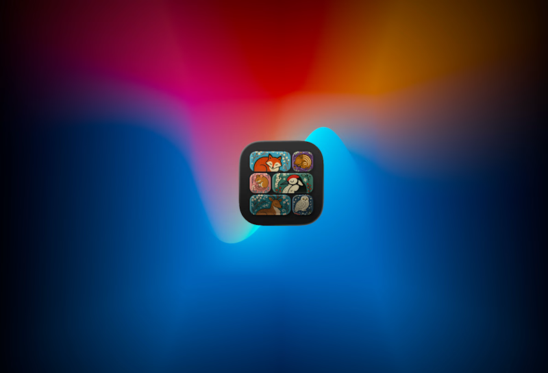
Kinda like version A it held my attention longer
Version A
Both are same dont us Fool lol
I fooled myself too 😂
at first glance i would go with be, i like how not all the triangles are the same size, it makes it more interesting to look at
That what I was thinking too
I do prefer version B tiles
A Version without a doubt
wonderful! I love version B!
I’d go with Version B. The variation in shapes makes it feel more dynamic and visually engaging at first glance.
I think it would be helpful to see that icon in the context of other app icons. Both versions, especially (A), look more like a folder with several apps inside (similar to iOS) rather than an icon for a single app. I would also try a third version where you use a full rectangle for the icon design :)
Hey @Lukasz Krzeminski thank you for the feedback. 100% right. I am already on this
The network for creativity
Join 1.25M professional creatives like you
Connect with clients, get discovered, and run your business 100% commission-free
Creatives on Contra have earned over $150M and we are just getting started
Related posts
This is good. Which tool did you use
Base44 vs. Lovable
I’ve been testing the same prompt across different tools to see how they handle a website layout. While both nailed the aesthetic, the real difference came down to the interactive layer.
Base44 successfully captured the hover effects on the CTA buttons, while Lovable kept things a bit more static. It’s a small win, but these are the details that matter when moving from a mockup to a functional product.
What do you think?
27 votes
Ends in 4h
base44
Trending
Claude
Claude has entered the design space. How are you using Claude Design?
Contra University
Learn from expert creatives how to earn more using next-gen AI tools.
creativeaiflow
Creative AI workflows are evolving. What tools do you use, and what are their strengths and weaknesses?
portfolioreview
The best portfolios tell a story, not just show a grid. Share yours for feedback.
freelancerlife
Freelancer life is wins, pivots, and everything in between. What’s yours right now?