The network for creativity
Join 1.25M professional creatives like you
Connect with clients, get discovered, and run your business 100% commission-free
Creatives on Contra have earned over $150M and we are just getting started
Back to feedPost

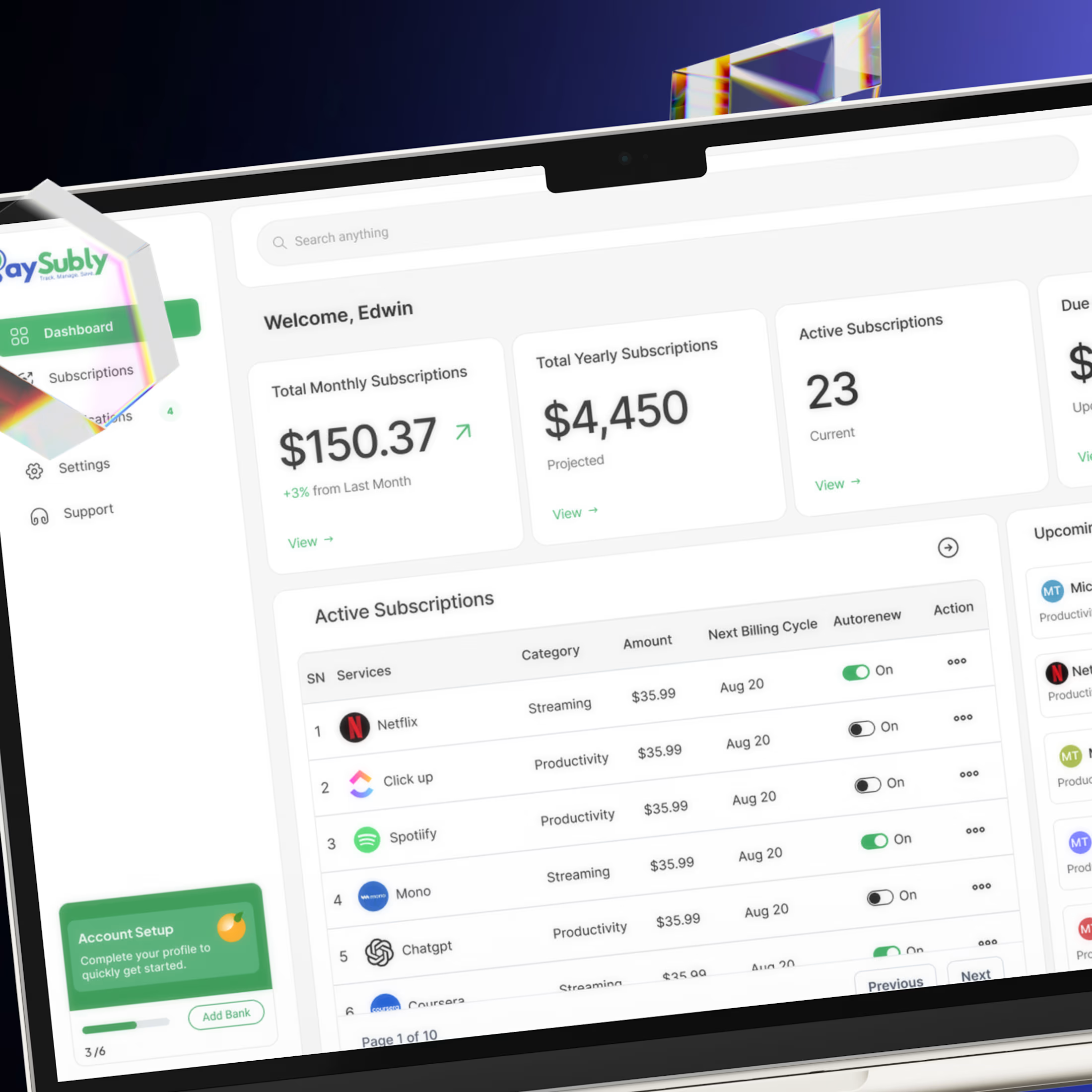
I designed this dashboard to make subscription tracking feel simple, not stressful.
This dashboard brings clarity to recurring payments with clear metrics, smart tables, and a clean layout that helps users stay in control of their spend at a glance.
The network for creativity
Join 1.25M professional creatives like you
Connect with clients, get discovered, and run your business 100% commission-free
Creatives on Contra have earned over $150M and we are just getting started





Related posts

Threadly is a SaaS dashboard for independent sellers who need one clear workspace for products, orders, stores, and sales performance.
We focused on making commerce data feel approachable: key metrics are easy to scan, top products stay visible, recent orders are structured clearly, and product quick views give sellers deeper context without interrupting their workflow.
See the design:
https://dribbble.com/shots/27777724-Dashboard-E-commerce


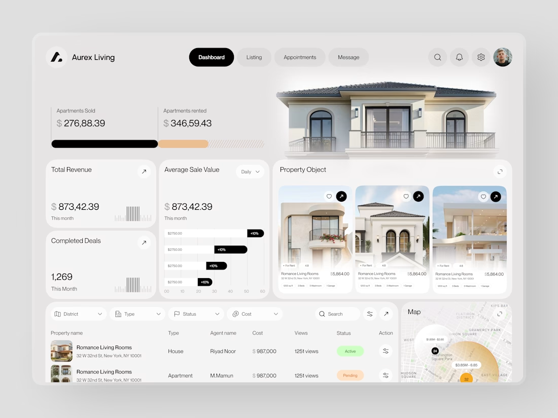
Real estate dashboards are usually built for data entry. Aurex Living was built for decision-making.
$873,42.39 total revenue. 1,269 completed deals this month. $276K sold, $346K rented. Property cards, agent tracking, map view, average sale value trending +10% - every number a real estate operator actually needs, on one clean white canvas.

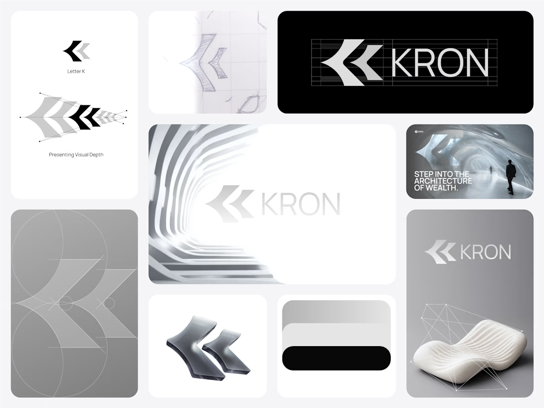
Does a fintech brand actually need to look like fintech?
We don’t think it does.
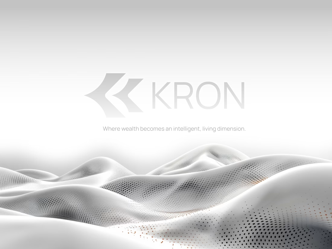
For KRON, we wanted to move away from the visual language you’d normally associate with finance.
No banking blue.
No obvious financial symbols.
No trying to scream “AI.”
Instead, we started with one idea:
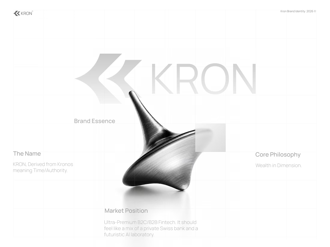
What if wealth had depth?
That led us toward a much more spatial identity built around form, movement, architecture, and dimension.
Even the K started becoming less of a letter and more of a structure we could build around.
Still exploring how far this system can go.
Would you know this was a fintech brand without being told?
And more importantly, does it need to?


Honestly this branding kit feels luxury specially with high contrast and soft colors good job 🎉🎉❤️❤️