The network for creativity
Join 1.25M professional creatives like you
Connect with clients, get discovered, and run your business 100% commission-free
Creatives on Contra have earned over $150M and we are just getting started
Back to feedPost
Taste Test
Team Light or Team Dark? ☀️🌙
I created two versions of the same experience, and now I need your vote.
Watch both videos and comment:
☀️ LIGHT
🌙 DARK
No long explanations — just choose the one you would actually use.
Let the theme battle begin. 👇
Also, if you have a project involving Next.js, Framer, custom software, AI solutions, automations, or web applications, feel free to reach out:
📩 panicvaskrsije@gmail.com
🌐 panicdigital.com/contact


12 votes
Ends in 1d

Amazing work

Team light has a good color contrast and visibility.

Dark

Team Light


Voted Light! Both versions look incredibly clean, but what really stands out is the handling of the accent typography in the light UI—specifically how the vibrant blue numbers and highlights contrast perfectly against the deep navy background without losing readability or...

Really big thanks for this comment 👋

i like dark mode better
The network for creativity
Join 1.25M professional creatives like you
Connect with clients, get discovered, and run your business 100% commission-free
Creatives on Contra have earned over $150M and we are just getting started
Related posts

Been heads down building something for creative agencies...
The kind of site that makes a studio feel like a global creative force from the first scroll.
New Framer template coming this week

Great Work

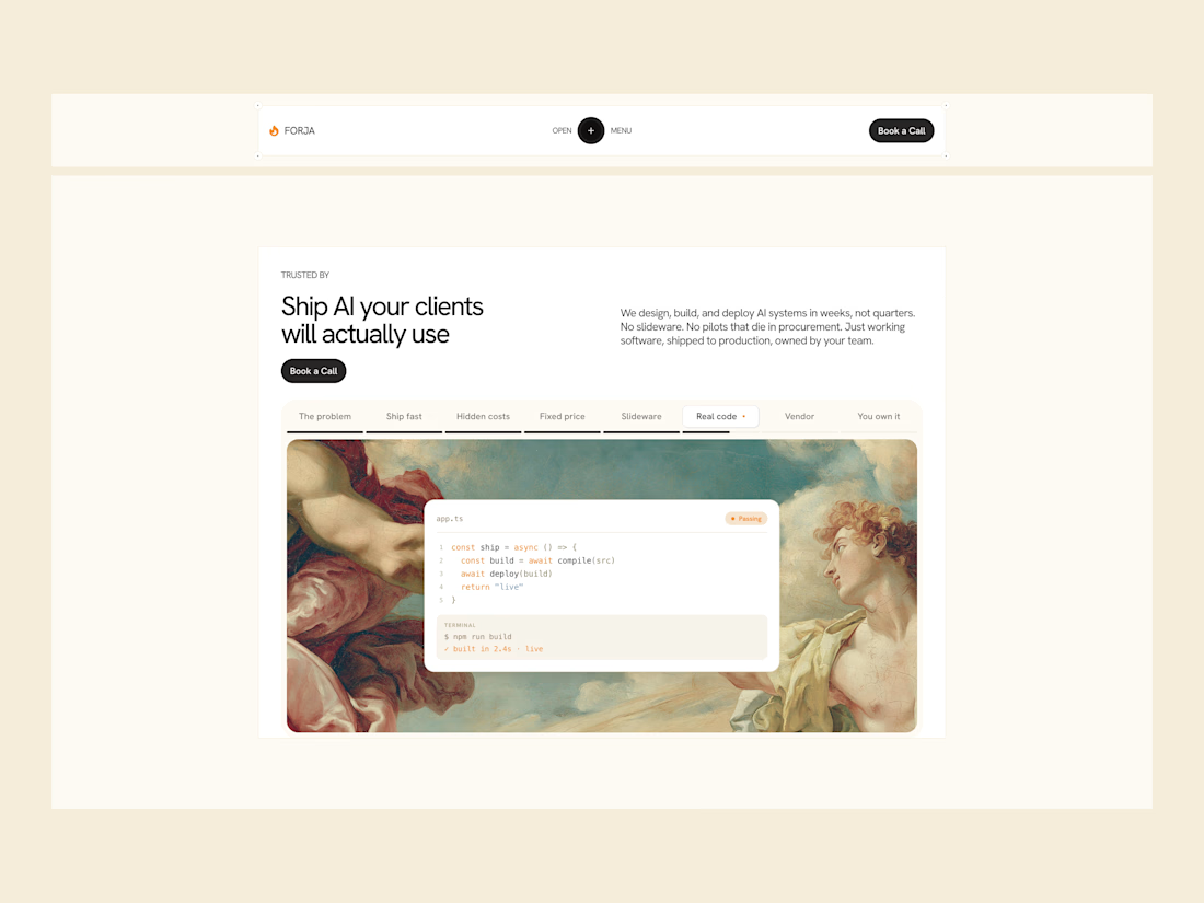

The renaissance painting next to the terminal window is an unexpected pairing that actually works, gives it more personality than the usual gradient blob hero. What made you go with that contrast?


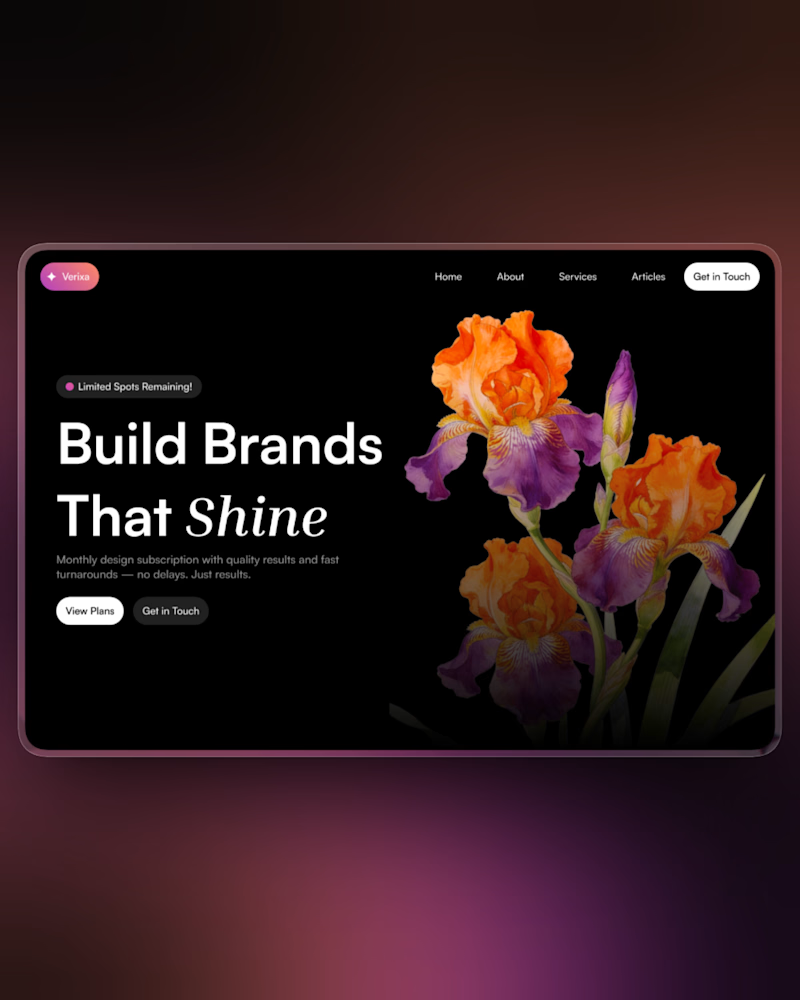
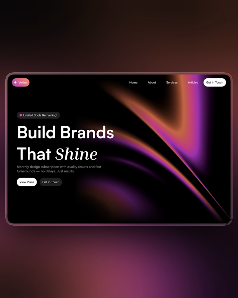
My 4th Framer template has been on the marketplace for nearly 3 days now, and I kinda feel like the hero section is a little dull, so I am thinking of revamping it. ✨
Which one should I go with: Left (original) or right?
26 voted
58%
19 voted
42%
45 votes
Closed
New design looks better








Trending

Claude
Claude has entered the design space. How are you using Claude Design?

Contra University
Learn from expert creatives how to earn more using next-gen AI tools.
fifaworldcup2026
The World Cup is here and the whole world's watching. How are you designing for the world stage?
creativeaiflow
Creative AI workflows are evolving. What tools do you use, and what are their strengths and weaknesses?
freelancerlife
Freelancer life is wins, pivots, and everything in between. What’s yours right now?