The network for creativity
Join 1.25M professional creatives like you
Connect with clients, get discovered, and run your business 100% commission-free
Creatives on Contra have earned over $150M and we are just getting started
Back to feedPost

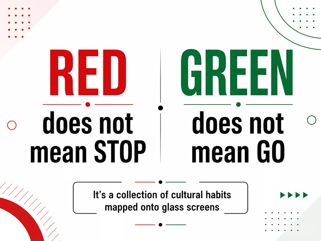
Red isn't always stop. Green isn't always go. And assuming they are, might be quietly tanking your conversion rates overseas.
If you launch a crypto, trading, or iGaming app in East Asia using standard Western color rules, your UI will confuse users from day one.
In Western markets:
Green = Gains / Success
Red = Losses / Error
In Eastern markets (like China and Taiwan):
Red = Growth / Prosperity
Green = Downturns
UI design isn't an absolute universal truth. It is a collection of cultural habits mapped onto glass screens. When you force Western visual defaults onto a global user base, you create micro-hesitations at the exact moment a user is about to make a trade, deposit, or wager.
If a user hesitates because your colors contradict their lifelong intuition, that isn't user error—that is a localized design flaw.
Building for a global audience? Ensure your design system relies on flexible semantic color variables (color-trend-positive vs color-trend-negative) rather than hardcoded hex values, allowing effortless cultural localization.
Are your design systems built to adapt across borders, or are you assuming your defaults are universal?
The network for creativity
Join 1.25M professional creatives like you
Connect with clients, get discovered, and run your business 100% commission-free
Creatives on Contra have earned over $150M and we are just getting started
Trending

Claude
Claude has entered the design space. How are you using it?

Contra University
Learn from expert creatives how to earn more using next-gen AI tools.
Brand Design
The best brand designers are on Contra. Scroll to see what's trending in brand design. What are you building?
creativeaiflow
Creative AI workflows are evolving. What tools do you use, and what are their strengths and weaknesses?
freelancerlife
Freelancer life is wins, pivots, and everything in between. What’s yours right now?



Related posts

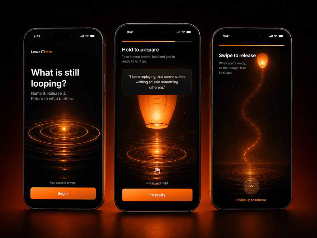
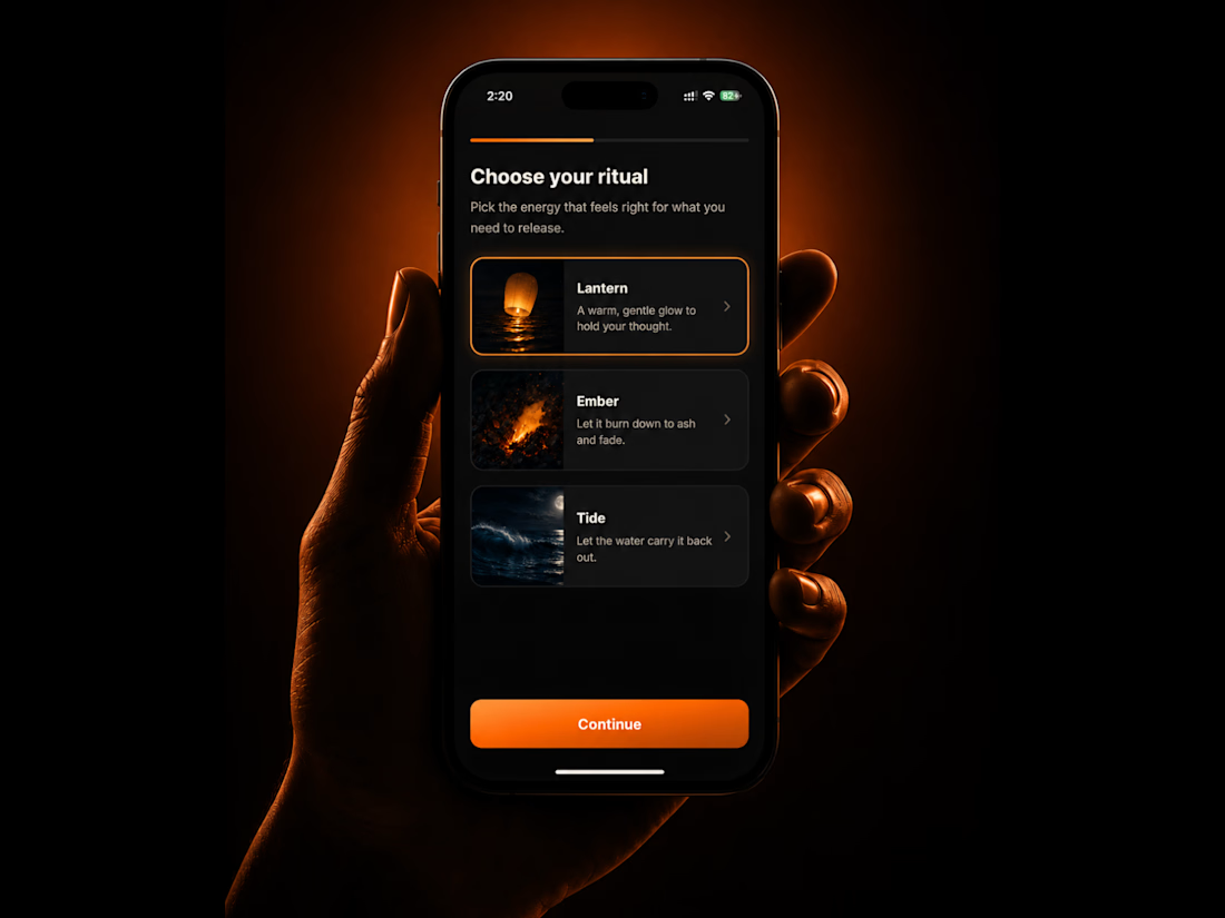
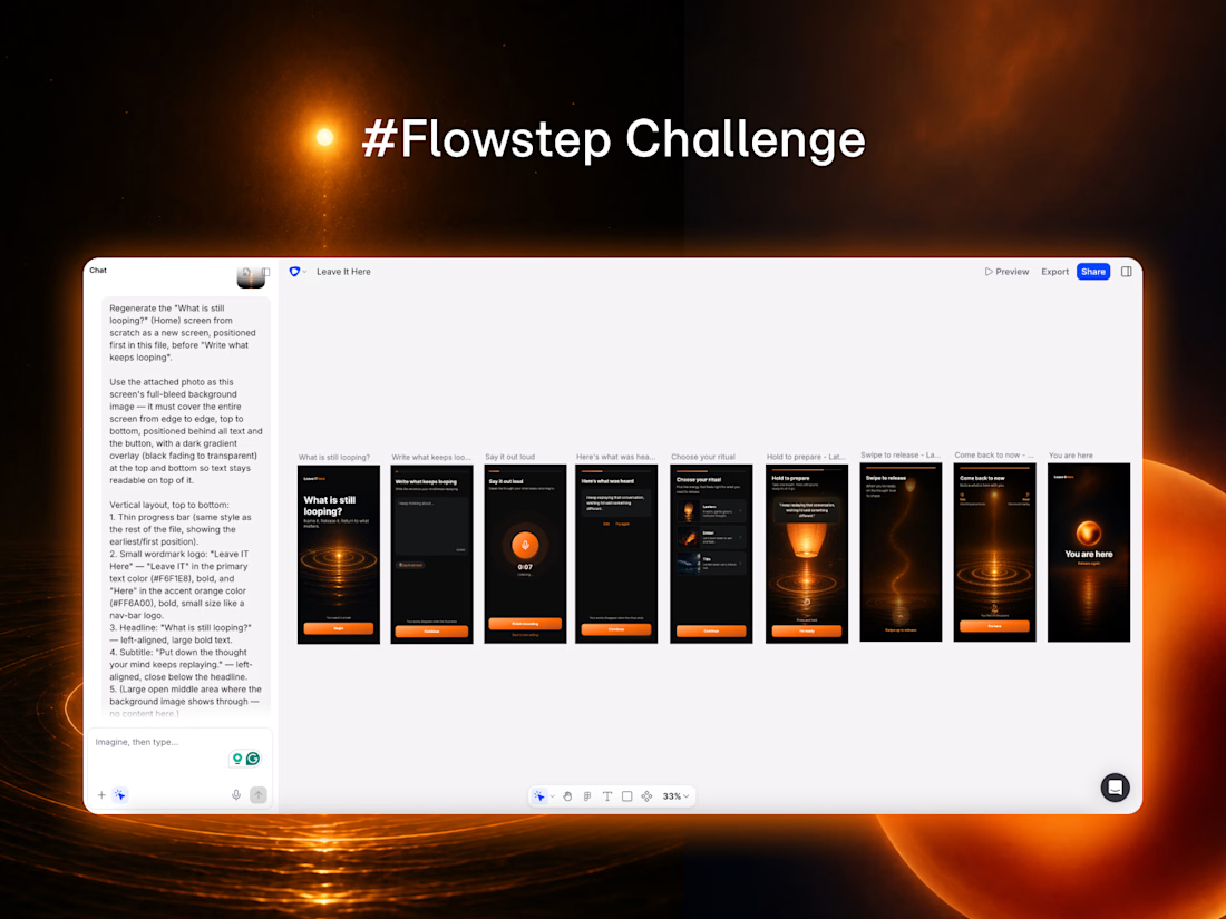
"Leave It Here" is a digital ritual for thoughts that keep looping in your mind.
I created this concept from a personal experience: when a conversation or situation hurts or unsettles me, I often replay it again and again (sometimes I can't even sleep), thinking about what happened or what I should have said or done differently.
🔮 How I used Flowstep
While working in Flowstep, I created a set of design guidelines and continuously refined them to keep the experience consistent across typography, color, spacing, tone, and interaction. I used prompting for larger changes and refined the smaller details manually, including images, texts, and button colors.
🚀 What I liked the most
I especially liked the automatic screen connections, clickable prototyping, and additional interaction states generated by Flowstep.
🔗 Prototype link
https://app.flowstep.ai/file?activeFileId=f87f9bcd-57ee-49af-a879-383ac20301cc
P.S. The prototype currently opens on the second screen instead of the intended first screen. The first screen was created later in the workflow, and I could not find a way to redefine the starting point. Flowstep team, I would really appreciate your advice on this.
💻 Thank you, Contra and Flowstep, for creating this challenge and giving me the opportunity to bring this idea to life!



Concepts built around a real feeling instead of a business use case usually turn out more polished. every design decision has something real to check against instead of just a guess


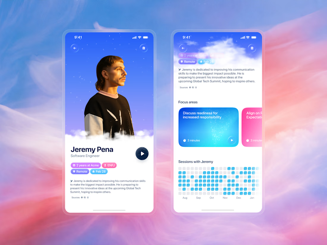
Practice a difficult conversation before you actually have it. We designed a virtual character that feels like the person you are about to talk to.
The profile screen pulls from Slack, Notion, Workday, email, and calendar to build a picture of how Jeremy communicates, what drives him, and how he tends to respond under pressure.
The design choice was to make the profile feel like a person. Each scenario comes with a goal and the leadership skills it targets, communication, ownership, and decision confidence. When you walk into the real conversation, you have already had a trial run.

That's a beautiful design there

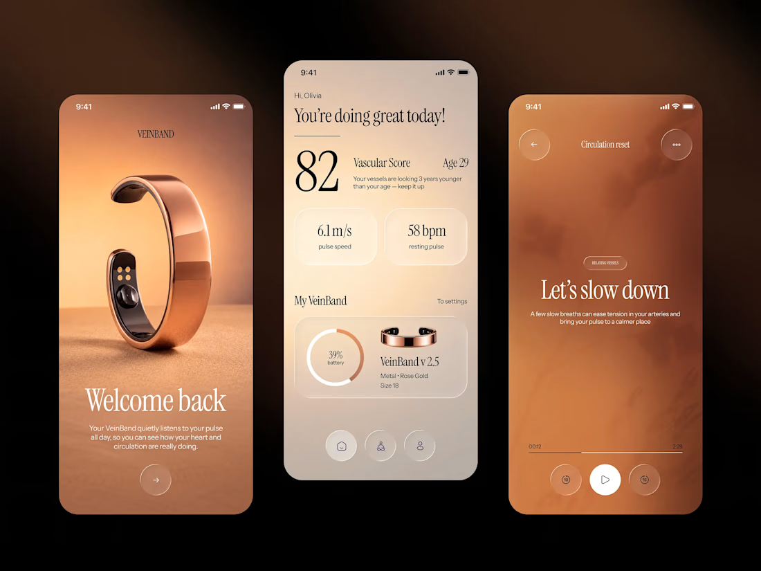
Sharing screens from one of the latest project - VeinBand, a wearable that tracks vascular health through a sleek rose gold band, pairing pulse speed and resting pulse readings with a "vascular age" score that makes cardiovascular data feel personal.
Warm, sun-washed imagery grounds the product in real life, while the interface underneath stays calm and editorial — serif typography, soft neutral tones, and a single warm copper accent that reads more wellness ritual than clinical dashboard.