The network for creativity
Join 1.25M professional creatives like you
Connect with clients, get discovered, and run your business 100% commission-free
Creatives on Contra have earned over $150M and we are just getting started
Back to feedPost
What Makes a Logo Timeless vs. Trendy
Every few years, the design world falls in love with a new trick. Gradient meshes. Ultra-thin sans-serifs. Geometric everything.
And every few years, those logos start looking dated.
The marks that last decades share a few things:
Simplicity that survives scale. If it doesn't work at 16px, it won't work at 16 feet either. The Nike swoosh. The Apple mark. They're almost absurdly simple.
No dependency on color. A strong logo works in black and white first. Color is a layer, not a crutch.
A point of view, not a trend. The Mercedes star wasn't designed to look "modern." It was designed to mean something. That's why it still works over a century later.
I've been designing logos for over 10 years. The ones clients come back and thank me for aren't the flashy ones. They're the ones that still feel right 5 years later.
Trends are fun to watch. But I design to outlast them.
The network for creativity
Join 1.25M professional creatives like you
Connect with clients, get discovered, and run your business 100% commission-free
Creatives on Contra have earned over $150M and we are just getting started
Related posts
Logo Design for an AI-powered execution platform
Share your thoughts or rate this logo out of 10.
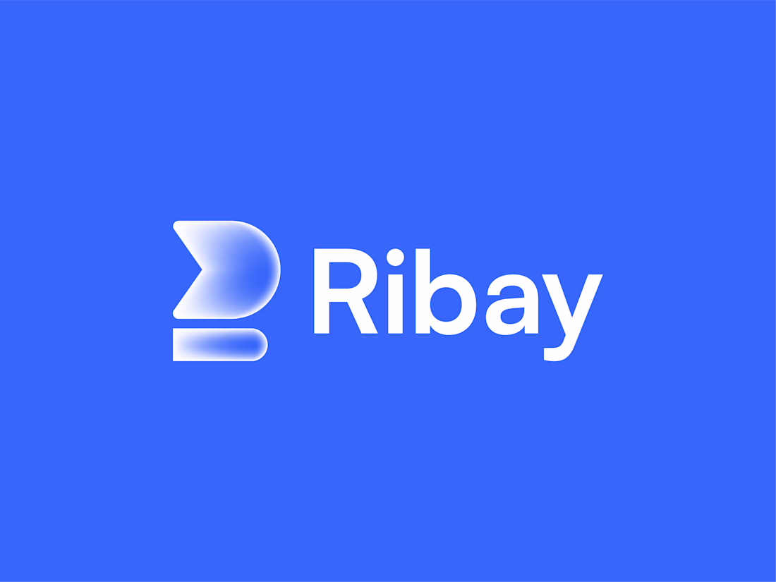
Clean execution. The icon reads as both a forward arrow and a stylized letter R, which works well for an execution platform brand. I'd give it an 8 - the wordmark and icon feel balanced, and the blue has a lot of confidence to it.
branding for Elevate, a Shopify A/B testing app

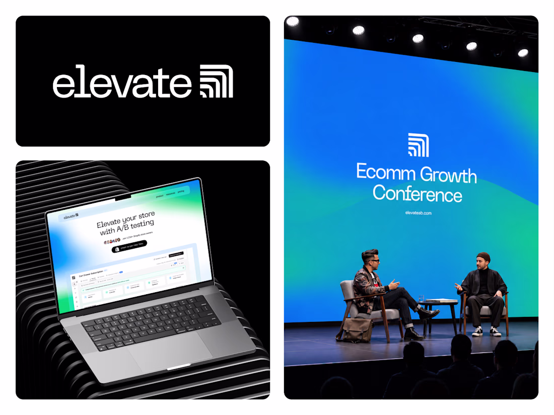
The wordmark works really well for an A/B testing tool. The signal icon embedded in the letterform reads as both a data/analytics reference and something more dynamic than a typical SaaS logo. Seeing it on the conference stage makes a strong case for how it holds up in large-format use.
The identity blends minimal design, smart geometry, and bold visuals to represent speed, innovation, and creativity.
🔻 Stylized play symbol
🧠 AI-powered workflows
⚡ Faster content creation
🎨 Built for storytellers
Designed with a modern, cinematic aesthetic to help Vidoma stand out in the evolving world of AI tools.
What do you think? 👇
❤️ Save & Share if you love this branding!
Design by @muhammadaslam #Vidoma #LogoDesign #BrandIdentity #GraphicDesign #Branding #AIDesign #VideoEditing #TechBranding #VisualIdentity #LogoInspiration #CreativeDesign #DesignInspiration #StartupBranding #MinimalLogo #DesignerLife #AdobeIllustrator #Behance #Dribbble #UIDesign #MuhammadAslam
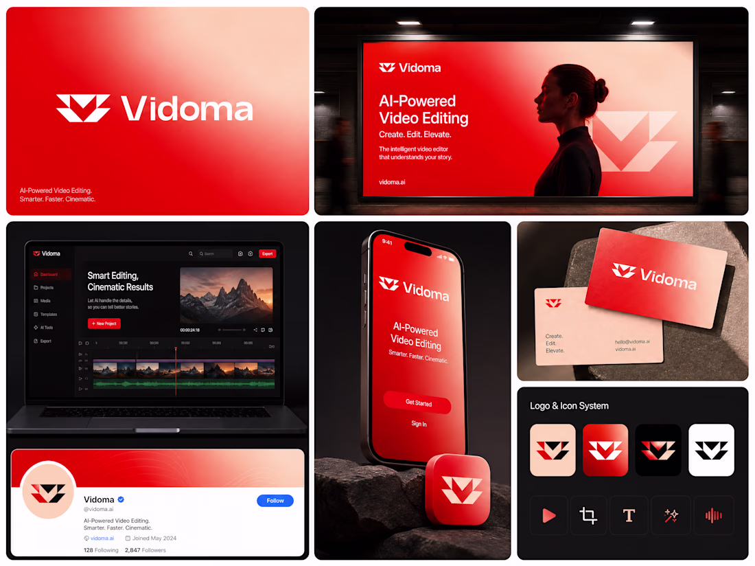
The icon system grid is the most interesting part of this. Seeing all the logo variants side by side shows just how much versatility they built into a single mark. The red on black with the play symbol reads instantly across every format shown.
Trending
Claude
Claude has entered the design space. How are you using Claude Design?
Contra University
Learn from expert creatives how to earn more using next-gen AI tools.
MagicPath
The canvas is infinite, and exploration is becoming the workflow. How are you using MagicPath?
creativeaiflow
Creative AI workflows are evolving. What tools do you use, and what are their strengths and weaknesses?
freelancerlife
Freelancer life is wins, pivots, and everything in between. What’s yours right now?