The network for creativity
Join 1.25M professional creatives like you
Connect with clients, get discovered, and run your business 100% commission-free
Creatives on Contra have earned over $150M and we are just getting started
Back to feedPost

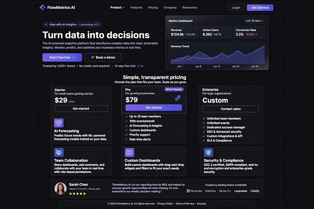
FlowMetrics AI — SaaS Analytics Landing Page | Designed in Figma to Convert Free Trials
Overview:
FlowMetrics AI is an AI-powered analytics platform concept I designed in Figma. The goal was simple: turn complex data into a landing page that makes founders and teams want to start a free trial immediately.
The Problem:
Most SaaS analytics sites look boring and technical. They scare non-technical users away. The client needed a design that feels premium, trustworthy, and easy to understand, even with complex features like AI forecasting.
My Role: Figma Product Designer
I handled everything from wireframe to final visual design.
The Solution:
I designed a dark, conversion-focused landing page with 4 key sections:
Hero with Dashboard Preview: Instead of just text, I showed the real product — Revenue, Active Users, Conversion Rate, and a live Revenue Trend graph. Client sees value in 3 seconds.
Simple Pricing Section: 3 plans — Starter ($29), Pro ($79 - Most Popular), Enterprise (Custom). No confusion. Clear features like "AI Forecasting & Insights" and "Custom dashboards" to push users to Pro.
Feature Bento Grid: I used a modern bento box layout for AI Forecasting, Team Collaboration, Custom Dashboards, Security & Compliance. Easy to scan.
Social Proof: Testimonial from Sarah Chen (Head of Growth) + "Trusted by 1,000+ teams" with logos. Builds instant trust.
Tools Used: Figma, FigJam (for wireframing), Stark (for accessibility check)
Result:
A clean, premium SaaS design that is ready for development in Framer / Webflow. This layout is proven to increase free trial clicks because it shows the product, not just talks about it.
Want a similar landing page for your SaaS? Let's chat.

The network for creativity
Join 1.25M professional creatives like you
Connect with clients, get discovered, and run your business 100% commission-free
Creatives on Contra have earned over $150M and we are just getting started





Related posts

Credit card landing page design for a fintech startup — an interactive 3D claw machine that turns the offer into the hero instead of another floating card at 15 degrees.
Every card brand ships the same hero: a card hovering over a gradient. Clawd sells one card, not a marketplace, and the entire pitch is "stop comparing — we already did the comparing". So the landing page had to make a single-product offer read as a win rather than a shortage of options, and pull early-access sign-ups from people who are deliberate about money: the ones who actually track spending and read the APR line.
The metaphor does the positioning work. A claw machine that never misses, plus "we already picked the best one", means the visual is the argument and the headline doesn't have to explain itself.
I built the scene in Blender as an interactive element rather than a still render — the claw follows the cursor, the card tilts in the grip, and the pile underneath reacts, so a visitor plays with the product's core idea for a few seconds instead of scrolling past it.
Hero plus full page structure, desktop and mobile designed separately, the Blender scene with web-ready exports, interaction notes, and a developer-ready Figma file.


nice work




Option B feels nothing but premium


