The network for creativity
Join 1.25M professional creatives like you
Connect with clients, get discovered, and run your business 100% commission-free
Creatives on Contra have earned over $150M and we are just getting started
Back to feedPost

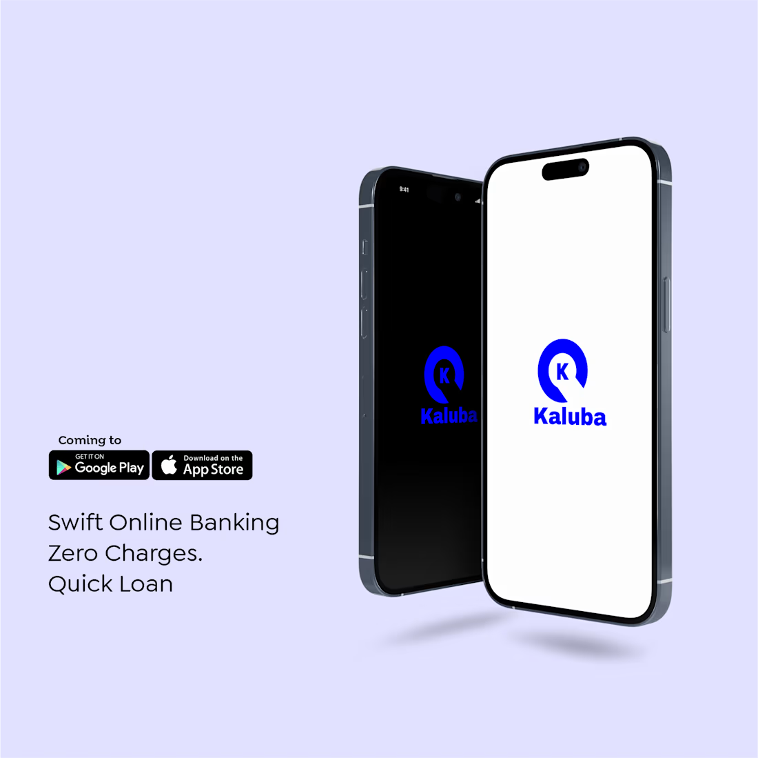
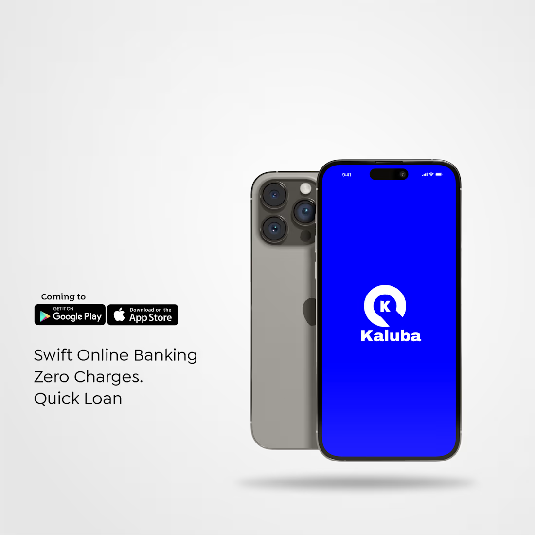
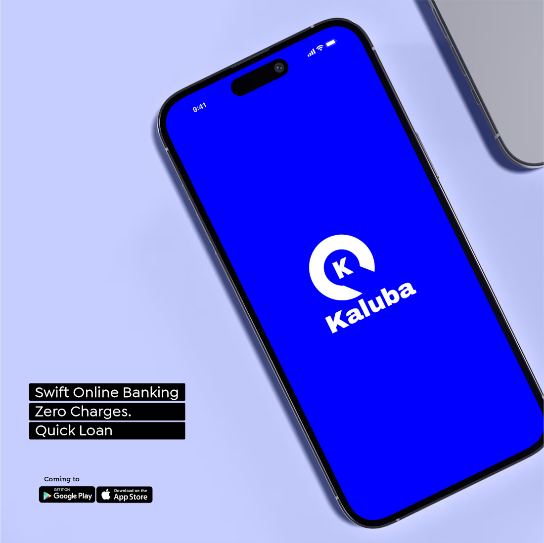
Currently working on the visual direction for Kaluba, an online banking platform built around speed, accessibility and zero-friction financial experiences.
This is still a work in progress.
Would you keep the direction this minimal, or would you push the visual identity further?
I’d love to hear what you think.

The network for creativity
Join 1.25M professional creatives like you
Connect with clients, get discovered, and run your business 100% commission-free
Creatives on Contra have earned over $150M and we are just getting started











Related posts


Approved logo for a mental health and daily habit app built for seafarers and offshore workers.
Can't wait to share more.


Lovely cohesive work, Alex. The motion is spot on!

Have you ever designed packaging for a brand that never launched? 👀
Surprisingly, it’s happened to me more times than I expected.
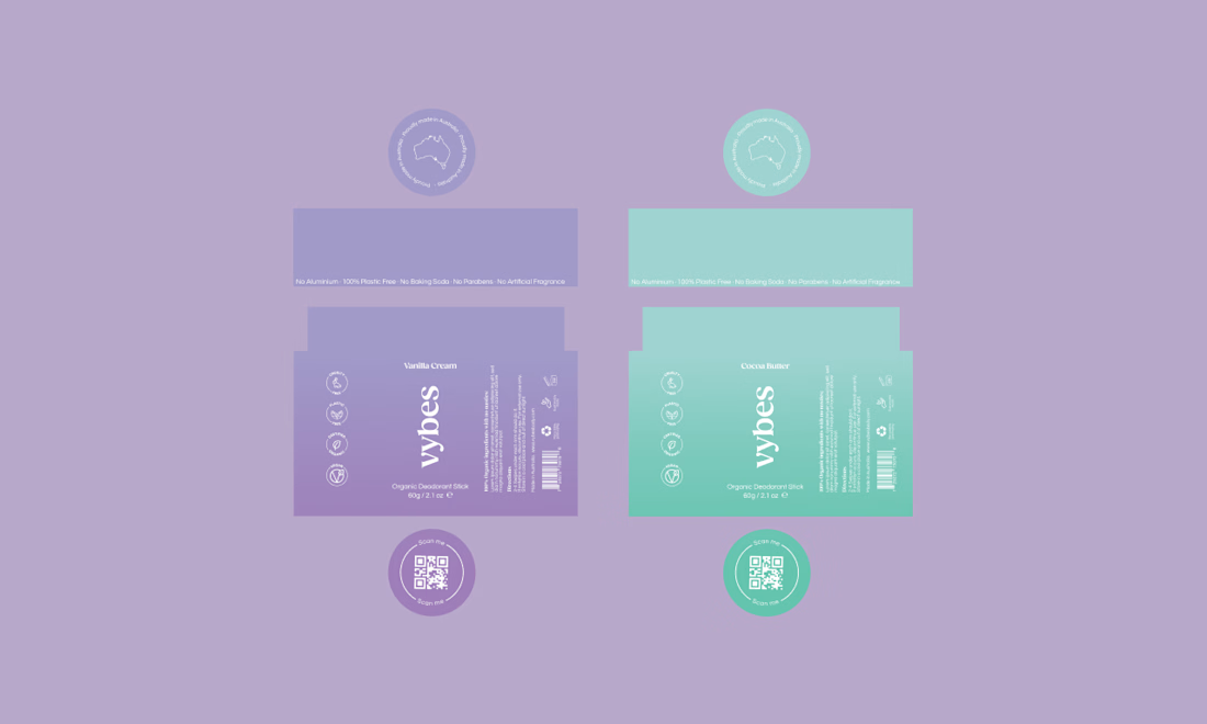
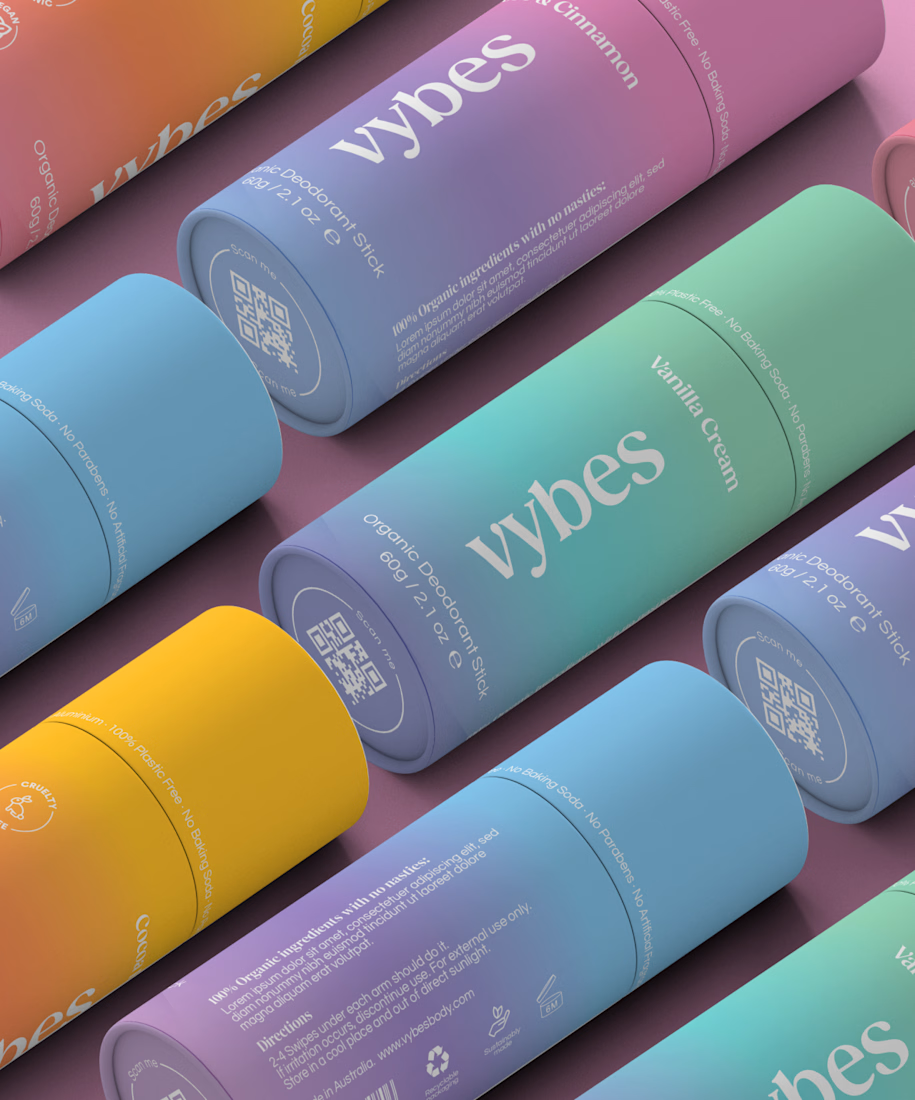
Vybes was an organic deodorant brand from Australia I worked on, designing packaging for a product that, in the end, never made it to market.
It’s a weird feeling putting so much thought into packaging for a product that people will never see on a shelf.
How many unreleased projects are hiding in your folders? 😂