The network for creativity
Join 1.25M professional creatives like you
Connect with clients, get discovered, and run your business 100% commission-free
Creatives on Contra have earned over $150M and we are just getting started
Back to feedPost

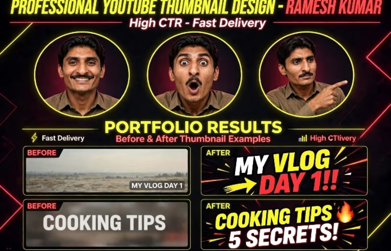
Professional YouTube Thumbnail Design - High CTR Portfolio by Ramesh Kumar
I designed these before & after thumbnails to increase CTR for Vlogs and Cooking channels.
What you will get:
High CTR Viral Design
Fast Delivery in 24 Hours
Before & After Comparison
Source File Included
Tools: Photoshop, Canva
DM for custom thumbnail design!


The network for creativity
Join 1.25M professional creatives like you
Connect with clients, get discovered, and run your business 100% commission-free
Creatives on Contra have earned over $150M and we are just getting started



Related posts

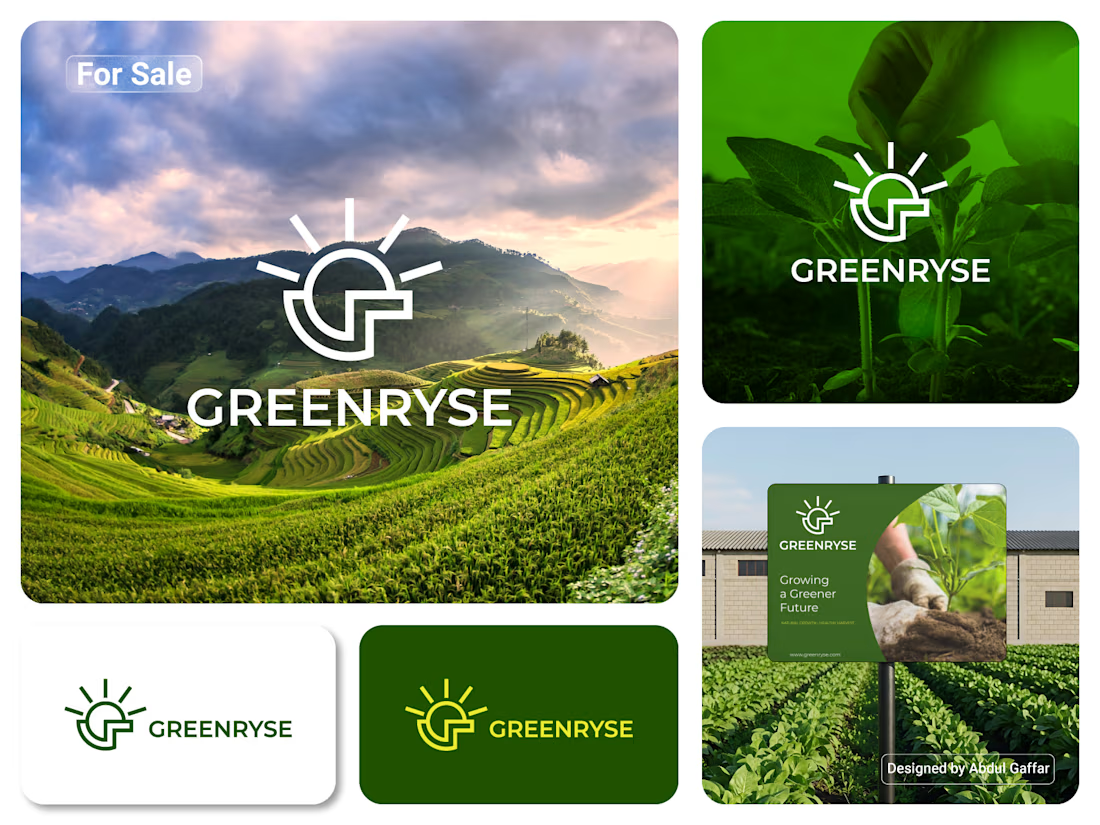
GREENRYSE – G Lettermark, Sun Logo Design, Sustainable Agriculture.
Introducing GREENRYSE, a modern logo concept inspired by nature, agriculture, and the power of growth. The symbol combines a geometric letter G with a rising sun, representing new beginnings, natural energy, and a brighter future for agriculture.
The presentation explores how the logo works across different backgrounds and applications, including agricultural landscapes, product imagery, and outdoor signage. Its clean geometric structure and fresh green color direction create a natural yet professional look.
Designed for agricultural companies, organic farming businesses, crop production, sustainable agriculture, and modern agritech ventures.


Stunning!

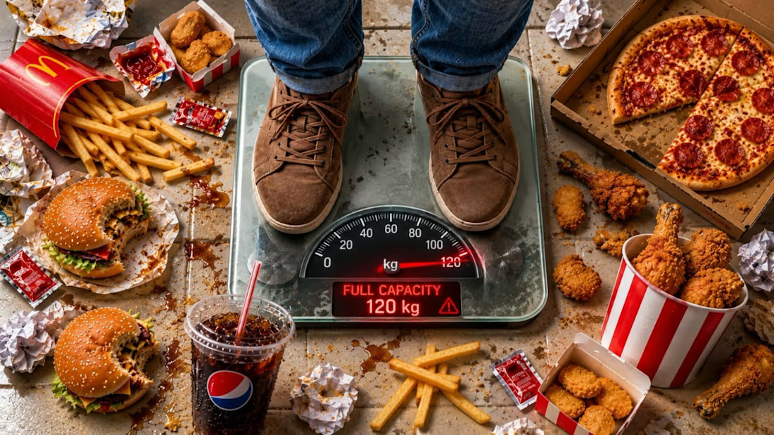
🔥 FOOD OVERLOAD! | High-Impact YouTube Thumbnail Design
A powerful thumbnail designed to grab attention, spark curiosity, and make viewers stop scrolling.
This concept combines realistic fast-food elements, dramatic visual storytelling, a 120 KG maximum-capacity scale, and bold typography to create an instantly understandable visual message.
Design Highlights:
Hyper-realistic food composition and textures
Strong visual hierarchy and attention flow
Bold, high-contrast typography
Cinematic lighting and realistic details
Strategic composition for YouTube visibility
The Goal: Turn an everyday concept into a visually striking thumbnail that communicates its story in seconds.
Professional thumbnail design isn't just about making images look good—it's about making people notice.

🔥

7:30 a.m. First coffee. Same ritual, every single day.
Some people have a sweet tooth. I have a coffee tooth. And while the kettle boils, I usually catch myself daydreaming about the same place: Japan, a trip I’ve wanted to take for years.
For this challenge, I brought the two...