The network for creativity
Join 1.25M professional creatives like you
Connect with clients, get discovered, and run your business 100% commission-free
Creatives on Contra have earned over $150M and we are just getting started
Back to feedPost

I am officially suspicious of anything that looks easy. 😂
I was trying to improve my sound design, so I watched someone rebuild the sound for a tiny Transformers scene.
Then I saw the FL Studio timeline underneath it.
Excuse me???
All those tracks…
for THAT few seconds?
And suddenly I remembered something we all conveniently forget:
People only see the result.
They don't see the 47 failed attempts.
They don't see the boring repetitions.
They don't see the research.
They don't see the decisions nobody applauded.
They don't see the nights you questioned whether you were actually getting better.
They see the polished brand.
The successful company.
The beautiful design.
The finished product.
The promotion.
The launch.
The "overnight success."
And sometimes they look at it and say:
"Wow. You make it look easy."
That's the funny part.
Easy is often what hard work looks like after mastery.
That Transformers clip reminded me that excellence is usually hiding a ridiculous amount of invisible work underneath a very simple-looking result.
And honestly, I think that's true for almost everything worth building.
So if your work looks simple now, don't assume it was simple to build.
And if your work still looks messy?
Good.
Keep building.
What is something in your life or career that looks effortless from the outside but you know the amount of work hiding underneath it?
I genuinely want to hear this one.
The network for creativity
Join 1.25M professional creatives like you
Connect with clients, get discovered, and run your business 100% commission-free
Creatives on Contra have earned over $150M and we are just getting started





Related posts

What if your design had to solve a problem before it got to look good?
Today’s exploration: a manta ray, retro terminal code, one line. “A little chaos looks good on you.”
My process: understand the problem first, design second.
Your outcome: a brand people get in seconds.

🔥 100 followers on Contra in 2 months!
Honestly, the first few weeks were slow. I posted polished renders and got almost nothing back. 🚀 Then I changed my approach:
- Engaged with others first.
- Shared the process, not just the final render.
- Posted small, regular updates instead of waiting for perfection.
- Wrote like a human.
🌿New motion designers: your failures are content too. Post them.
Thanks, everyone, for being part of this.💙


Ever postponed delivering to a client because you couldn’t figure out what was missing in your designs? 🥹
Earlier this year, I worked on Matahari, a secondary brand under Ulu Soleil. Every direction looked good, but none of them felt right, and I was getting frustrated. 😩
I stepped away.
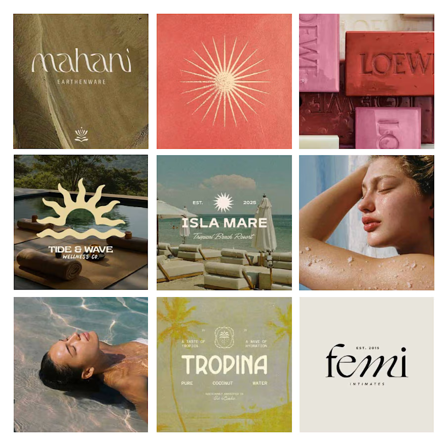
Coming back with fresh eyes, I stopped trying to rescue every original idea and started a moodboard from scratch focused on what was ACTUALLY working.
What started as a few logo explorations turned into testing typefaces, adjusting letterforms and refining proportions to find the balance between personality and simplicity.
Here’s where it started vs. where it ended up.
What’s the hardest part of logo design for you: the initial concept or the final refinements?



Starting the moodboard from scratch instead of rescuing every original direction is such a good call. The letterform refinements on Matahari show that patience paid off.