The network for creativity
Join 1.25M professional creatives like you
Connect with clients, get discovered, and run your business 100% commission-free
Creatives on Contra have earned over $150M and we are just getting started
Back to feedPost

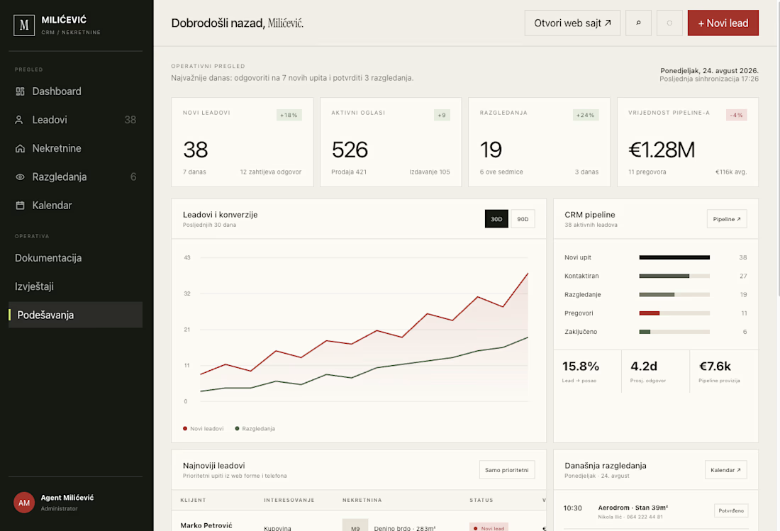
Real estate CRM dashboard — testing a warmer palette instead of the usual blue SaaS look.
Charcoal sidebar, off-white canvas, and one red accent that only shows up where a decision happens: pipeline value, conversion trend, hot leads. Everything else stays quiet on purpose — an agent should open this in the morning and know what to do in three seconds.
Curious what you think about the color direction — too warm for real estate, or does it work?
I design and build sites and web apps like this at panicdigital.com — open for work, DMs open.
If you like it, drop an upgoat.


The network for creativity
Join 1.25M professional creatives like you
Connect with clients, get discovered, and run your business 100% commission-free
Creatives on Contra have earned over $150M and we are just getting started





Related posts

Small preview of my free Framer template for weddings 💒👰🏽♀️
Remix for free (and use as you wish!): https://framer.link/OVLj7Ay

That deep wine band framing the hillside shot gives it such an invitation-card feel. Giving this away for free is really kind. Have you seen what people end up doing with it once they remix, or does it mostly disappear into the wild?

Built my new Framer portfolio around custom code, motion, and interaction.
The project combines advanced Framer development, custom React components, scroll-driven interactions, and experimental WebGL effects.


Nice portfolio update!

Six website templates I'd happily hand to a client. Each one comes as plain HTML (unzip, open, online) and as React. None of them make third-party requests, they're accessible by default, and the docs are written for AI tools.
It's also like my portfolio in a way.


Building zero-request clean templates with AI-ready docs is absolute developer witchcraft.


