The network for creativity
Join 1.25M professional creatives like you
Connect with clients, get discovered, and run your business 100% commission-free
Creatives on Contra have earned over $150M and we are just getting started
Back to feedPost
Another fun little design...
Mojo.fm - Commercial Free Radio for everyone!
Built this so my 82 year old father would understand > Big play button. No sign up . Save favorite stations to local storage by clicking the heart.
Cloudflare Workers + Astro.js + Radio Browser API.




Building for your dad as the user is a really honest design brief. 'My 82 year old father would understand' is a better constraint than most product specs. The big play button with no sign up is the right call.


Thanks MD! That made my night!
I think apps for older people would do well in general... This has been on my mind for some time. Huge button, one per page, super obvious what to do next. AOL auth? lol

wow cool..looks like gumroad theme
Wow. It totally does... I'm used to the old pink weird color gumroad... good catch!

Awesome 😎 👍
Thank you!
The network for creativity
Join 1.25M professional creatives like you
Connect with clients, get discovered, and run your business 100% commission-free
Creatives on Contra have earned over $150M and we are just getting started

Challenges
View all


Related posts

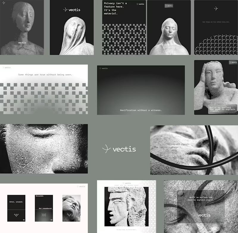
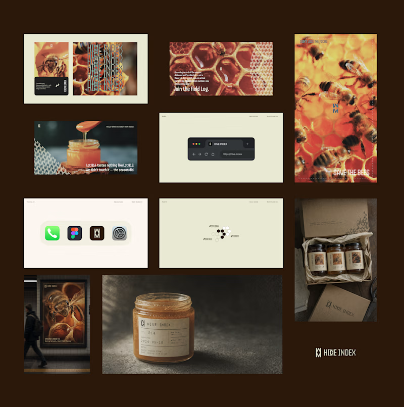
Two case studies, two totally opposite registers.
One is carved in stone and says nothing.
One drips off a spoon and won't shut up about which field it came from.
Which one do you want first?
vectis — zero-knowledge privacy, dithered like a forgotten statue
HIVE INDEX — raw honey with a paper trail. No two lots taste the same, and we don't correct for that.
45 voted
51%
43 voted
49%
88 votes
Closed

Vectis


Engaging website for a New York–based architecture and construction studio, balancing bold typography, immersive imagery and a minimal editorial layout.


Where should the photo live - behind the words or beside them?
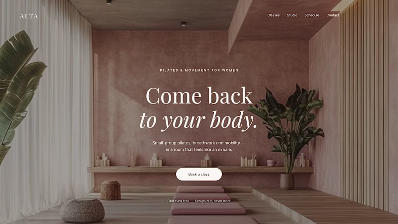
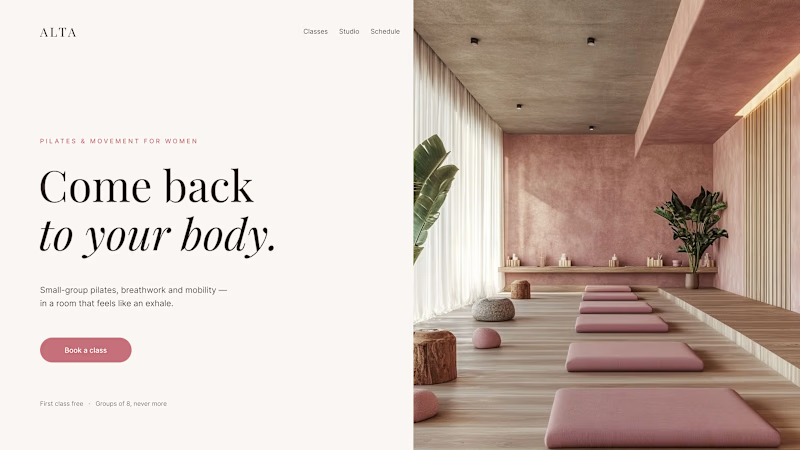
Same pilates studio, same headline.
01 - Photo as the background. Full-bleed atmosphere: the room wraps around the words. Immersive and cinematic, but the text only survives thanks to a darkening overlay laid over the image.
02 - Photo beside the text. A clean split: words on calm ground, the room in its own column. Everything readable at a glance, the trade is a little less drama.
One sells the feeling. The other sells the clarity. Which hero would make you book the class?

80 voted
75%
27 voted
25%
107 votes
Closed

1 nails it


