The network for creativity
Join 1.25M professional creatives like you
Connect with clients, get discovered, and run your business 100% commission-free
Creatives on Contra have earned over $150M and we are just getting started
Back to feedPost

Free store audit for the first 10 merchants this week.
If your store looks finished but isn’t converting, message me.
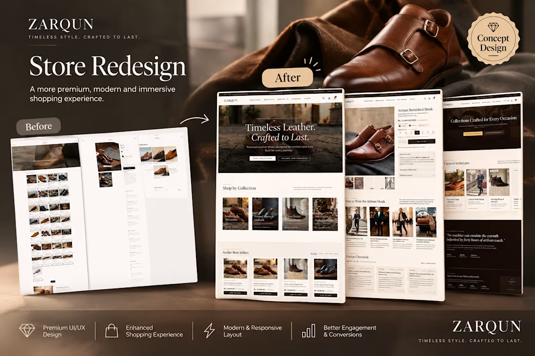
I recently redesigned a leather goods store. Here’s what changed:
- Homepage: A clear headline and a single action, so visitors know what the brand sells in seconds
- Collections: Shop-by-category tiles with real product photos, instead of a text-only menu
- Product page: Size and stock visible next to the price, a “How to wear” section for context, and patron reviews higher on the page
- Cart: A free-shipping progress bar and a clear checkout button, so buyers know what’s left before they pay
None of this was about making it look more expensive. It was about answering the questions buyers ask before they commit.
If your store needs the same kind of cleanup, send me the link. I’ll review it and send you the three biggest blockers with specific fixes.

The network for creativity
Join 1.25M professional creatives like you
Connect with clients, get discovered, and run your business 100% commission-free
Creatives on Contra have earned over $150M and we are just getting started




Related posts

✨ A premium brand deserves a website that feels just as premium.
Here's my latest Shopify design concept for AZAD, focused on elegant visuals, refined product presentation, and a seamless shopping experience.
I'd love to hear your thoughts!
What's the first thing that catches your attention: the visuals, layout, or product presentation?👇
#ShopifyDesign #EcommerceDesign #WebDesign #UIDesign


Great work 👏🏻

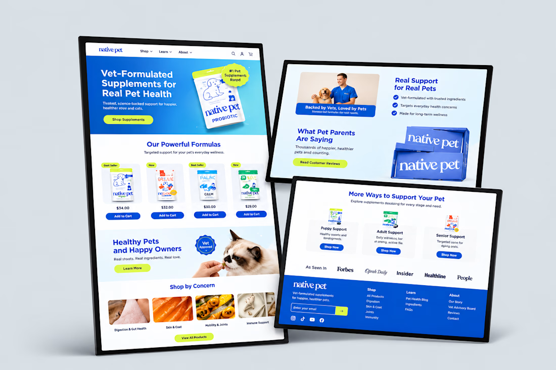
Designed a clean, modern Shopify ecommerce website for a pet wellness brand offering vet-formulated supplements for dogs and cats. The homepage features a bo...


Hey Contra Community! 👋
Sharing one of my recent Shopify projects, Woodsbury! 🌿
What I like about this brand is how it turns a small detail into something meaningful. While working on the store, the focus was on presenting its wooden ring boxes in a way that feels premium, highlighting the products while keeping the shopping experience smooth and easy to navigate.
✨ A little mix of thoughtful design, product-focused layouts, and practical Shopify development.
💻 Built on: Shopify
🎯 My Focus: Store Development & Ecommerce Experience
Always exciting to bring a brand’s vision to life through its online store. Have a Shopify project brewing? Let’s talk! 🤝
#ShopifyDeveloper #ShopifyStore #EcommerceDevelopment #ShopifyDesign #Contra #Freelancer