The network for creativity
Join 1.25M professional creatives like you
Connect with clients, get discovered, and run your business 100% commission-free
Creatives on Contra have earned over $150M and we are just getting started
Back to feedPost

SaleUp | Shaping Growth
For sales training company SaleUp, I designed a logo that brings direction, progress, and personal development into one distinctive mark.
The symbol features interlocking, ribbon-like forms that create a dynamic, arrow-inspired silhouette. Its directional geometry conveys momentum and ambition, while rounded edges introduce an approachable, human quality suited to a business built around developing people.
Deep teal and vibrant cyan give the folded form depth and dimension, creating a recognizable symbol that can stand independently of the company name.
The wordmark balances this fluidity with bold uppercase lettering and generous spacing, conveying confidence and professionalism. A distinctive detail is the crossbar-free “A,” which echoes the symbol’s triangular geometry and visually connects the typography to the icon.
Together, these elements express SaleUp’s purpose: helping people build confidence, sharpen their skills, and move forward in sales.


The network for creativity
Join 1.25M professional creatives like you
Connect with clients, get discovered, and run your business 100% commission-free
Creatives on Contra have earned over $150M and we are just getting started
Related posts

Brand Expressions -- Merdes



love this

🍔 BITE BOX — Where Every Bite Brings a Smile! 🧡
A fun, fresh, and memorable logo concept designed for a modern fast-food brand. The smile icon represents happiness, while the bold typography creates a friendly and recognizable identity. 🍟✨
#LogoDesign #FoodBranding #GraphicDesign #BrandIdentity #LogoDesigner

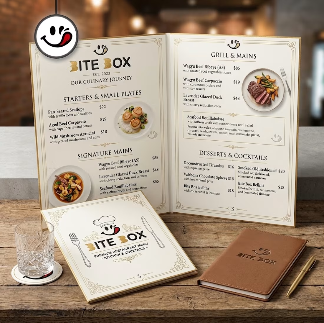
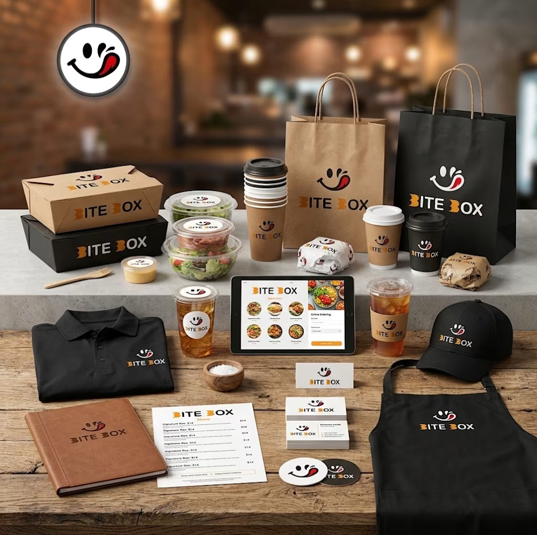
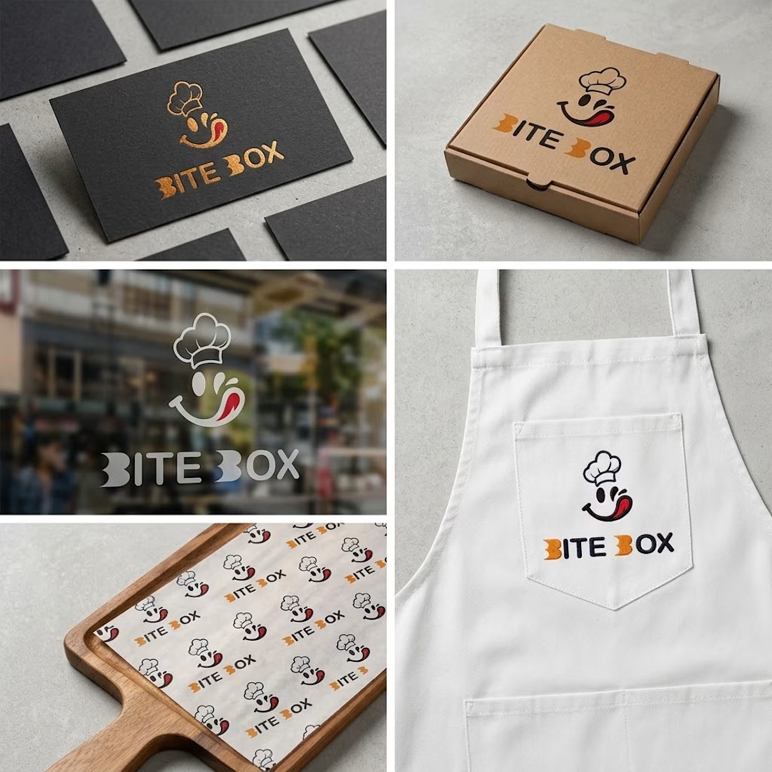
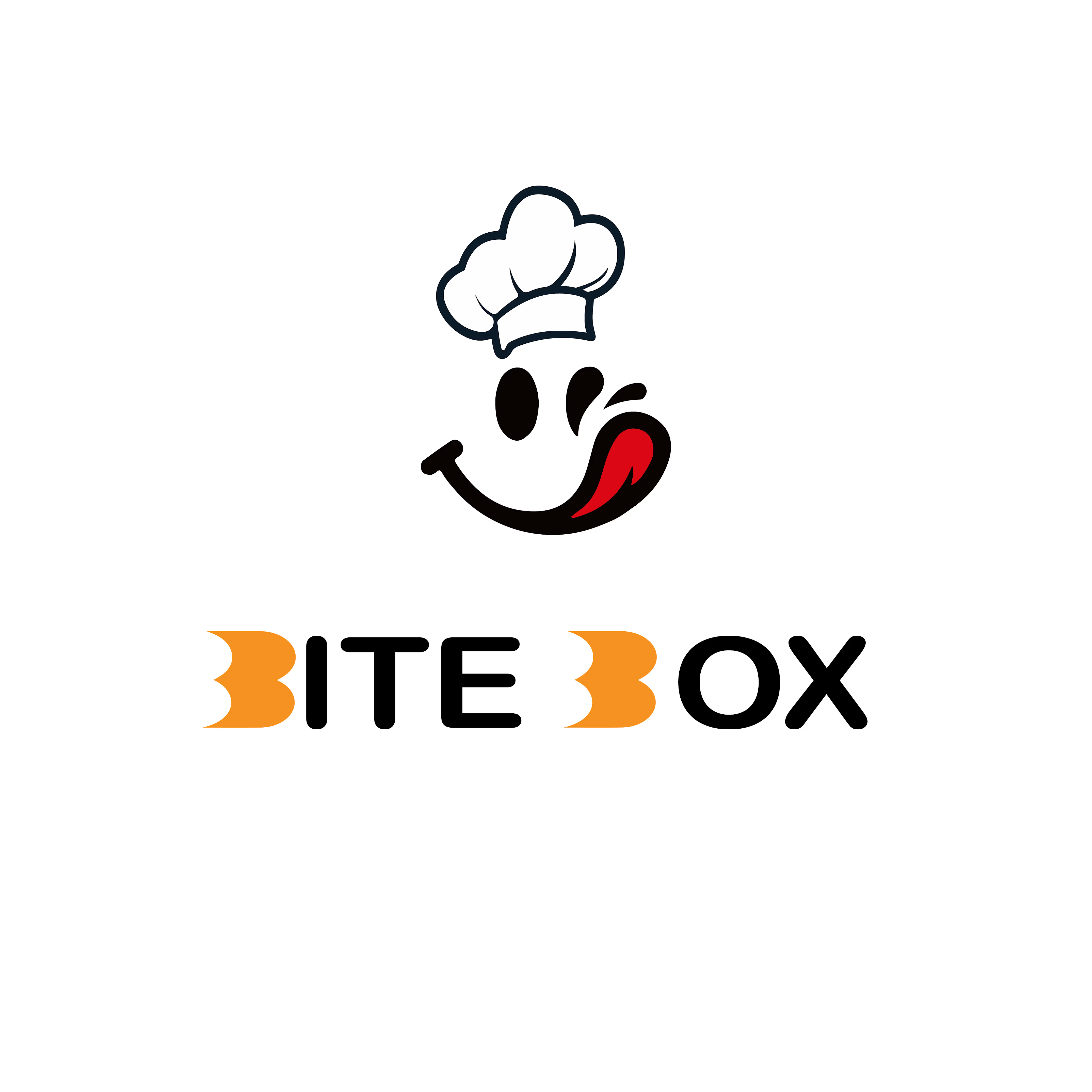


the little chef smile on the box is doing a lot of the work here
✨ Your Clothing Brand Deserves a Unique Identity! 👕🖤
A stylish, modern, and professional logo can make your clothing brand stand out. From elegant fashion labels to trendy streetwear brands, I create unique logo designs that reflect your brand’s personality.
💎 Clean & Modern Designs
👕 Perfect for Clothing Brands
✨ Professional & Memorable Identity
Ready to give your clothing brand a fresh new look? Let’s create something amazing!
📩 DM me to get started!
#ClothingLogo #FashionBranding #LogoDesign #ClothingBrand #GraphicDesigner
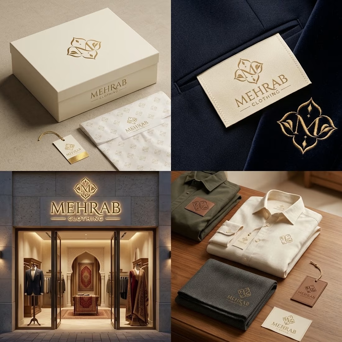

The elegant logo and refined typography work beautifully together.