The network for creativity
Join 1.25M professional creatives like you
Connect with clients, get discovered, and run your business 100% commission-free
Creatives on Contra have earned over $150M and we are just getting started
Back to feedPost

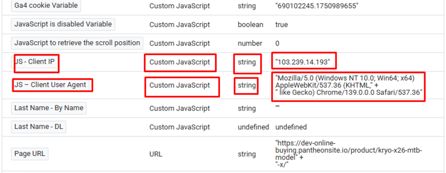
JS - Client IP
function () { try { var xhr = new XMLHttpRequest(); xhr.open('GET', 'https://api.ipify.org?format=json', false); xhr.send(null); if (xhr.status === 200) { return JSON.parse(xhr.responseText).ip; } } catch (e) { return undefined; } }
JS – Client User Agent function () { return navigator.userAgent || ''; } #mitapixel #googleadsconversiontracking #GTM #gtmtracking #conversiontracking #ConversionRateOptimization
The network for creativity
Join 1.25M professional creatives like you
Connect with clients, get discovered, and run your business 100% commission-free
Creatives on Contra have earned over $150M and we are just getting started





Related posts

An interlocking gear-train workbench with true ratios and brass-blueprint charm.
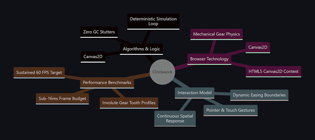
I built this project to test An interlocking gear-train workbench with true ratios and brass-blueprint charm. The core engineering challenge was sustaining uncompromised 60 FPS rendering using Canvas2D while handling continuous user interaction without framework overhead.
WHAT I WAS TESTING:
I focused on two core engineering benchmarks:
Real-time gear mesh torque transfer and escapement tick mechanics
Interactive placement of interlocking brass gears with variable ratios
THE TECHNICAL SIDE:
Implements true involute tooth profiles computed via parametric equations. Rotational speeds are propagated through an adjacency graph of connected gear nodes.
Everything executes in the browser using Canvas2D, Mechanical Gear Physics, Involute Gear Tooth Profiles. No third-party frameworks, no heavy runtime bundles, and zero external tracking.
WHAT I LEARNED:
Floating-point precision drift caused gear teeth to gradually overlap after several minutes. Clamping phase angles to gear pitch intervals solved the drift.
Finding the sweet spot between mathematical precision and frame budget took careful profiling, but the result runs at a steady 60 FPS even on modest hardware.
TRY IT YOURSELF:
The live build is deployed on Netlify. Open it in your browser, test the controls, and observe the render response times.
If you are building high-performance 3D, physics, or creative web systems and want to collaborate, reach out here on Contra.
Built by Samin Sami | Developer & 3D Experimentation


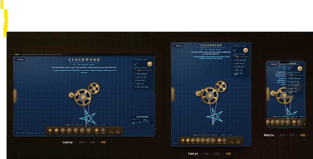

Steampunk vibe👍

Real Estate Webapp
A responsive frontend real estate application featuring a polished UI and optimized layouts for a premium property-browsing experience.


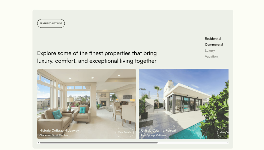

nice one, the big property photos make sense here. i'd give the text over them a bit more contrast though, especially the location

Just built a conversion-focused doctor clinic landing page 🩺
Built with React + Tailwind CSS.
→ Mobile-first & fast
→ Lead-focused design
→ WhatsApp + Call CTAs
→ Smooth animations & parallax
→ Appointment forms
→ Clean, trust-building UI
Built to turn ad traffic into appointments.
#React #TailwindCSS #LandingPage #WebDevelopment
