The network for creativity
Join 1.25M professional creatives like you
Connect with clients, get discovered, and run your business 100% commission-free
Creatives on Contra have earned over $150M and we are just getting started
Back to feedPost
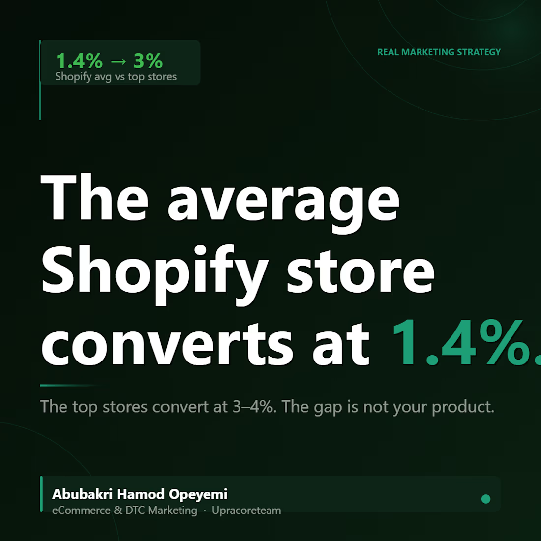
The average Shopify store converts at 1.4%.
The top stores? 3% to 4%.
That gap is not about product quality. It is not about brand. It is not about ad creative.
It is almost always about what happens on the page after the click.
Here is the number that should change how you think about your budget:
A store doing 10,000 monthly visitors at 1.4% conversion makes 140 sales.
That same store, same traffic, same ad spend — bumped to 3%?
300 sales.
No new ads. No new audiences. No new product.
Just a funnel that actually works.
This is why I am obsessed with conversion rate optimization over traffic acquisition. Traffic costs money every single month. Conversion improvements compound indefinitely.
The brands winning in eCommerce right now are not necessarily the ones spending the most on Meta or TikTok.
They are the ones who fixed the page before they scaled the spend.
And the fix is almost always the same three things:
A headline that speaks to the buyer's problem not the brand's product.
A CTA that describes the outcome not the action.
Trust signals visible before the first scroll. That is not a redesign. That is a 48-hour project.
Before you increase your ad budget this month run this question on your store:
What is my current conversion rate, and what would my revenue look like if I moved it by 1%?
The answer will tell you exactly where to spend the next hour.
Save this and run that calculation on your own store today.


Drop your current conversion rate in the comments. I will tell you the one thing I would fix first.
The network for creativity
Join 1.25M professional creatives like you
Connect with clients, get discovered, and run your business 100% commission-free
Creatives on Contra have earned over $150M and we are just getting started





Related posts

Project: Glossé Strawberry Lip Gloss - 3.2x ROAS Ad Campaign
Problem: DTC beauty brand needed scroll-stopping video ads for Shopify.
My Solution: Created high-converting UGC-style video ad using Google Flow AI. Focused on texture, color payoff & glossy finish.
Results:
3.2x ROAS in 14 days
182% CTR Increase
1450+ Conversions
Tools: Google Flow, Shopify, TikTok Ads
Perfect for beauty brands who want TikTok-ready ads that sell.


About us page for Peptra
People buy from brands they trust.
This page builds that trust.
This is what a converting store looks like.
Check out the Full case study here: https://contra.com/p/LELlrOUm-shopify-design-and-development-for-peptra


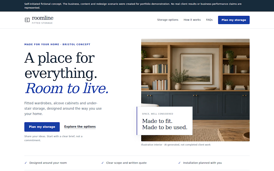
Your landing page doesn't need more sections. It needs a clearer next step.
Self-initiated fictional concept. Roomline is a fictional fitted-storage business created for portfolio demonstration. No real client results or conversion data are represented.
I redesigned a fictional landing page around a simple question:
Can a visitor quickly understand the offer, see the relevant options, trust the next step, and know what to do?
The redesign focuses on:
• A clearer value proposition
• More focused service choices
• Stronger CTA hierarchy
• A simpler enquiry path
• Responsive mobile behavior
• FAQ content that addresses common questions
• A practical demonstration enquiry flow
I deliberately avoided claiming conversion improvements because this is a portfolio concept with no real traffic or A/B testing.
For landing pages, the useful work is often less about adding more sections and more about making the existing decision path easier to understand.