The network for creativity
Join 1.25M professional creatives like you
Connect with clients, get discovered, and run your business 100% commission-free
Creatives on Contra have earned over $150M and we are just getting started
Back to feedPost

SaaS Product Launch - Motion & UI Animation


The network for creativity
Join 1.25M professional creatives like you
Connect with clients, get discovered, and run your business 100% commission-free
Creatives on Contra have earned over $150M and we are just getting started







Related posts


A look at my design work for Tithe, an app built around being more deliberate with your attention.
That idea carries into the design too. Soft blue and warm neutrals give the screens a quiet feel, while direct copy makes the next step clear.
There’s a lot happening across the product, from choosing what deserves your focus to earning your way back into blocked apps. The challenge is making each of those moments feel simple – @BrightStudios®

Amazing work Daniel🙌

Footer exploration for an AI-powered platform built for B2B sales teams.
Which one would you pick — 1 or 2?
27 voted
40%
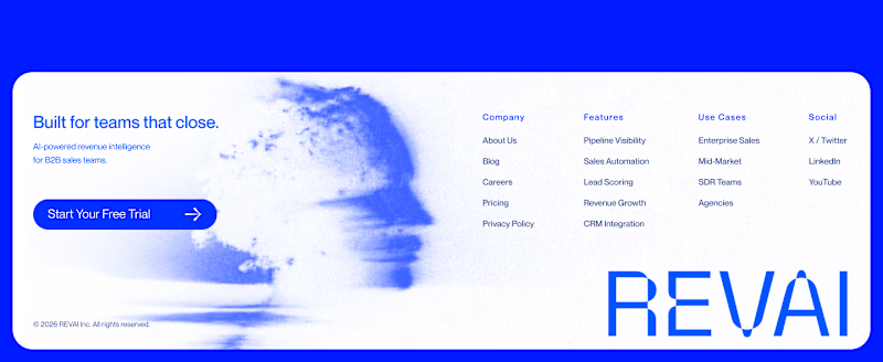
41 voted
60%
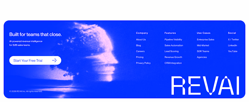
68 votes
Closed

The blue footer feels more confident for a B2B sales product—the contrast gives the navigation and CTA a clearer presence. I’d pick Blue Footer.

A part from the Landys promo I animated. The arc paints itself out of job photos, then collapses into the app feed.
Do you think that style matches the theme?

The way the arc paints itself out of the photos before collapsing into the feed has a nice build-up-and-release rhythm to it. Did you time that reveal to a specific beat in the audio, or was the pacing locked before sound came into the mix?