The network for creativity
Join 1.25M professional creatives like you
Connect with clients, get discovered, and run your business 100% commission-free
Creatives on Contra have earned over $150M and we are just getting started
Back to feedPost

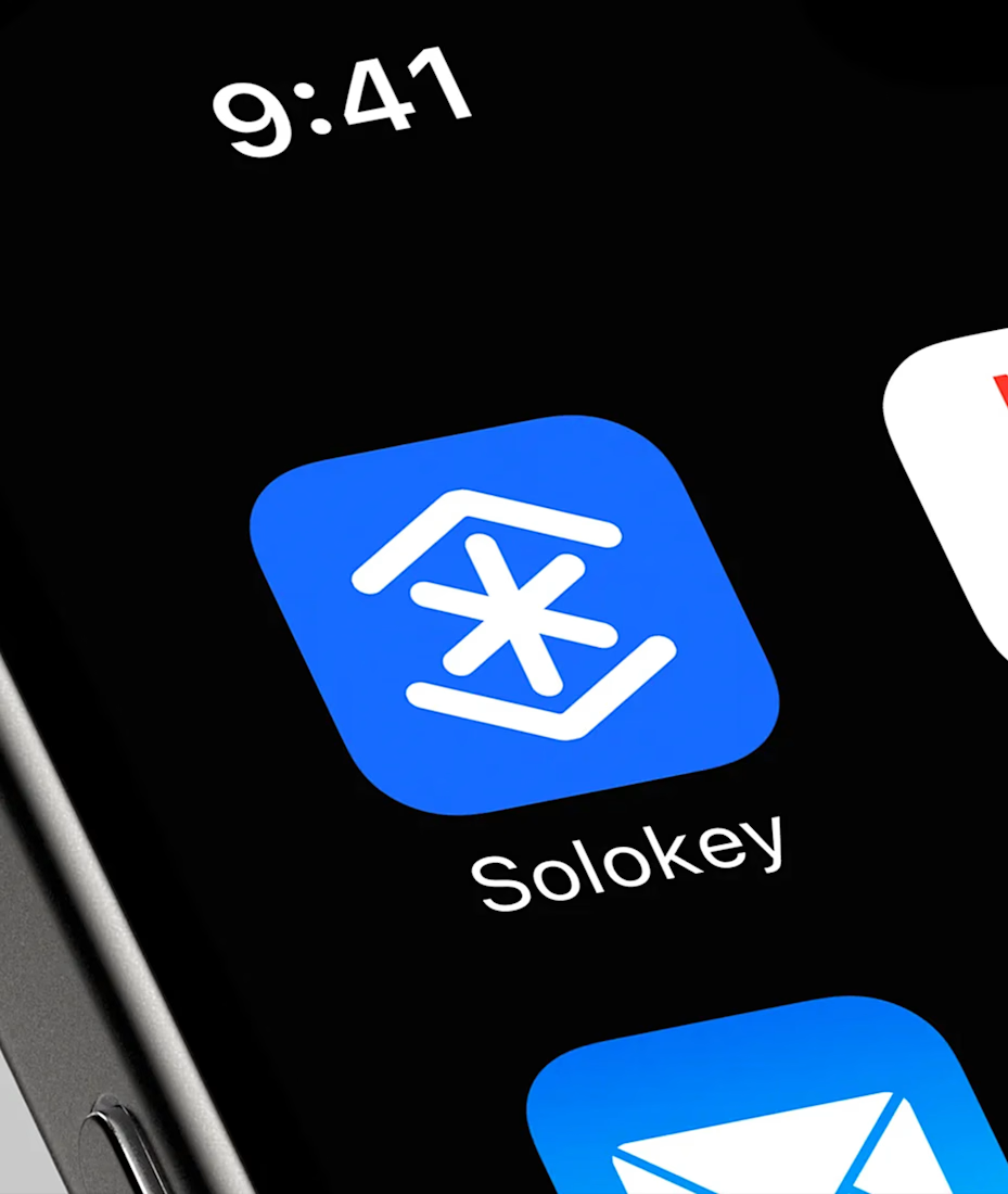
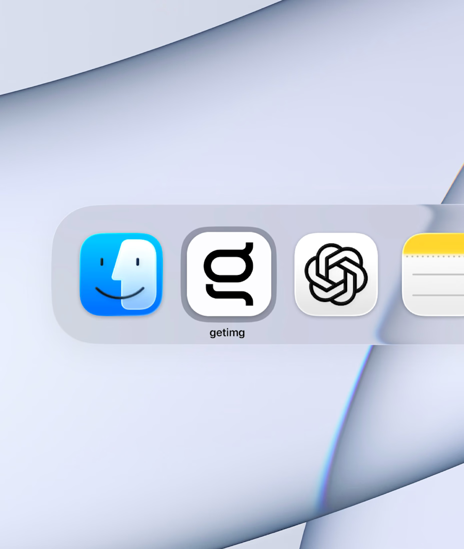
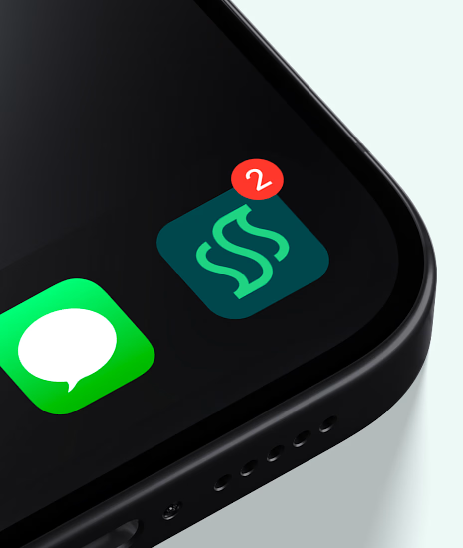
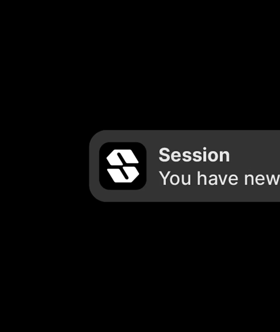
Some of my favorite logos + app icons.


nice set

What's your bar for an icon making this favorites list, craft or memorability? That dark Session mark is doing a lot with very little.


They are pretty works


That blue X mark on the top left icon is a good example of restraint, one bold gesture instead of trying to cram a full illustration into a rounded square.

Those app icons are really amazing
The network for creativity
Join 1.25M professional creatives like you
Connect with clients, get discovered, and run your business 100% commission-free
Creatives on Contra have earned over $150M and we are just getting started








Related posts

We do more than product and web design 👀
My team and I also work on branding and graphic design.
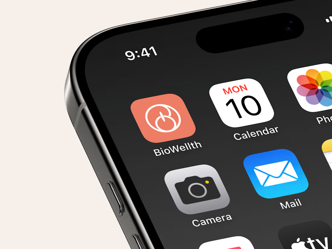
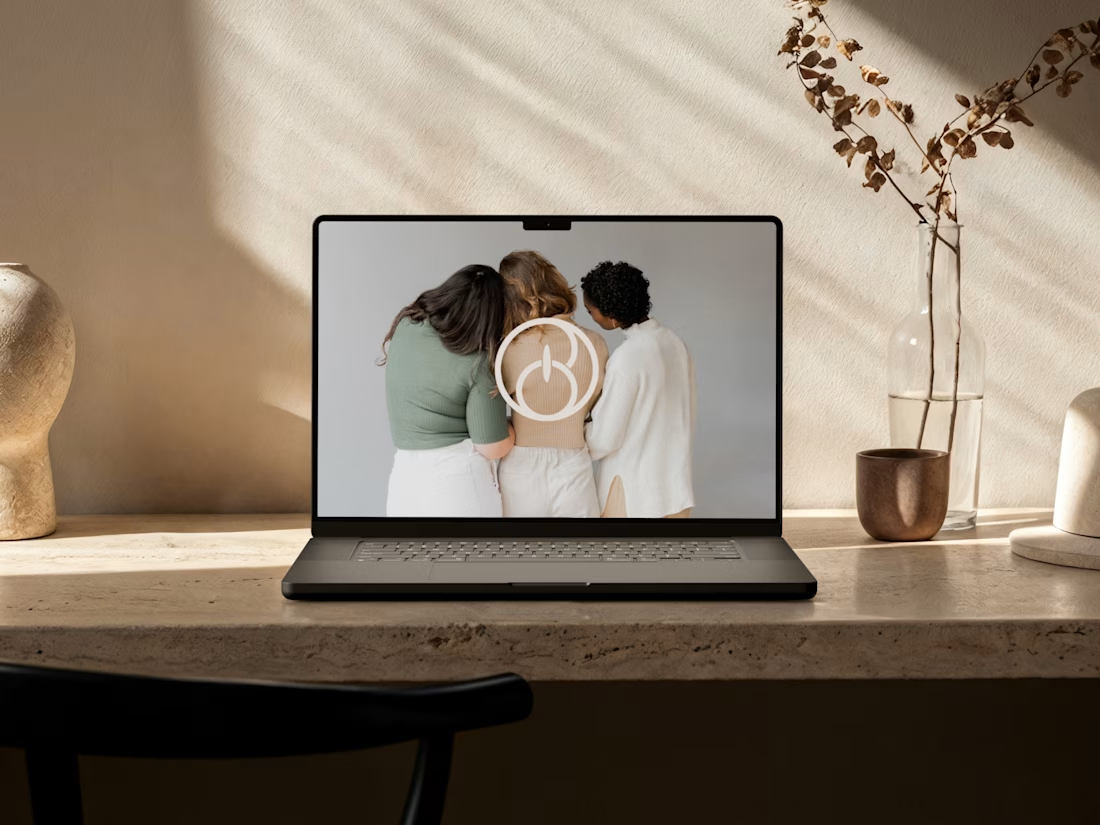
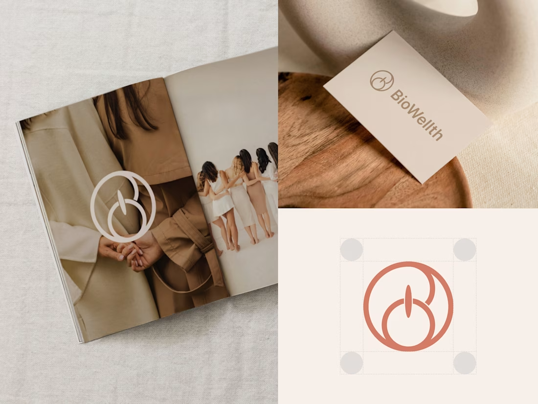
For BioWellth, a wellness app for women, we redesigned the app and built the brand identity too, including this logo.
What do you think of it? Would love to hear your thoughts!
And if you need help with design, my DMs are open ✨

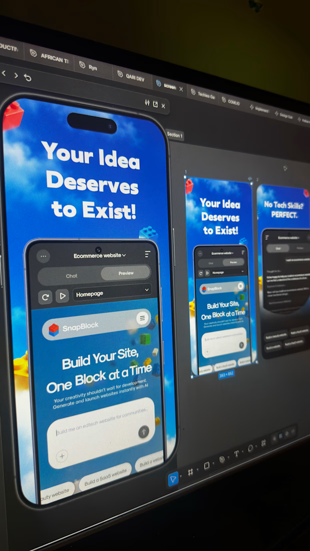
Currently working on these app screenshot for a project.


Logos that are simple, memorable, and built to fit the brand. I design marks that work everywhere, from a sign to a phone screen.