The network for creativity
Join 1.25M professional creatives like you
Connect with clients, get discovered, and run your business 100% commission-free
Creatives on Contra have earned over $150M and we are just getting started
Back to feedPost
Taste Test
My first app update is live on App Store and with it I added a dark mode to the app interface. What's your preference.. light or dark
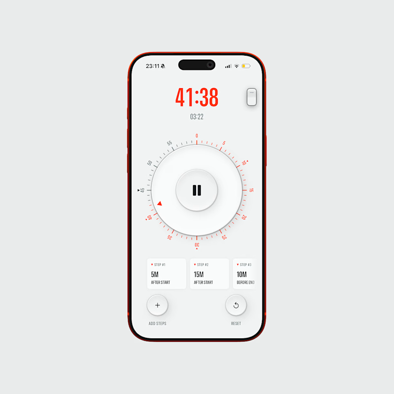
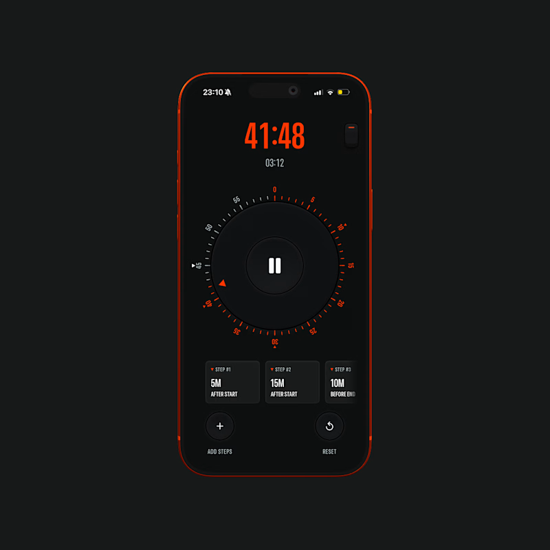
47 votes
Ends in 1d
perfect job
Light is premium! Nice one.
I usually don’t like light mode but this one is an exception
Congrats!
Both are awesome 😎 💯
I prefer Dark Mode.
Fantastic work!
Light version 🙌
This result can be variable perhaps. Most people use contra on desktop, and the white version. So you get maximum votes for the white one because your white design is more focused than the dark one in the white contra version.
The network for creativity
Join 1.25M professional creatives like you
Connect with clients, get discovered, and run your business 100% commission-free
Creatives on Contra have earned over $150M and we are just getting started
Related posts
WIP - Dark mode coming to Rung with the first app update this weekend. 🌑
No idea how this happened, but my stupid simple kitchen timer app somehow became the #1 Top Dowloaded (paid) Utility app in the Bulgarian App Store 🔥
It's now two days old 🤯
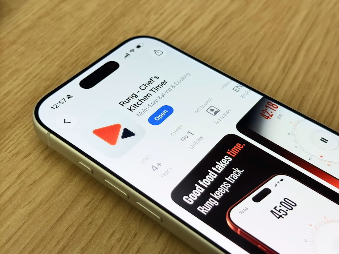
That's wild for a 2-day-old app. Did you go native Swift or did you use a cross-platform base? Asking because we're seeing the same pattern on niche utility apps.
Dark Mode" UI/UX that looks professional, modern, and expensive. Using the aesthetic seen in my Blvck Coffee project
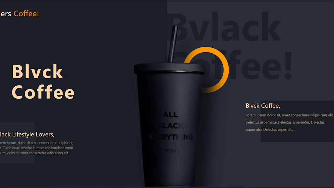
Great work, it reflects the high-end image of the coffee brand! I think reducing the spacing between the title letters would make it even better.
Trending
Runway
AI video generation is exploding. What are you dreaming up in Runway?
Contra University
Learn from expert creatives how to earn more using next-gen AI tools.
creativeaiflow
Creative AI workflows are evolving. What tools do you use, and what are their strengths and weaknesses?
portfolioreview
The best portfolios tell a story, not just show a grid. Share yours for feedback.
freelancerlife
Freelancer life is wins, pivots, and everything in between. What’s yours right now?